Showing posts with label Website Enhancement. Show all posts

Jun 23, 2014

Why do you need a multilingual website

Why do you need a multilingual website
Learn how you lose about 95% of your visitors and how to get them back. Demographics play an exceedingly pivotal role in determining the fate of your website. Language does pose a barrier if you want your blog to go truly global. 

Codemakit ran an article on “Why do some countries hate your website?” answering the question how a simple change in spelling can cause your blog to stop receives visitors/readers from certain countries. On similar lines, the language in which your blog was written in bounds the overall reach of your blog.

Languages Based on Mother Tongue

According to Wikipedia, the percentage of world population speaking English is about 5.43%. Considering many WebPages and websites are now made in English, you would wonder, that you're losing about 94.57 % of your potential readers just by writing in English!

Table 1 : Languages (Mother Tongue) spoken by people around the world

Rank Language Native speakers (millions) % of world population
1,
Mandarin
955*
14.40%
2,
Spanish
405*
6.15%
3,
English
360*
5.43%
4,
Hindi
310*
4.70%
5,
Arabic
,295*
4.43%
Source : Wikipedia Retrieved on 10th June 2014

Here comes the need for a language specific approach towards webpage creation. But there is a catch; the above data is basically for mother tongues. So 5.43% of the world's population has their mother tongue as English. (Now the figures do not disappoint).

Languages Acquired By Readers

But what if your mother tongue is not English and for answers you have to look towards English content on the web. So you use the language skills hammered in by your teachers at school and look for content published in English. Using this scenario in mind, you get almost 27% of the world as your potential readers. (Now that is pretty and believable)

Table 2 : Languages (Acquired) spoken by people around the world

Rank Language Internet users Percentage
1 English 565004000 27.00%  
2 Chinese 509965000 25.00%  
3 Spanish 164969000 8.00%  
4 Japanese 99182000 5.00%  
5 Portuguese 82587000 4.00%  
Source : Wikipedia Retrieved on 10th June 2014

Languages of Existing Webpages

In the previous Para we discussed a problem. A Problem often faced by readers all over the world. You do not find WebPages with content in your language. Would you like to hear what the language most websites are made of is? The answer not surprising is English or Anglais (I'm learning French). But what alarms is not the language, but the sheer number of WebPages using the language. What would be your estimate? Huh? 20% or 25% or 35%? Prepare to be floored; it is a whopping 56%, followed by 6% of Russian and 6% of German.

Table 3 : Webpages Existing on the web (Based on Languages)

Rank   Language   Percentage
English 55.70%  
Russian 6.00%  
German 6.00%  
Japanese 5.00%  
Spanish 4.60%  
Source : Wikipedia Retrieved on 10th June 2014

This was the problem I was talking about. You need answers; you have a presentation/ test/ viva tomorrow and all you find are WebPages in English. Hence you force yourself to plough deep into the webpage and try to understand the obscure language (The sentence might be futile for codemakit readers reading the blog in English). This might lead to visitors leaving webpage in search of a non Shakespearean website where the language is much simpler. This would increase your bounce rate, maybe this is the reason why your blog is not growing.

A Comparison

Here's a comparison of the languages discussed above.

Table 4 : Comparison of Languages, Based on demographics, Analytics and Website Content.

Rank Language
(Mother tongue)
Language
(Internet Users)
Language
(Website Content)
1
Mandrin
English
English
2
Spanish
Chinese
Russian
3
English
Spanish
German
4
Hindi
Japanese
Japanese
5
Arabic
Portuguese
Spanish
Source : Wikipedia Retrieved on 10th June 2014

Conclusion

In conclusion, it is evident from the fact that we would always like to be presented with content in our language, and the apparent lack of content on the web based on reader demographics, we should strive towards WebPages/ Websites with localized content presented in local languages. Even General Elections of countries were affected because of such tactics. Online Giants are doing it (Example : the Case of Wikipedia) and so should you (Unless you’re a potato blogger)

This answered your Question
Why do you need a multilingual website MohitChar

Jun 16, 2014

7 Best Free Image Websites without Watermarks and More

7 Best Free Websites without Watermarks
How often have you felt the need of a really nice image for your blog but all you can find are stock images charging you 1.29$ or 3.99$ for a single image. You try and optimize images you already have and you put on a long face cursing the website for the outrageous prices and move on?

But you know, high resolution photographs and images are often a major requirement for a better web design, this has been said even by design experts like, Jacob Gube and Steven Snell

Codemakit presents to you the best of the best image websites hosting free images for your benefit, Images that do not have a grotesque watermark at the center, Images that do not need any attribution (some that allow you to use for commercial purposes too) and definitely no websites that charge you outrageous amounts for seemingly stupid images. These need no attribution (some might), are absolutely free and you are free to meddle with them (almost).

Codemakit has always tried to bring you a comparison of the best. Never has it presented its own opinions on its readers. Take the examples of the Top 8 form creation websites or A comparison of Free storage for your website or even the recent Best Office websites of 2014. When you see the top competitors (each offering a different approach) you connect with them and finally bookmark them.

Stock Free Images

Stock Free images by far contain one of the most vibrant collections of stock free images (Ahem). The images are free to download, displaying image size, and dimensions along with sharing options.

Stock Free Images

Free Images

Free images, A UK based website, too has a really nice collection of images from around the world. My advice to them is to start working on the SEO side of their website. Otherwise everything else is nice, mate!

Free Images

UnProfound

Unprofound was started by Jim in 2001. Though his website has been attracting a lot of attention lately because of the sheer number and quality of images it hosts. But he still needs to work on his website.

UnProfound

Foter

Foter is by far the best website in terms of website design, and functionality. The landing page does not boast of overly beautiful images and sunset beach photos, but just a search bar where you need to type in your query and the engine would comply.

Foter

Morgue

Morgue file, though a small website with a little collection to offer is still workable as the pictures are of high quality and often meet the standards set by the webmasters. (p.s. It is the best website for photography students)

Morgue

Public Domain Archive

Public domain archive is an altogether different website. A professionally designed website filled with a really beautiful High resolution images. Codemakit tried contacting Matt the founder of this project for an interview but couldn't get through. I guess I would have to post a public invitation (So Matt if you're reading this, you are invited for an interview with codemakit)

Public Domain Archive

As is the custom, codemakit provides a complete comparison of all websites that have been studied in terms of functionality, web design and above all, content. Though the websites have been ranked, the readers not familiar with codemakit website rating (CWR) system can have a look at the rating document of Website Ratings.


Rank Name Download
Available
Creative
Commons
Free Codemakit
Index
1
Public Domain Archive
Yes
Yes
Yes
A2
2
Pixel Perfect Digital
NA
NA
NA
NA
3
Stock Free Images
Yes
NA
Yes
A3
4
Foter
Yes
Yes
Yes
B1
5
Free Images
Yes
NA
Yes
B2
6
Morguefile
Yes
Yes
Yes
B2
7
UnProfound
Yes
NA
Yes
C1

Update

Pixels

The website, Pixels provides photos licenced under Creative Commons Zero Licence. This means, you are free to download and use the images as you please. They have a huge collection of photos available in different sizes.


Large Photos

The website and its photos are mainly focused on commercial usage. But, don't fret yet, they're completely free to use. You can choose whether or not to attribute to the photos. However, as the name Large Photos suggests, the size of the photos can be pretty large.

Related reading,


This was about,

May 12, 2014

The best 404 pages in History

The best 404 pages in History front404 is an error page. It simply means that the page you looked for does not exist. The 400 series of errors were discussed before. At codemakit we had also discussed the concept of using 404 pages to your strength. But certainly one learns as he watches. A really good 404 page can spark inspiration and lead to the birth of yet another shining star.

So based on several hours of surfing and encountering 404 pages, I bring you THE BEST 404 PAGES in History!

Blizzard

In our list of Best 404 pages in history, Blizzard the gaming Giant comes at the top with its broken page. The page looks as if a bomb had just gone off and you're standing in its debris.

Blizzard


Lockerz

Lockerz with its really dynamic, animated yet simple page stands second in our list of bad-ass 404 pages. The astronaut too looks really lifelike (if it weren't for the cutout).

lockerz


PagalGuy

The third in our list is an Indian MBA Community. The forum has similar faces as its mascots. The page really gives off a cool and carefree look. Though the layout used for it is different, still can't complain.

Pagal Guy


RSQ,

RSQ with its dark comedy deserves the fourth place here. Though a link in a coffin does seem a really hilarious situation.

RSQ


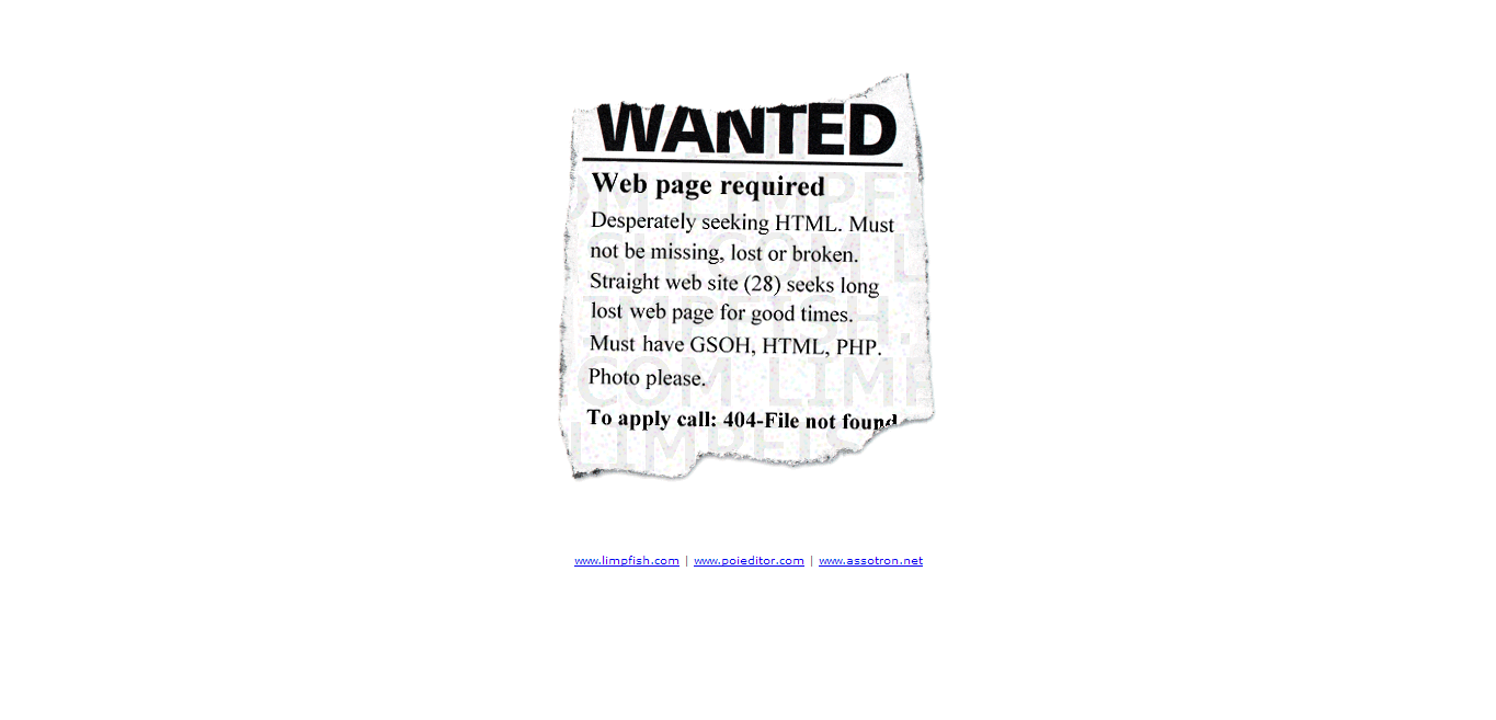
Limpfish

"Originality always trumps content", A wise man said. Limpfish with its highly original and worthy 404 page deserves rank 5.

limpfish


AttackPattern

The 404 page of Attack pattern simply lightens the mood. It is relevant too, you know because we're just surfing.

Attack pattern


SAUS

Talking of Dynamic animated 404 pages, SAUS could have jumped up to 4 if it weren't for the language paralysis. The page hypnotises you to keep staring at it forever. See at you own risk.

SAUS


Rareview

Taking of minimalist 404 pages, Rarereviews sets a nice little example for a page wchich informs and doesn't take much space or time to load Which can be otherwise reduced.

rareview


Knormal

Often expletives liven up the mood of a surfer, Such SEO psychology is used by Knormal to keep visitors on page even after encountering a 404 page.

Knormal


Duoh

I once had the honour to interview duoh.com owner veerle pieters. Now I am honoured to present its 404 page for your scrutiny.

Duoh


If you feel we've left some worthy pages in the list, there is a provision known as Comment.

This was,
The best 404 pages in History mohitchar

Mar 24, 2014

A Guide to Creating Awesome E-Book Covers


A content based website like a blog is always dependent on its readers for fame. Such websites strive for quality and try to provide as much new knowledge as possible. But alas, webmasters can only do this much. 

This is where having an eBook comes in handy. Some distinct advantages of an eBook are often forgotten by people. In this article we'll first talk why do webmasters need eBooks on their website and secondly some of the best E-Book covers and what you could learn from them.

Why E-Books?

Lets first discuss, why would a webmaster/ owner/ blogger ever need an E-Book. 
Is the website not enough?
  1. An eBook is never crawled by a Google bot. So in short you could write anything and everything in an eBook. You can badmouth others, you can give away links that you could never ever host on your website, hell you could even plagiarize from your competitors, take their images, text etc. But a worthy and ethical person would never do that, (and believe me, only the people in the latter category succeed). 
  2. Another reason for hosting eBooks or pdf materials at websites is that psychologically people are happy to download an eBook because they feel a sense of superiority as well as achievement as they downloaded a material that was not readily available on the internet. A sense of attachment starts towards the eBook and hence the website too.
  3. Another reason for websites to use eBooks is because they stand out in the world of bloggers and web enthusiasts, the race towards unique content and quality material has never been tougher, hence an eBook that would set them apart.
  4. Though an eBook is a less popular method of disseminating information than an embedded video, it still is an effective method for targeting visitors and converting them into a regularly visiting/loyal readers.
  5. Finally, E-Books are currently one of the niches where marketing geeks have just stepped into. E book websites like bookboon is speculated to earn a lot by just allotting some space in their eBooks for advertisements. So you can earn from eBooks too!

Famous E-Book Covers..

Now that we're talking about eBook, we must also know that no body would read an eBook if it does not look interesting. So here are some examples of famous eBooks and what their cover designers did to attract visitors.


The first example could be Bookboon, just because of its sheer size and output that the website provides. It has a really simple yet elegant way of creating their covers. Almost all books hosted on bookboon have the same cover page template. Orange background, Really large text "Bookboon" and simple space in between displaying a really simple image relevant to the contents of the eBook. All in all, a really nice but average type of eBook cover.


Let us take another type of cover for our discussion. Let us take "Access to Information Act, Canada" for the same. Keeping the content aside, one must first acknowledge how color combination can set a really different mood. Complete Front page is of a single color, lined with matching colors. But as is evident, The document is a part of series. Hence the book number in huge font and the book title as well as other information in smaller fonts (However, It looks microscopic related to the number itself, but who are we to judge)


For many books color isn't that important, psychologically too black as a color denotes completeness and creates a sense of awe in the mind of readers. Check out, for example the book E2, written by Pam Grout. Based on its content, Pam had to choose the cover image as something between awkwardly mathematical or unrealistic photoshoped abstract, So he chose something in between. If your content is something like this, you too can experiment.


Same is the case with the Fiction, "Hunger Games", The ebook's frontpage dwlves on human psychology that often humans judge a book by its cover, and as expected the cover goes perfectly well with the book. Complete black background with golden words and an insignia at the center, preping its readers for a journey into the unknown.


E-books do not always use monochromatic backgrounds or Orange and red stripes to woo their readers. Some, like "The essential Guide to customs and culture, Ireland" also use images as the front page. You know a really detailed and colorful image can go a long way in attracting readers. Also, since its an eBook, one does not have to pay extra for printing such high resolution images. But images like these can become the perfect way for Authors to showcase their book. Take this for examples willfully placed the word Ireland  on the shores depicted in the image. In short, the images do not look awkwardly hanging in the air but look properly supported (in this case on sandy beaches). You too can try, this out, However you much choose your background image carefully for the effect to look authentic.


But as a website, you cannot afford to have an image like the above on your webpage. It simply does not go with the content. So you create something much simpler, something that you could change with the flick of your hand. Copyblogger's ebook front pages are popular in this matter. The front page is usually red with simple images at the back as if it has nothing to hide. Then it has a small strip at the bottom for the website name.


If you do not have enough images and you are releasing eBooks in a row, you can take you inspiration from United Nations Human Rights (UNHRC) eBook. It is less minimalist from the information Act document discussed above, as it provides much more information than its counterparts. One look at the eBook and you know its contents. If you too hate highly minimalist front pages, you should go for this. Replete with images, logos and text, It can be called as a really comprehensive front page.

This was all about,
\

Feb 10, 2014

Create an Auto Responding Google Form

Create an Auto Responding Google Form
Corporates and institutions often accept information from public through online forms. The best (Non Google) form creation websites have already been discussed which do provide a lot of facilities. Often the best of them are disguised behind the paid ones. These are mostly inaccessible to the general web owners as the professional ones need a note for shelling out money from their firms and the freelancers just don't have the money. 

One such facility is the automated response which one receives after he/she has filled up an online form which might say "thank you for your responses" or something. The facility, though available on Google docs is not readily available. You would not see fancy buttons to facilitate your auto responding form. So, you'll have to do it yourself.

For this purpose an app needs to be created. The app will obviously have a script. but fret not, as most part of the script is already filled by Google. you just need to add a small snippet and your work will be done. Following are some really simple steps with instructive screenshots which will help you create an auto responding form which has the ability to send emails to the filler. But, do read the special note so that things go smoothly.

Step 1: 

Firstly you need to create a form at google Docs. The form creation has been explained pretty clear article at codemakit.

Create an Auto Responding Google Form ScreenShot 1


Step 2 : 

Now assuming you are accepting the responses in a google spreadsheet, You then need to open the spreadsheet where the responses for the form are stored.

Create an Auto Responding Google Form ScreenShot 2

Step 3 : 

You will land on the Google Script Window where you need to select, which script do you need to create. Since we're creation a script for a spreadsheet, click spreadsheet. A scipt will then be visible to you. Do not modify any code, Just add another piece of code given here.

Create an Auto Responding Google Form ScreenShot 3

The Code

Edit the code to your wishes, Do check the notes to understand the functioning. 

function formSubmitReply(e) {
var userEmail = e.values[2];
MailApp.sendEmail(userEmail,
"Yo! Thanks for your time",
"Thanks for submitting your information to us, \n\n",
{name:"Help Desk"});
};


Create an Auto Responding Google Form ScreenShot 4

Note. 

One must understand the intricacies of the code and not use it mindlessly.
formSubmitReply is a function, which handles events, this is the function that initiates the action. It has a parameter 'e' which basically is an array filled with values. Have a look at your spreadsheet containing responses, First one will always be the timestamp. If your table consists of 2 questions, ie.e 'Name' and 'email' address, you will have to put the array value as e[2] so that the app would know where to send the response.
Also the name of the sender is taken as "help desk" Which can be changed to suit your needs.
Create an Auto Responding Google Form ScreenShot 5

Step 4 : 

Now you need to set a trigger for the script you just set. Click on resources menu and select "All your triggers". You will see a window stating all your triggers, Click on "create new", which will create a new trigger instance. Select values from the dropdown window as is done in the screenshot below.

Create an Auto Responding Google Form ScreenShot 6

Step 5 : 

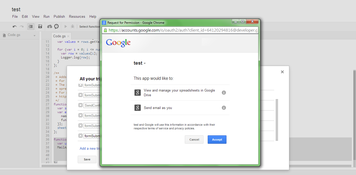
You might be presented with an authorization window where you need to click yes to go forward. Once you've authorized the app. Your form will start sending automatic responses to anyone who fills your form with an email address.

Create an Auto Responding Google Form ScreenShot 7

Related Reading


  1. If you're unsure, why you need an online form, you can check out Why Online forms, A study (Part One) and the rest can be found out at Why Online Forms, A study (Part Two)
  2. Need help creating a form using Google Forms, Try this.

This was all about,
Create an Auto Responding Google Form MohitChar

Jan 13, 2014

Why Online Forms? Best Online Form Creation websites (A Study : Part I)

Why Online Forms? Best Online Form Creation websites (A Study : Part I)
Forms are tools by which any web owner/developer/designer wants to communicate with its intended readers. So having a form on your site is as important as having a label system or a subscribe button (Which itself is a form). 

codemakit ran an article on "How to create easy online Forms with Google Forms?" when the service was first Launched. By far google is one of the most easiest and most economic ways of creating an online form. But, free services are bound to have drawbacks and lower fucntionalities. And so comes the need for other form creating websites which shall be discussed in the next article. But first we must understand why do webmasters need online forms? Why aren't they happy with their websites? What more are they trying to achieve? Consider the following examples.

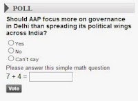
Times of India Political Polls1. You need to determine which photo or image would look great on your website. You put up a form collecting votes by showing both the pictures together and asking the users which one do you like. You put up a voting form on current topics to attract visitors showing interaction.


2. You need to put up a survey for your visitors as you need to know what age group do they belong to, what do they like, what don't they like. So that using these questions you could mold your website content to suit your readers. Result? increased visitors who are content with your content. No need for SEO, keyword study or best content practices.

3. You need a form which collects email addresses and related information from users in exchange for premium information.

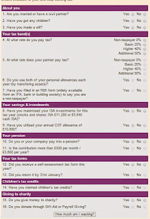
Financial Times Tax Calculator4. You need forms so that people may comment on your articles which they found interesting. More comments would surely attract more comments (even the spam ones).

5. You might have a plethora of content and would like to share the same with other users, but the website is too large for them to find just be clicking.So you create a form which takes inputs from the users and displays a list of those pictures/videos/content which matches the most.

6. You want some extra functionality added to your website making it more interactive and user friendly, by adding a tool/calculator. E.g. Financial calculator, bond returns calculator (A really great example is tabelizer which itself is a tool for converting xl data sheets into html code)

7. There are yet smaller forms available with just one or two fields like, the subscribe us form, change language form (Which has been incorporated on codemakit since 2011 or change currency form etc.

Related Articles, Create an Auto-Responding Google Form

This answered your question,