Showing posts with label Inspiration. Show all posts

Aug 3, 2015

Why do Black and White images look awesome?

Why do Black and White images look awesome? Front
In the world of filters I had often wondered why do black and white images look so cool. You would find them on website front pages, birthday cards, magazines and what not.


But the mystery surrounding the human obsession about the binary colors seem unexplained at best. What is it in those colors that attracts us?

Why do pictures in black and white look more beautiful than their colored counterparts?

There are several reasons to begin with, Lets have a look at some of them.

Uncluttered,

Images in black and white are so uncluttered, clear and devoid of unnecessary distractions. The crux of the image or the main focus becomes painfully obvious when seen in black and white. In colored images the said crux is easy to mix. This phenomenon can be extrapolated to explain why paintings with minimal colors are often the ones valued extraordinarily.

See beyond,

Images in black and white are often used to help viewers see beyond the image itself. The patterns, textures and depth suddenly becomes obvious in a BW picture. Suddenly the curves, valleys and peaks become relevant and provide a new perspective to the image.

More Objectivity

We often attribute many of our emotions to the things we see around us. It is said that we subconsciously attribute our emotions to colors around us. For Example, red is often attributed to passions, green is attributed to envy, yellow with prosperity (or at least that is what we are led to believe in India). When looking at BW images, we are free of our individual biases and hence see the subject with much clarity.

Why do Black and White images look awesome?

Higher Visual interaction

Though partially correct, there is more to the explanation given above than that seems on surface. When seeing a B/W image, we see what we want to and not what the photographer wanted us to. This leads to a much higher visual interaction than the brain planned on having with the image. This is what interests it and the image suddenly looks a lot beautiful because now it means something. To illustrate the idea further, let us consider an image of a fruit basket, when you look at it, your mind will immediately start filling the requisite colors in the image and piece together information from your past experiences to make the picture look whole again, this will inevitably lead to higher brain functioning than expected and thereby lead to a piqued interest altogether.

Related Reading,

Using the concepts above, you too can create an awesome ebook cover,


This was an answer to,
Why do Black and White images look awesome? MohitChar

Mar 23, 2015

An Experiment on the Ease of Reading Text

An Experiment on the Ease of Reading Text Front
Though it is true that the real information about the quality of text can be collected by reading it, there exist better empirical ways to do that for you. To judge the text in accordance with such empirical methods require some raw data. 

For instance, the average number of words per unit sentence, the percentage of complex words in the text, and the average number of syllables per word.

To understand this even further, you would need to know what a syllable is. A syllable is basically a unit of sound in a word. Let us take an example; If you say the word 'maker', you are combining two syllables, 'ma' and 'ker'.
Now, the texts for this experiment were taken from various sources in different period of times.

The Study Participants

First we have Harold Pinter, Nobel Prize in Literature in 2005. The text was taken from his Noble Prize acceptance speech.
Second we have, Alison Munro, another noble laureate in the field of literature, who received the prize in 2013. Her style of writing is short stories and the text was taken from 'Passion' one of her popular short stories.
Third we have Amartya Sen, the Indian economist who received the Sveriges Riksbank Prize in Economic Sciences in 1998. The text was taken from his book, 'The Idea of Justice'.
Lastly, we have Oliver E Williamson, who received the Sveriges Riksbank Prize In Economic Sciences in 2009. He wrote a book on Transaction-Cost Economics: The Governance of Contractual Relation, from which the text was taken.

The Study

Now that we have introduced the participants of the study, we need to understand the reason for their selection. For both literature and economic laureates the idea was to include two types of passage with the amount of time varying as between 10 to 15 years. Also, the participants were to belong to different countries. This idea however proved inefficient as the noble laureates in Literature from different countries than US and England tend to write in languages different than English. Hence finding a laureate with major works in English was exceptionally difficult.

Analysis of the Results

It is true, not all text excerpts were of the same size, which is partly because of the difference in media and mode of text found. Speeches in particular need to be taken as a whole instead of small excerpts (Full chapter) from a book. Similarly, short stories should also be considered as a whole instead of a part.


Name of The nobel Laureate(Award Details) Harold Pinter (Nobel Prize in Literature 2005) Alison Munro(Nobel Prize in Literature 2013) Amartya Sen (The SverigesRiksbank Prize in Economic Sciences in Memory of Alfred Nobel 1998) Oliver E. Williamson (TheSveriges Riksbank Prize In Economic Sciences In Memory Of Alfred Nobel 2009)
Source of Text Nobel Lecture (Speech) December 7, 2005 Passion (Short Story), fromMarch 22, 2004 Issue of New Yorker The Idea of Justice (Book), The Belknap Press of Harvard University Press Cambridge, Massachusetts. Transaction-Cost Economics:The Governance Of Contractual Relation (Book), Oliver E. Williamson University Of Pennsylvania
Number of sentences 367 956 20 24
Number of words 4698 11460 636 527
Number of complex words 650 640 122 159
Percentage of complex words 13.84% 5.58% 19.18% 30.17%
Average words per sentence 12.8 11.99 31.8 21.96
Average syllables per word 1.53 1.3 1.64 1.94
Minimum age required to understand the text 13-14 Years 11-12 Years 21-22 Year 22-23 Years

As is evident, the percentage of complex words (methodology of counting which is still unknown) is considerably higher in the case of economists in comparison to the literature laureates. Similarly the average number of words per sentence too is about 3 times the ones used by laureates in literature.
Though the average syllables per word tends to increase as you use higher/ complex words, the average syllables per word for all four of our participants were comparable.

Hence According to the tests through read-able.com, the minimum age of any reader trying to read one of their typical texts range from 11 to 14 years for literature laureates. Hmm, their writings do not seem so tough to understand now. Also, the writings of economics laureates tend to fall within the range of 21 to 23 years.

Based on the raw data found in the previous table, one can determine these important indices to examine the text sample.

Advanced Tests

As per the results of Flesch Kincaid Reading Ease test, where a higher score means that the text is easier to read, you can see that due to the number of complex words, the score for economics Nobel laureates are considerably lower than their literature counterparts.

According to SMOG Index, Alison Munro's piece on passion depicted the use of simple words, thereby leading to better understanding of the text. The same can be correlated with the Coleman Liau Index with the highest for Oliver E. Williamson.

Parameter Nobel Laureates
Name Name of The nobel Laureate (Award Details) Harold Pinter (Nobel Prize in Literature 2005) Alison Munro (Nobel Prize in Literature 2013) Amartya Sen (The Sveriges Riksbank Prize in Economic Sciences in Memory of Alfred Nobel 1998) Oliver E. Williamson (The Sveriges Riksbank Prize In Economic Sciences In Memory Of Alfred Nobel 2009)
Source of Text Type of Text, Date/ source Nobel Lecture (Speech) December 7, 2005 Passion (Short Story), from March 22, 2004 Issue of New Yorker The Idea of Justice (Book), The Belknap Press of Harvard University Press Cambridge, Massachusetts. Transaction-Cost Economics: The Governance Of Contractual Relation (Book), Oliver E. Williamson University Of Pennsylvania
Flesch Kincaid Reading Ease (A high score means the text is easier to read) 64.4 84.6 35.4 20.2
SMOG Index Greater the Score, tougher the text 7.8 5 14.2 14.8
Coleman Liau Index Shows the Grade of student required 10.8 8.1 13.4 17.8

Related Reading

You can check out our article on the relationship between reading ease and viewership here.

This was,
MohitChar An Experiment on the Ease of Reading Text

Jul 28, 2014

The Dangers of Fair Use Copyright Policy

The Dangers of Fair Use Copyright Policy frontHow often do you feel safe about your work? Do you feel that your work is protected enough by copyright laws?

If you do there is a bad news for you. There is a flaw in the existing copyright law, a flaw known as Fair Use Policy.

What is Fair Use Policy?

The fair use policy is an exemption to the existing copyright law, the one which all bloggers and websites use in order to ward off copiers from your precious creation. Wikipedia on Fair Use states that

'Fair use is a doctrine that permits limited use of copyrighted material without acquiring permission from the rights holders'. 

The fair use policy grants right to use a small snippet of copyrighted material without actually getting permission from the original owner. Though it was created to provide a preview of a person's copyrighted work which actually is not free to use, there is an inherent weakness or a flaw in the policy itself.

Difference between Fair Use and Creative Commons

This is much different that a creative commons concept. In a creative commons concept, the web owner allows the use of content with some limitations (Here you license your work with a creative commons). The first image of this article is a part of creative commons, which allows me to modify and use it for personal purposes. This however is not the case with fair use. A Fair use is an exception allowed for using/ reproducing a copyrighted material.

What is the problem with Fair Use?

Do you know the problem in the policy? It is just a single word in the Wikipedia's version.  The word is "Limited Use"

What is limited use? For a 400 word article, limited use may include hosting a copy containing words ranging from a meager 20 word preview or a 399 word preview "I left out a word you know. I did not use your complete article you know”. For a 20 minute video, the preview might range from a harmless 1 minute trailer or a 19 minute 59 seconds video, thereby leaving out the thank you note at the end of the video.

Since the implementation and the interpretation of fair use reside only with judges and the legal eagles, you never know if your work has been copied "Fairly" or "Unfairly" (Yes I'm using sarcastic quotes). In short, though it is named as fair use, it actually is a loophole in the system itself thereby enabling a cyber thief to blatantly copy your work without offering an apology.

How does Fair Use affect you?

When your content is available on another website for perusal, you lose valuable readers, your page start coming below the alleged website and hence your website drops in SERPs.

Related Reading,

This was about,
The Dangers of Fair Use Copyright Policy MohitChar

Jun 23, 2014

Why do you need a multilingual website

Why do you need a multilingual website
Learn how you lose about 95% of your visitors and how to get them back. Demographics play an exceedingly pivotal role in determining the fate of your website. Language does pose a barrier if you want your blog to go truly global. 

Codemakit ran an article on “Why do some countries hate your website?” answering the question how a simple change in spelling can cause your blog to stop receives visitors/readers from certain countries. On similar lines, the language in which your blog was written in bounds the overall reach of your blog.

Languages Based on Mother Tongue

According to Wikipedia, the percentage of world population speaking English is about 5.43%. Considering many WebPages and websites are now made in English, you would wonder, that you're losing about 94.57 % of your potential readers just by writing in English!

Table 1 : Languages (Mother Tongue) spoken by people around the world

Rank Language Native speakers (millions) % of world population
1,
Mandarin
955*
14.40%
2,
Spanish
405*
6.15%
3,
English
360*
5.43%
4,
Hindi
310*
4.70%
5,
Arabic
,295*
4.43%
Source : Wikipedia Retrieved on 10th June 2014

Here comes the need for a language specific approach towards webpage creation. But there is a catch; the above data is basically for mother tongues. So 5.43% of the world's population has their mother tongue as English. (Now the figures do not disappoint).

Languages Acquired By Readers

But what if your mother tongue is not English and for answers you have to look towards English content on the web. So you use the language skills hammered in by your teachers at school and look for content published in English. Using this scenario in mind, you get almost 27% of the world as your potential readers. (Now that is pretty and believable)

Table 2 : Languages (Acquired) spoken by people around the world

Rank Language Internet users Percentage
1 English 565004000 27.00%  
2 Chinese 509965000 25.00%  
3 Spanish 164969000 8.00%  
4 Japanese 99182000 5.00%  
5 Portuguese 82587000 4.00%  
Source : Wikipedia Retrieved on 10th June 2014

Languages of Existing Webpages

In the previous Para we discussed a problem. A Problem often faced by readers all over the world. You do not find WebPages with content in your language. Would you like to hear what the language most websites are made of is? The answer not surprising is English or Anglais (I'm learning French). But what alarms is not the language, but the sheer number of WebPages using the language. What would be your estimate? Huh? 20% or 25% or 35%? Prepare to be floored; it is a whopping 56%, followed by 6% of Russian and 6% of German.

Table 3 : Webpages Existing on the web (Based on Languages)

Rank   Language   Percentage
English 55.70%  
Russian 6.00%  
German 6.00%  
Japanese 5.00%  
Spanish 4.60%  
Source : Wikipedia Retrieved on 10th June 2014

This was the problem I was talking about. You need answers; you have a presentation/ test/ viva tomorrow and all you find are WebPages in English. Hence you force yourself to plough deep into the webpage and try to understand the obscure language (The sentence might be futile for codemakit readers reading the blog in English). This might lead to visitors leaving webpage in search of a non Shakespearean website where the language is much simpler. This would increase your bounce rate, maybe this is the reason why your blog is not growing.

A Comparison

Here's a comparison of the languages discussed above.

Table 4 : Comparison of Languages, Based on demographics, Analytics and Website Content.

Rank Language
(Mother tongue)
Language
(Internet Users)
Language
(Website Content)
1
Mandrin
English
English
2
Spanish
Chinese
Russian
3
English
Spanish
German
4
Hindi
Japanese
Japanese
5
Arabic
Portuguese
Spanish
Source : Wikipedia Retrieved on 10th June 2014

Conclusion

In conclusion, it is evident from the fact that we would always like to be presented with content in our language, and the apparent lack of content on the web based on reader demographics, we should strive towards WebPages/ Websites with localized content presented in local languages. Even General Elections of countries were affected because of such tactics. Online Giants are doing it (Example : the Case of Wikipedia) and so should you (Unless you’re a potato blogger)

This answered your Question
Why do you need a multilingual website MohitChar

May 12, 2014

The best 404 pages in History

The best 404 pages in History front404 is an error page. It simply means that the page you looked for does not exist. The 400 series of errors were discussed before. At codemakit we had also discussed the concept of using 404 pages to your strength. But certainly one learns as he watches. A really good 404 page can spark inspiration and lead to the birth of yet another shining star.

So based on several hours of surfing and encountering 404 pages, I bring you THE BEST 404 PAGES in History!

Blizzard

In our list of Best 404 pages in history, Blizzard the gaming Giant comes at the top with its broken page. The page looks as if a bomb had just gone off and you're standing in its debris.

Blizzard


Lockerz

Lockerz with its really dynamic, animated yet simple page stands second in our list of bad-ass 404 pages. The astronaut too looks really lifelike (if it weren't for the cutout).

lockerz


PagalGuy

The third in our list is an Indian MBA Community. The forum has similar faces as its mascots. The page really gives off a cool and carefree look. Though the layout used for it is different, still can't complain.

Pagal Guy


RSQ,

RSQ with its dark comedy deserves the fourth place here. Though a link in a coffin does seem a really hilarious situation.

RSQ


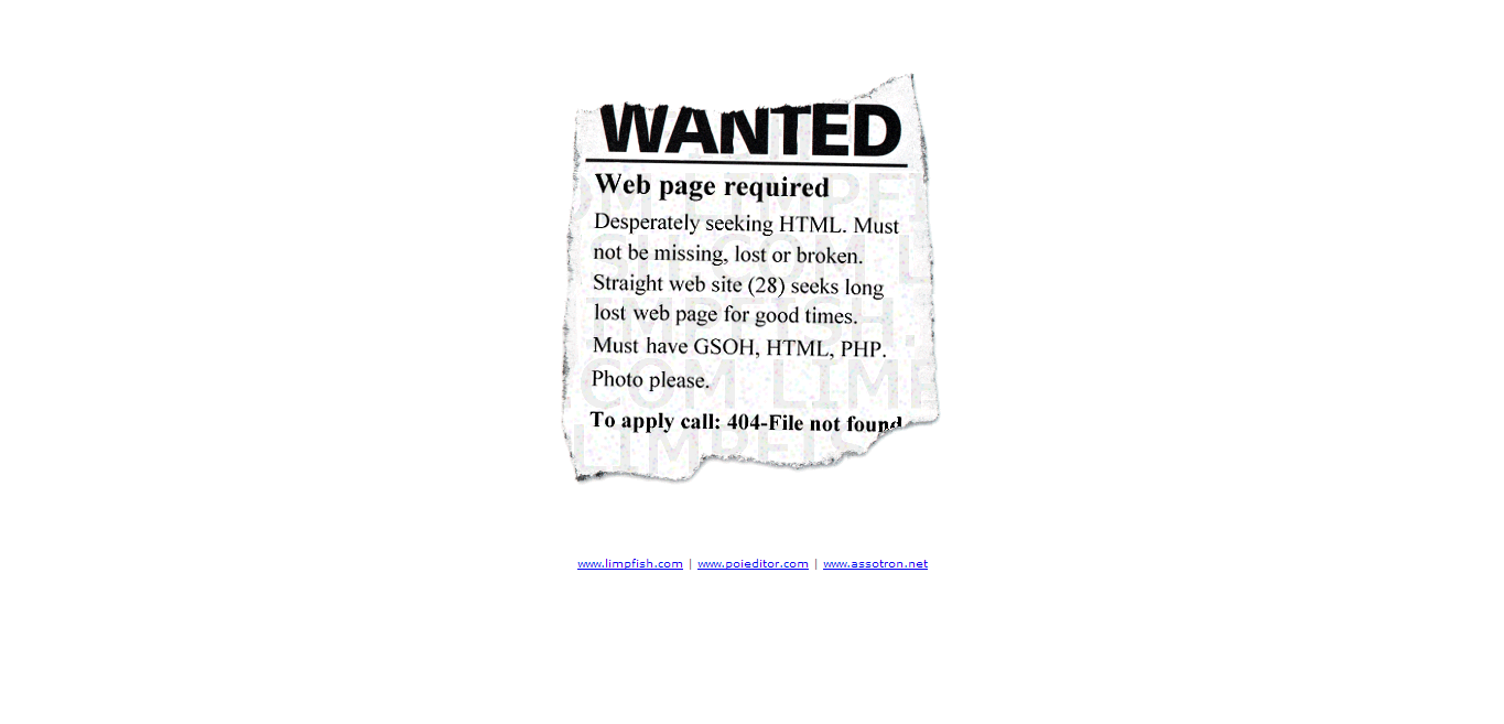
Limpfish

"Originality always trumps content", A wise man said. Limpfish with its highly original and worthy 404 page deserves rank 5.

limpfish


AttackPattern

The 404 page of Attack pattern simply lightens the mood. It is relevant too, you know because we're just surfing.

Attack pattern


SAUS

Talking of Dynamic animated 404 pages, SAUS could have jumped up to 4 if it weren't for the language paralysis. The page hypnotises you to keep staring at it forever. See at you own risk.

SAUS


Rareview

Taking of minimalist 404 pages, Rarereviews sets a nice little example for a page wchich informs and doesn't take much space or time to load Which can be otherwise reduced.

rareview


Knormal

Often expletives liven up the mood of a surfer, Such SEO psychology is used by Knormal to keep visitors on page even after encountering a 404 page.

Knormal


Duoh

I once had the honour to interview duoh.com owner veerle pieters. Now I am honoured to present its 404 page for your scrutiny.

Duoh


If you feel we've left some worthy pages in the list, there is a provision known as Comment.

This was,
The best 404 pages in History mohitchar

May 5, 2014

An Interview with Metin Saylan from Shailan

An Interview with Metin Saylan from Shailan front
Metin Saylan is a Turkish Naval Architect with an awesome programming background. He has been coding websites since 1998. This reminds me, when I interviewed Steven Bradley of Vanseo Design, I found that he too was a structural Engineer. It seems that your background does not matter when you have passion for something. 


Coming back to Metin, he was associated with yahoo geocities. He is a WordPress enthusiast and often says that it saves you from database programming hassle, and lets you focus on design and content. In 2006 He acquired Shailan.com and it started as a personal blog then. But when he bought his own personal domain, He switched Shailan.com to a web design blog mainly focusing on WordPress and web design. Let us talk to Metin and find out all about his experiences,

It's like Clark Kent and Superman. I feel like superman when I am coding :)About Design and Development

Mohit: You are basically a naval architect with an array of exceptional projects to your name, why did you get into web Design and Development?

Metin: I just love designing websites. It's like a hobby to me. I still work as a design engineer. But when I find time, I like working on my personal website metinsaylan.com. It's my blog about everything. When I need something specific, I consider writing a plugin about it. If I can, I release it to public. This brings more visitors to Shailan.com, and makes me happy. However, my real income is always engineering. It's like Clark Kent and Superman. I feel like superman when I am coding :)


Mohit: Your articles are always dripping with originality and detail. How do you get the ideas and organization to write them?

good content always brings more visitors.
Metin: As I said before, I like solving problems. When I want to add a feature to my personal site, or when a client request requires a custom feature, I do a wide research. Most people don’t have time to do wide researches. I try to summarize those problems and how to solve them on my web design blog. I also share basic tips, resources and Plugins I like on Shailan.com.


Sometimes I get inspired by a tweet, a freelancer.com project or a stackoverflow question. Those are great resources if you want high quality content. Of course you need to work hard to solve them, but good content always brings more visitors.


Mohit: Shailan.com is almost synonymous with WordPress Plugins; however any person visiting metinsaylan.com would scratch their heads when asked about the nature of the blog. With no specific topic/genre, don't you face problems during monetization or visitor Retention? 
I mean why would people bother to subscribe to metinsayan.com if the posts range from Marine Engineering to wallpaper to programming?

Metin: Shailan.com is a specific site about WordPress and Web Design. I like sharing knowledge and tips about web design. When I need to do something, and it's really hard to reach on web, I share my experiences about it. 

My personal site, metinsaylan.com is indented for everything else that is not about web design. I don't need people to subscribe on my personal site. It mainly works like my web memory, when you work on multiple sides; you get to forget things really quickly. That's why on my personal site, you would find everything I want to remember. I know it is not a readable blog, but still helps many people about many problems. It just acts as a visit and go website.

Revenue from the Website

Mohit: Your revenue model consists of Advertisements, Projects, Support Packages and Donations. How do these methods perform in comparison?

Metin: My main revenue comes from WordPress Projects. I have a few clients that outsource coding parts of their web design projects. If you prove yourself as a good developer, people tend to work with you in every project. I started working cheap first to get clients, now for a WordPress theme I get about 100$ and that's a 3 days work for me.

My second best performing revenue model is Google Adsense. It works because Shailan.com has really specific content. It's not optimized for High CPC words, but I still get around 100$ for a month from Adsense. That's enough for my hosting costs.

I accept donations for my free Plugins. People don’t donate on my site too much, maybe because I couldn't update my Plugins for a time now. In two years I only got 200$ from donations. 

Support packages are a new thing to my site. It just prevents too many support comments on my free Plugins. People always tend to think, you will answer every question. That support button tells them that I don't. It doesn't bring me anything really.

On Social Networks

Mohit: Shailan has acceptable fan following at Facebook and Twitter, but after interviewing several equally talented websites with a lesser page rank, (Bluntly) it seems Shailan doesn't invest much time at social media interactions. What are your thoughts?

once you have a good optimized website, you may go rest, and your site will do the rest.
Metin: I like sharing something time to time mainly on Facebook and Twitter. If an important update comes, I announce it on my website, and then share it on our social profiles. 


Social platforms are a great way for marketing, but if you don't sell anything on your website, sharing page links just gives you a temporary boost. Mainly people coming from twitter, doesn't bring too much revenue on Adsense when compared to search visitors. So if you want money from adsense, SEO is way better then temporary boosts. Plus, once you have a good optimized website, you may go rest, and your site will do the rest.

Metin's Advice

Mohit: I always ask this question in every one of my interviews to know about what they actually learnt in their journey. 
Having been in the blog atmosphere for so long, you must have seen the rise and fall of many webmasters and websites. What advice do you give to passionate amateur web designers?

Metin: I am not really a webdesign expert, but my advice would be that, if you want to earn money from writing, try writing original content. In time, sites change, themes change, even ways to reach the content change; but content stays. Quality content should be your aim, the rest will come afterwards.
If you are not a programming expert, compose useful resource lists from all over the web. Once you help people do things faster, they will stay with you. 

Keep your site simple and usable. Make it look similar to popular websites, because users don’t like extreme layouts. Once you have enough audience, you may change it to something else, but don't change everything at once. Those are just a few advice I'd like to follow.

WordPress VS Blogger

Mohit: Finally, towards the most contentious topics in the blogging world, I am currently using Blogger for codemakit and you are a WordPress enthusiast, How is WordPress any better than blogger?

Metin: Blogger is the simplest and best way to blog if you have good content. I started with Blogger myself too. Then I thought, why just depend on other people's websites, while I can make one. That's how my WordPress journey started. In fact, a few times later, Blogger was restricted for access in Turkey. That's too common in Turkey, so I was glad I had my own hosting. 

With self hosted WordPress site, you have full control over your site. This sometimes gets you away from main idea behind blogging, but surely it gave me a lot of content to write about.

I'm sure Metin would be happy to answer our readers's questions, If you have any, drop it in the comment below. Also, you can connect with him at Facebook or Twitter.

Further,

Metin Saylan was an absolute delight, but if you need another designer like Steven Snell of Vandelay Design, You should check out that interview too.

This was, 
An Interview with Metin Saylan from Shailan Mohitchar

Apr 21, 2014

Jacob Gube of Six Revisions Up Close

Up Close with Jacob Gube of Six Revisions
SixRevisions, A website aimed at providing the best designs to its readers for free. The face behind SixRevisions is here with us today (Applause for Jacob). Jacob Gube is a web developer, designer and the founder of Six Revisions.

He has been a web professional for more than 8 years. His comfort areas include PHP, JavaScript, and standards-based CSS/HTML. He is also quite versed with .NET, VB, Perl, AS2/Flash etc.

The Story

Like all exceptional stories, this one too starts with our protagonist starting from humble beginnings (like the ones of Reza Farazmand or Paul Crowe). Jacob started as a freelancing graphic designer who made brand identities for small businesses. He started a blog with his brother on tech gadgets. Though it witnessed a good start but lack of scheduled posting (What did I tell you about regularity) lead to its demise. But finally he found something worth writing for, something he was passionate about.

Though SixRevisions has now become something just short of an Internet giant, the site too had humble beginnings like his maker. It was started on a Sunday morning in February. He wrote two posts and published one, just the same day. Many ask why "SixRevisions"? What's so special about the name. Jacob explains that the name was inspired by his experience as a graphic designer where they often had to make many revisions to the same design.

Now enough of me, Let us move towards Jacob. Let's pick his brains and see what has he leant from SixRevisions.

From Jacob's Flickr Page


More than 35 Authors?


Mohit: I would skip the "Hi Jacob, Tell us about yourself" as your fans know everything about you. First and foremost question, 35 Authors (Check out the about page) for a single Website! Why?

Jacob: Actually, we have a lot more authors than that. The authors in the Six Revisions "About" page are just a few of our authors. That reminds me: That page needs to be updated. In the last 14 months alone, we've on-boarded 62 new authors. In total, both  Six Revisions and Design Instruct combined, we've worked with over 300 authors. Our authors are responsible for the growth of our websites. It simply wouldn't  be possible to get our sites to where they are now without the valuable contributions of our authors.

In addition, it's important for any online publisher that covers subjects as big as design and development to have a diversity of thought. In order to have a fuller understanding of these subjects, you need to learn them from multiple qualified sources.


Mohit: A page-rank 6 Website backed with such huge online presence is one tough nut to crack, what’s your secret?

Jacob: There's only one secret. And, really, it's not a secret. Focus on publishing great content.
When we work on articles, we never discuss SEO, or spinning the article a certain way just to get more page views, or any of the other tricks that's unfortunately become commonplace within the online publishing industry. We don't care about those things. We believe that if our content is good, then people will read it. And if it isn't, then we have to work on it. What we do is concentrate all our time, effort, and resources to publishing great content our readers will find useful. And that takes a considerable amount of work on our authors' part and on us.

We have just one mission: Publish content that provides value to the lives of our readers.And if that result in more page views, that's awesome, but only because it's a signal that we're on the right track in terms of publishing content our audience wants to read.

From Jacob's Flickr Page


On Social Media

Mohit: With a website as huge as SixRevisions, maintenance must be a drag; from updating previous articles and moderating comments to interacting at social media, how do you distribute the work?

Jacob: We prioritize the work. We identify key tasks and long-term projects that bring the most value to our readers and decide that we're going to work on those first. We assign tasks based on ability and availability. It's nothing formal. We just meet once a week, discuss important matters, and then dole out the tasks as needed. Social media almost runs itself. We'll check it a couple of times a day just to see if we have any messages.

Moderating comments continues to be the toughest day-to-day task because we receive hundreds of spam comments a day despite having our spam-prevention mechanisms in place, and so we have to manually moderate those.


Mohit: You have an enormous Twitter following and considerable number of likes at Facebook and several highly interactive social profiles. How important is social Media Interaction for any website/Blog?

Jacob: Social media is important for being able to have discussions with your readers. We find that it's convenient for our readers to just send us a tweet or a message on Facebook rather than email. So if you truly care about what your audience has to say, social media becomes important. But let it grow organically. Let people truly interested in engaging with you to find you on social media by themselves.

Something Personal :-P

Mohit: Let us get into something personal, some of us wonder Why isn't Isaac a part of your Author team?

Jacob: Isaac, my brother and my co-founder on Design Instruct, is part of the Six Revisions author team because he's written few posts on Six Revisions. But, as I've alluded to earlier, the Six Revisions "About" page doesn't display all of our authors.

He's editor-in-chief on Design Instruct. That means he's my boss when we're working on Design Instruct.


Mohit: What do you do when you're not working?

Jacob: I make it a habit to try and go to the gym a few times a week, I travel whenever I get a chance, and I work on personal coding projects. Recently, I've been playing console games on the PS 3. I suck though. You can add me on PSN and here's my public profile:


Mohit: Regarding revenue, how does the advertising revenue help in sustaining the website?


Jacob: It helps quite a lot. It's our primary source of funding.


Mohit: Ok Sensing a little secrecy.. Moving on, the designs at SixRevisions are unbelievingly cool and urbane. Yet, all of them are free. Why don't you sell them? I'm sure the proceeds would go a long way in improving SixRevisions.

Jacob: Our freebies? They're contributed to our community by creative professionals. Our freebies aren't meant for profit, but rather to provide useful resources our readers can use in their own projects. I believe publishing freebies is part of our mission to publish content that adds value to our readers' lives.

WordPress or Blogger?

Mohit: Let me ask a controversial question, many bloggers including me still prefer blogger/BlogSpot to Wordpress, How would you react?

Jacob: At the end of the day, your blogging software is simply a tool - just like a pen, a computer, or a paint brush. These tools don't matter if they're not being used by people. But under the right set of hands, the same paint brush can produce remarkable works of art that are celebrated for centuries, and the same laptop computer can be used to develop life-changing technologies that change the world forever.

So, use whatever helps you write and publish articles. Wordpress vs. Blogger vs. other publishing platforms is really all about preference. As for my personal choice: I use Wordpress. My partiality to WP is evident because it's the only online publishing platform that has its own category on Six Revisions. But I do regularly watch out for new publishing platforms that might serve our community better. I haven't found one yet, but a few new projects are coming close in terms of being better-suited for us. I'm keeping an eye on those.

Finally

Jacob Gube
Alright, this is the end of our up close and personal interview of Jacob from Six Revisions. We wish him well for his future endeavors. You can connect with him at Facebook and Twitter too. But do not forget to check out his awesome creations at his Flickr page.


If you have any questions, Pitch it in the comments, I'm sure Jacob wouldn't mind answering some more.

Further,

If you think another interview with a prominent designer, you should definitely have a look at the interview with Veerle Pieters of Duoh.com.

This was about.
Up Close with Jacob Gube of Six Revisions MohitChar

Mar 24, 2014

A Guide to Creating Awesome E-Book Covers


A content based website like a blog is always dependent on its readers for fame. Such websites strive for quality and try to provide as much new knowledge as possible. But alas, webmasters can only do this much. 

This is where having an eBook comes in handy. Some distinct advantages of an eBook are often forgotten by people. In this article we'll first talk why do webmasters need eBooks on their website and secondly some of the best E-Book covers and what you could learn from them.

Why E-Books?

Lets first discuss, why would a webmaster/ owner/ blogger ever need an E-Book. 
Is the website not enough?
  1. An eBook is never crawled by a Google bot. So in short you could write anything and everything in an eBook. You can badmouth others, you can give away links that you could never ever host on your website, hell you could even plagiarize from your competitors, take their images, text etc. But a worthy and ethical person would never do that, (and believe me, only the people in the latter category succeed). 
  2. Another reason for hosting eBooks or pdf materials at websites is that psychologically people are happy to download an eBook because they feel a sense of superiority as well as achievement as they downloaded a material that was not readily available on the internet. A sense of attachment starts towards the eBook and hence the website too.
  3. Another reason for websites to use eBooks is because they stand out in the world of bloggers and web enthusiasts, the race towards unique content and quality material has never been tougher, hence an eBook that would set them apart.
  4. Though an eBook is a less popular method of disseminating information than an embedded video, it still is an effective method for targeting visitors and converting them into a regularly visiting/loyal readers.
  5. Finally, E-Books are currently one of the niches where marketing geeks have just stepped into. E book websites like bookboon is speculated to earn a lot by just allotting some space in their eBooks for advertisements. So you can earn from eBooks too!

Famous E-Book Covers..

Now that we're talking about eBook, we must also know that no body would read an eBook if it does not look interesting. So here are some examples of famous eBooks and what their cover designers did to attract visitors.


The first example could be Bookboon, just because of its sheer size and output that the website provides. It has a really simple yet elegant way of creating their covers. Almost all books hosted on bookboon have the same cover page template. Orange background, Really large text "Bookboon" and simple space in between displaying a really simple image relevant to the contents of the eBook. All in all, a really nice but average type of eBook cover.


Let us take another type of cover for our discussion. Let us take "Access to Information Act, Canada" for the same. Keeping the content aside, one must first acknowledge how color combination can set a really different mood. Complete Front page is of a single color, lined with matching colors. But as is evident, The document is a part of series. Hence the book number in huge font and the book title as well as other information in smaller fonts (However, It looks microscopic related to the number itself, but who are we to judge)


For many books color isn't that important, psychologically too black as a color denotes completeness and creates a sense of awe in the mind of readers. Check out, for example the book E2, written by Pam Grout. Based on its content, Pam had to choose the cover image as something between awkwardly mathematical or unrealistic photoshoped abstract, So he chose something in between. If your content is something like this, you too can experiment.


Same is the case with the Fiction, "Hunger Games", The ebook's frontpage dwlves on human psychology that often humans judge a book by its cover, and as expected the cover goes perfectly well with the book. Complete black background with golden words and an insignia at the center, preping its readers for a journey into the unknown.


E-books do not always use monochromatic backgrounds or Orange and red stripes to woo their readers. Some, like "The essential Guide to customs and culture, Ireland" also use images as the front page. You know a really detailed and colorful image can go a long way in attracting readers. Also, since its an eBook, one does not have to pay extra for printing such high resolution images. But images like these can become the perfect way for Authors to showcase their book. Take this for examples willfully placed the word Ireland  on the shores depicted in the image. In short, the images do not look awkwardly hanging in the air but look properly supported (in this case on sandy beaches). You too can try, this out, However you much choose your background image carefully for the effect to look authentic.


But as a website, you cannot afford to have an image like the above on your webpage. It simply does not go with the content. So you create something much simpler, something that you could change with the flick of your hand. Copyblogger's ebook front pages are popular in this matter. The front page is usually red with simple images at the back as if it has nothing to hide. Then it has a small strip at the bottom for the website name.


If you do not have enough images and you are releasing eBooks in a row, you can take you inspiration from United Nations Human Rights (UNHRC) eBook. It is less minimalist from the information Act document discussed above, as it provides much more information than its counterparts. One look at the eBook and you know its contents. If you too hate highly minimalist front pages, you should go for this. Replete with images, logos and text, It can be called as a really comprehensive front page.

This was all about,
\