Showing posts with label How to Web. Show all posts

Apr 6, 2015

How to calculate the readability of a passage


The engine at read-able.com performs its function flawlessly when you add some text to be analyzed. 


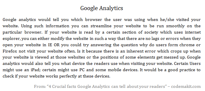
The following text is from an article on "4 crucial facts Google Analytics can tell about your readers". And the following are the results after assessing the piece of text.

As can be seen from the table itself, several parameters are calculated on the text. An explanation with the formula for each parameter can be found below.


Simple Textual Properties of the passage


Text Statistics Value
No. of sentences 7
No. of words 163
No. of complex words 16
Percent of complex words 9.82%
Average words per sentence 23.29
Average syllables per word 1.45

No. of sentences
Simply counting the number of full stops along with an algorithm

No. of words
Simply counting the number of spaces along with an algorithm

No. of complex words
I have no Idea, what can be construed as a complex word and what cannot. In my opinion, there must be a threshold number of characters in a word, exceeding which; the word can be construed as a complex word.

Percent of complex words
It can be calculated with the ratio of number of complex words to the number of total words.
The following is a valid formula for the same,
Percentage of Complex Words = ( ( number of complex words / Total Number of Words ) x 100 )

Average words per sentence
It can be calculated simply by dividing the number of words with the number of sentences
Average Words Per sentence = ( Number of Words / Number of sentences )

Average syllables per word
Syllable is a single unit of a word, separated in accordance with its sound. If you type 'Gutter" you have two syllables "Gut" and "ter". So the word "Gutter" will have two syllables.
A valid formula for the same can be

Scores found through empirical Formulas


Readability Indices Value
Flesch Kincaid Reading Ease 60.7
Flesch Kincaid Grade Level 10.6
Gunning Fog Score 13
SMOG Index 8.8
Coleman Liau Index 11.1
Automated Readability Index 11.7

Flesch–Kincaid Scores
Flesch–Kincaid readability test indicates the difficulty in understanding a text. They use word length and sentence length as parameters for their calculations.
The scale ranges from 0 to 100. Higher the score, easier is the text to read. If you receive a really low score, it means that the text is really complicated and hard to understand.
Flesch–Kincaid Score = 206.835 - 1.015 x (Words/sentences) - 84.6 x (Syllables/words)

Gunning Fog Score
Gunning Fog Index is simply the number of years of formal study; a typical US student would have undergone to understand the text written. So if you get a fog index of 11, it would mean that a typical US student of about 17 years would comprehend the subject completely.
The following is the formula for the same.
Fog Index = 0.4 x ( (Words/sentences) + 100 x (complex Words/Words) )

SMOG Grade
SMOG is a short form of Simple Measure of Gobbledygook. Just as Fog index measured the years of schooling required to interpret a piece of text for US based students, SMOG index can be applied anywhere.
The following is a formula for the same.
SMOG Index = 1.0430 x square root (30 x complex Words/sentences) + 3.1291

Coleman–Liau index
This index is also used to determine the difficulty of text. It uses only the number of letters per 100 words and the average number of sentences per 100 words.
The following is a formula for the same.
Coleman–Liau index = 0.0588(letters per 100 words) - 0.296(sentences per 100 words) - 15.8

Automated Readability Index
It takes in parameters as average characters per unit word and the average number of words per unit sentences.
Automated Readability Index = 4.71 (Characters/Words) + 0.5(Words/Sentences) - 2.43

Related Reading,

Here's a codemakit research article on the relation between readability and viewership.

This was about,

Jan 5, 2015

Tips for Comment Moderation. What Should you keep and what should you delete? Part 2

Tips for Comment Moderation. What Should you keep and what should you delete? Part 2 FrontComment moderation is one of those important aspects of managing a blog which tells the readers about the integrity and quality of the blog. 

A previous article on Tips for comment moderation talked about protecting a blog's image against comment spammers. This is the part two of the series.


The Link Factory Type

A very ancient breed of comment spammers often use a technique known as comment link flooding. In short, they flood the comment section with one or more links of a particular webpage, hoping that the sheer numbers would lead to an increase in the back links, thereby leading to higher page rank.
As mentioned above, they are an ancient breed because, such methods have already been countered by search engine's algorithms and have little or no effect on both the websites.

Another reason why such comments often do not work on websites is because, the websites have already marked their comments section as no-follow (Which means that any links in the comment section would not affect your image at google or similar search engines). Hence any attempt at garnering back links by spamming comments is foiled.

The Link Factory Type


The Hire Me Type

Some Comment spams are often disguised as marketing initiatives from unemployed designers/ developers and SEO professionals. Though it is not hard to decipher what they write, their text is often accompanied by options to hire the writer. Their comment reeks of "Hire Me!" all along. Needless to say, you should remove such comments.

The Following comment was found on a previous article at codemakit talking about the dangers of trading an article with a service.

The Hire Me Type

The Naked URL Type

You will often find that comments like the one below have little or no un-hyperlinked text. One often wonders if it is a ruse, with spammers trying to garner pageranks by adding links as mentioned in the first case.

However, you must be careful. One look at the URL of the link would tell you if it is related to the article or not. If it is related and genuinely adds quality to the article, you can keep it. If not you should remove it as a crushed bug on a car's windshield.

The Naked URL Type

True to Myself Type

Now you might see some comments which are genuinely concerned about the article and the blog.The first method of checking a comment against spam is to find is if the comment contains a hyperlink. The second method of finding if a comment isn't spam is to check the content for relevance to the article itself.

Like the previous article on comment moderation, Here's an example of a genuine comment in which the author is concerned about the content of the article and phrases his/her comment accordingly.

The following article is on the geomatic changes in blog.

True to Myself Type

The Shakespearean Spammer

Not often you encounter wordy Shakespearean comment spammers. Only one thing differentiates such comment spammers from normal ones, The use of herculean amount of words, often relating to the article as a bee relates to a space ship and nearly every character of the comment has been copied form somewhere.

The following comment was received at codemakit's article about including a favicon to your website.

Guess what? The spammer has commented about international concept of work from home! Who the F comments about work from home at a favicon based article? The comment was so large, that complete screenshot would have increased the length of the post by 30% and would have left you dazed.

The Shakespearean Spammer


Looking London Talking Tokyo Part 2

Some comment spammers do not use hyperlinks in their comments to avoid being filtered by automatic comment spam filters. The following comment is about Business phone lines at the Jetbro Interview article.

In such cases, it is often advisable to skim through the comment to ensure that the comment is in accordance with the article itself.

Looking London Talking Tokyo Part 2

Though this type of comment spam has been discussed before, I could not stop myself from entering the following comment from entering the wall of fame.

Looking London Talking Tokyo Part 2

The Brazen Comment Spam

Now there exist a rare breed of brazen super-strong, fearless comment spammers who defies every law of commenting on article.

First, Comments are often advised against adding links in their comments.
Secondly, Comments should be related.
Thirdly, the transition of ideas in the comments should be smooth and not abrupt.
Fourthly, You should not comment spam on an article on "Tips for comment moderation"!

The Brazen Comment Spam

Related Reading,

Liked it? You will obviously like the Part I of article on tips for comment moderation.

If you're not aware, here is the method of removing spam comments from the blog.

Have you read some of our funniest comment  spams here's Part I and here's part II?

Check out a case study about how a single sentence reduced comment spams by half.

This was about,
Tips for Comment Moderation. What Should you keep and what should you delete? Part 2 MohitChar

Dec 12, 2014

Check your Website for Mobile Compatibility Part 2

Check your Website for Mobile Compatibility Part 2
A Website can be easily converted into a mobile Website. A blogger based blog, still easier. What after the conversion? How do you reckon that the website is now mobile friendly and none of any readers will have problems opening the website in their PDA.

A previous article by codemakit talked on compatibility of websites for its use in mobile devices. The article talked of GoMo which developed a tool known as GoMometer which analyses the websites and reports its findings. 

Forever alone guyA major disadvantage in GoMo is that you need a person to give the feed-back. In Short, you need to ask a person to visit your website and fill the GoMo form. When many of them view and report their satisfaction/dissatisfaction, you'll get a fair idea about the website in question. But what should you do when you do not have enough beta testers, or if you're alone, you’ll need something better and faster. 

Behold! Out from the ashes, emerge, "Google Webmasters Mobile Friendly Test"! There exists a bar where you need to enter your website's URL and click analyze. To think of it, it is very similar to the page speed analysis page.

Best Practices for Mobile Compatibility

Though Google has enlisted some stuff which has to be thought of before you consider it as a mobile website, you can still view the condensed version of Google's Webmaster mobile best practices.

First codemakitcodemakit Example
Large Sizes


The worst thing about viewing a website from a mobile device is the strain your eyes have to endure while reading. A lower font size not only increases eye strain but also lowers the reader's interest leading to higher bounce rates and lesser session duration & Pages per session. If you're not sure which font size is the best, check out codemakit's study on the best font sizes for websites and the best font types for better user interaction.


Second codemakit
Low Flash


your website must have minimum of Flash content as it creates complications in mobile environment. Actually too much of flash content is not good for any website. 
Though Flash content looks more beautiful than most non-flash websites, the flash content is rarely read by bots and hence it is not indexed. 


Third codemakit
Viewports

The Ability of the website to scale itself, since the website will be opened in Tablets, Desktop computers, mobile devices etc. you cannot expect the text box in the website to be the same throughout. You'll need to configure your website's viewport so that the website content is modified to find with different screen widths. (For more information check out Google’s support page on setting the Viewport)

Checking Mobile Compatibility

If you have followed the three steps enumerated above and you're still not sure about how google sees your mobile website, you can have a look at Webmaster's mobile friendly tools.

Webmaster's mobile friendly tools

Though Google is reliable, what is more reliable than the creators of the internet, W3C or World Wide Web consortium too has an awesome mobile check tool, where after analyzing a URL, it will display the areas in which the website is weak and need improvement. Being a purely technical checking tool, the W3c mobile Checker can be a harsh checker. (It gives a score of 37% out of 100 to facebook.com) But it has the ability to point out separate problems in the website.

W3c mobile Checker

Related Reading,

You can check Google's mobile usability tips from Google Support

This was about,
Check your Website for Mobile Compatibility Part 2 MohitChar

Jul 7, 2014

When was a Webpage Updated

When was a Webpage Updated
Ever wanted to find when was a webpage updated? Here are some methods to find out when a webpage was updated. We'll be discussing several methods to find when a webpage was updated. 

For example the WayBack machine method, change Detection method and JavaScript method.


The WayBack Machine

One of the most popular methods for non-programmers is the wayback machine method. Codemakit had already discussed the method in one of its previous articles on the Internet Archivist.

It is a project by 'The Internet Archive' a non-profit enterprise which has been receiving data from Alexa and many websites. In short it is a type of library that stores versions of your website.

WayBack Machine


The usage is awfully clear, you need to enter the URL of the website which you need to check in the search bar and press enter. The previous version would be right before your eyes. Now it must be clear that you cannot use the Wayback machine for determining the last updated version of a website that needs a login before you enter, simply because, the website would need authentication.
Another problem is you would not get a very accurate date. For a smaller/ not so popular website it would be in the range of a month. If you need a more accurate method of finding when your page was updated, keep reading.

Change Detection Method

A website known a change detection also performs a similar task but differently. Here you need to paste the URL of the page and your email address. So, whenever the website/Webpage URL changes, you'll be the first one to receive a notification. The only problem with this method is you will not be able to get any historical data. The mails would start from the point when you enter the email address and never before.

Change Detection


The JavaScript Method

The JavaScript method is by far the most simple and the most effective method i have found to determine the last updated/modified version of the webpage. The steps too are simple.
  1. Go to the URL you need
  2. Paste the following code "alert(document.lastModified)" (without the quotes)
  3. Now type the following on the code "javascript:" (without the quotes) *
  4. Such that the complete code looks like "javascript:alert(document.lastModified)" (without the quotes)
  5. Press enter **

The steps are outlined below,

JavaScript Method


* Note. It is very important that you type in the code in third step. It doesn't seem to work without it. The code is said to work in all major browsers and gives the most accurate time and date.

** Note. You need to remember that the results are in the MM/DD/YYYY format and the Time is in HH:MM:SS format. This is particularly useful when you have a date as 01/04/2014.

This answered your Question,
When was a Webpage Updated MohitChar

May 19, 2014

Add RSS Feeds to Outlook Mailbox

Add RSS Feeds to Outlook Mailbox front
The professionals working at offices often get bored out of their wits at the end. What do they do? The computer issued to them often blocks a plethora of websites (Though some even help you in your work) that could provide a shred of decent, entertaining break they deserve. But, what if you could use your office issued technology to your advantage? 


When you could not open a website at your workstation (Simply because it is blocked), You can use your office issued email to access the content that has been kept away from you. For that you need your office issued mailbox. There are two very simple ways of accessing content that has been denied to you. 

The First Way

First, Subscribe. A lot of offices with a comparatively lenient IT department allow you to receive email subscriptions on your office mail.

However, If that is not the case, You should move to the second way which albeit interesting is a bit convoluted.

The Second Way

First find your personal folder in the mailbox, as depicted in the image below.
The folder will be named "RSS Feeds"

Add RSS Feeds to Outlook Mailbox sample

Now right click on the folder and select "Add a new RSS Feed"

You'll be presented with a simple window asking you to provide the feed details. (It is here when the RSS feed becomes really important. For more information on RSS feeds for any website or How to find the RSS Feed of a website, you could read some of codemakit previous articles.

Add RSS Feeds to Outlook Mailbox sample

Now after authenticating the RSS feed, just click enter and you're good to go.

Add RSS Feeds to Outlook Mailbox sample

After this, any new content on the website will be available instantly, as RSS feeds to your inbox. Let us assume, the Safety conscious IT guys do not know about our little arrangement.

This Showed about,
Add RSS Feeds to Outlook Mailbox MohitChar

Apr 7, 2014

7 Ways to check if a guest post is bad

7 Ways to check if a guest post is bad Front
Matt Cutts in his recent post took out all his artillery and beat down on Guest posts warning or so to say cautioning publishers and webmasters to stop using Guest posts as a link building exercise (Though he Himself used it). The Article was a real marvel but what it lacked were clear instructions. 


He reminded web owners that the websites with high quality guest articles would be exempt. But, there is no tangibility towards High Quality. 

What if the article is of better quality or of good quality? So here are some instructions for webmasters to determine if they should allow a guest post on their blog or not.

FirstTight Filter

First enforce a really tight filter on which guest posts to accept. 
In short publish only the best of Guest posts. When you target the best, you might not come under Matt's Purview.

SecondThink and Label

Wordstream.com came up with a really weird strategy, asking publishers to not label Guest posts as "Guest Post". Empirical evidence for its working is not available but logically, it still makes sense.

ThirdArticle or the Link

Any Webmaster aiming to be one of the top players of the internet world knows that External links and Internal Links play a pivotal role in determining the PageRank of the website
So site owners write guest posts for high page rank websites. Not for the information but for the links. But does the article you receive rely on making relationships or bringing back traffic? 

FourthBall-park a topic, 


If yours is not a personal blog, it is understood that the articles posted would be pertaining to a single topic or revolve around a topic. If tomorrow you receive a mail saying how awesome your site is or how amazed they are with your blog and would like to add something to it, ask them what they are writing on. If it’s a topic away from yours, decline respectfully.

FifthCtrl+C, 


This one is an understood one, If someone offers you some text for publication you would first check if it has not been plagiarized (You know there are some pretty good blogs around there). Simple steps to check are taking a snippet and Google it. For a more detailed method you can check out this Duplicate Content tool.

SixthCheck the content, 


The information sent by them should be synonymous with your website's content. It should cater to Google's Quality Guidelines. If you use blogger, it should be conducive to Blogger's content policy. All the more it should not try to pull visitors away from your website (Might be selfish). It should not promote itself; rather it should just provide quality information. Grammatical and semantic errors should also be checked.

SeventhThe Thumb Rule,

One comment at Matt's Blog always inspires me. It said, "Before you agree to post some one's article on your blog, try and answer this question, Was the article written for your readers or for a search engine". I feel this point will always help you when you're confused.

This was all about.
7 Ways to check if a guest post is bad MohitChar

Mar 24, 2014

A Guide to Creating Awesome E-Book Covers


A content based website like a blog is always dependent on its readers for fame. Such websites strive for quality and try to provide as much new knowledge as possible. But alas, webmasters can only do this much. 

This is where having an eBook comes in handy. Some distinct advantages of an eBook are often forgotten by people. In this article we'll first talk why do webmasters need eBooks on their website and secondly some of the best E-Book covers and what you could learn from them.

Why E-Books?

Lets first discuss, why would a webmaster/ owner/ blogger ever need an E-Book. 
Is the website not enough?
  1. An eBook is never crawled by a Google bot. So in short you could write anything and everything in an eBook. You can badmouth others, you can give away links that you could never ever host on your website, hell you could even plagiarize from your competitors, take their images, text etc. But a worthy and ethical person would never do that, (and believe me, only the people in the latter category succeed). 
  2. Another reason for hosting eBooks or pdf materials at websites is that psychologically people are happy to download an eBook because they feel a sense of superiority as well as achievement as they downloaded a material that was not readily available on the internet. A sense of attachment starts towards the eBook and hence the website too.
  3. Another reason for websites to use eBooks is because they stand out in the world of bloggers and web enthusiasts, the race towards unique content and quality material has never been tougher, hence an eBook that would set them apart.
  4. Though an eBook is a less popular method of disseminating information than an embedded video, it still is an effective method for targeting visitors and converting them into a regularly visiting/loyal readers.
  5. Finally, E-Books are currently one of the niches where marketing geeks have just stepped into. E book websites like bookboon is speculated to earn a lot by just allotting some space in their eBooks for advertisements. So you can earn from eBooks too!

Famous E-Book Covers..

Now that we're talking about eBook, we must also know that no body would read an eBook if it does not look interesting. So here are some examples of famous eBooks and what their cover designers did to attract visitors.


The first example could be Bookboon, just because of its sheer size and output that the website provides. It has a really simple yet elegant way of creating their covers. Almost all books hosted on bookboon have the same cover page template. Orange background, Really large text "Bookboon" and simple space in between displaying a really simple image relevant to the contents of the eBook. All in all, a really nice but average type of eBook cover.


Let us take another type of cover for our discussion. Let us take "Access to Information Act, Canada" for the same. Keeping the content aside, one must first acknowledge how color combination can set a really different mood. Complete Front page is of a single color, lined with matching colors. But as is evident, The document is a part of series. Hence the book number in huge font and the book title as well as other information in smaller fonts (However, It looks microscopic related to the number itself, but who are we to judge)


For many books color isn't that important, psychologically too black as a color denotes completeness and creates a sense of awe in the mind of readers. Check out, for example the book E2, written by Pam Grout. Based on its content, Pam had to choose the cover image as something between awkwardly mathematical or unrealistic photoshoped abstract, So he chose something in between. If your content is something like this, you too can experiment.


Same is the case with the Fiction, "Hunger Games", The ebook's frontpage dwlves on human psychology that often humans judge a book by its cover, and as expected the cover goes perfectly well with the book. Complete black background with golden words and an insignia at the center, preping its readers for a journey into the unknown.


E-books do not always use monochromatic backgrounds or Orange and red stripes to woo their readers. Some, like "The essential Guide to customs and culture, Ireland" also use images as the front page. You know a really detailed and colorful image can go a long way in attracting readers. Also, since its an eBook, one does not have to pay extra for printing such high resolution images. But images like these can become the perfect way for Authors to showcase their book. Take this for examples willfully placed the word Ireland  on the shores depicted in the image. In short, the images do not look awkwardly hanging in the air but look properly supported (in this case on sandy beaches). You too can try, this out, However you much choose your background image carefully for the effect to look authentic.


But as a website, you cannot afford to have an image like the above on your webpage. It simply does not go with the content. So you create something much simpler, something that you could change with the flick of your hand. Copyblogger's ebook front pages are popular in this matter. The front page is usually red with simple images at the back as if it has nothing to hide. Then it has a small strip at the bottom for the website name.


If you do not have enough images and you are releasing eBooks in a row, you can take you inspiration from United Nations Human Rights (UNHRC) eBook. It is less minimalist from the information Act document discussed above, as it provides much more information than its counterparts. One look at the eBook and you know its contents. If you too hate highly minimalist front pages, you should go for this. Replete with images, logos and text, It can be called as a really comprehensive front page.

This was all about,
\