Showing posts with label Research. Show all posts

Feb 24, 2016

Vowel Length of the Top Million Website Names


Ever thought, How many vowels are present in award winning successful website names? How are these websites named?


Of-course if you think about it, the answer seems pretty clear at first. When you name a website, it has to have enough letters to make a meaningful yet logical impression on the viewer's mind.

However, a name that is long taxes the memory of the viewer and it is unlikely you'll see him visiting your website anytime soon, if you have a website name such as, "cuteandfunnywebsitenames"

But if you have a website name that is a single syllable or contains negligible characters, it would fail to register on the memory of the viewer. Another reason why website names with the least number of characters are uncommon and hard to use is because, they're expensive. 

A study on the length of website names can be found at one of our previous articles on number of characters in website names for top million websites.

But what about the number of vowels? 

Is there a thumb rule for how many vowels should a website name contain? A larger number of vowels would entail a larger number of syllables. And as seen from one of our previous articles on the relation between page views and syllables (An Experiment on readability), that a larger number of syllables mean a higher degree of complexity in the word itself. So larger number of vowels are not good. But what about lesser number of vowels? Words like ted, bed, cup etc seem like a good choice considering a single vowel and a memorable word.

The problem with words containing lesser number of vowels is that the words created from them are often too memorable. Which often triggers too many memories and associations in your brain leading to a hazy link between the website name and the content that you viewed. Also vowels are often associated with moods too. For example, the vowel 'i' is often associated with a happy mood. You can find more about the vowels and the moods they elicit at Dailymail or you could try how brands name themselves.

Observations

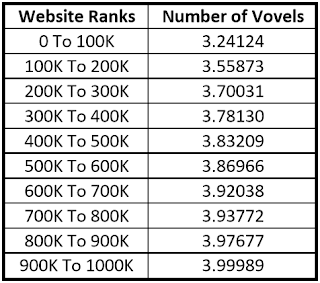
while both extremes are not good, Let us find what do the top million websites do. As is evident from the graph below, all websites have an average of 3-4 vowels in their names.
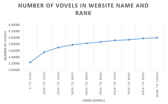


The top 100k even have an average of 3.2. This average further moves towards 4 letters when we move towards the higher end of the million.


Conclusions

Though higher number of vowels in website names aren't good, the lower number of vowels also pose a certain risk to the website image.

As per the analysis, codemakit recommends 3-4 vowels in your website name.

Related Reading,

Check out Part 1 of the series, Website Name Trends in the Top Million Websites
Check out Part 2 of the series, Length of the Top Million Website Names

This was about,

Feb 18, 2016

Character Length of the Top Million Website Names

Length of the Top Million Website Names
How do you choose your website name? Is there a thumb-rule? How do you ensure that your website is among the top million websites around the world?


So, apart from the exceptional content, intelligent digital marketing and beautiful design, you now have another parameter to worry about. It is worth mentioning that I haven't even started with the number of internal and external links required or the SEO strategy or even google analytics.

Adding another parameter like, website name ofcourse puts any professional on a backfoot as the name of the website in a URL seldom changes and for 99% of the cases is fixed. So.. No Pressure.

The Premise

But what you CAN change is the website URL name for any future projects that you work upon. What is really interesting is the near mathematical graph followed in our analysis in this post. 

As discussed in the first part of this series on the word length of top million website names, the averge word length of a website is 7 words. Also the average number of vovels in the URL name of top million websites in the world is just 3.

The Experiment

We would try and segregate the data into ranges to get a better idea of trends and create thumbrules out of it.

For the sake of discussion, we'll divide the complete data into chunks of 100,000 each. Top 100,000 websites among the million will be displayed as "0 to 100,000".

Length of the Top Million Website Names Graph

As depicted in the graph, the total length of most websites in the top 100,000 websites is 8.85.
What seems interesting is that as you move towards the lower ranked websites, the average length of the website name increases.

Length of the Top Million Website Names Table

In the range 100,000-200,000 the average touched 9 letters and in the range 200,000-300,000 the average touched 10 letters. The trend follows an increasing parabolic path and it seems from first look that increasing the length of your website name might put you at a disadvantage.

Conclusions

Lesser number of letters in a website denotes efficiency. It also lessens the reader's burden of remembering the word or the name itself.

Hence one must strive towards lesser number of words.

Related Reading,

Check out Part 1 of the series, Website Name Trends in the Top Million Websites
Check out Part 3 of the series, Vowel Length of the Top Million Website Names


This was about,
Length of the Top Million Website Names MohitChar

Jan 31, 2016

Website Name Trends in the Top Million Websites

Vowels in the top million websites
1 Billion Websites! That is the number of indexed websites that exist on the internet, as per the estimations of dazeinfo and Dailymail.

New websites are constantly being added. What is surprising is that the top million often remains unchanged.

Alexa provides data for the top 1 million best performing websites of the world. But, is there something other than amazing content, Beautiful fonts or super intelligent color combinations that pull users towards websites or is it something entirely unrelated? What about the size of the website name.

It is a common knowledge that users often dread typing in long lines of text in the address bar. Many would argue, that with the advent of "Search from the bar" type of browsers, users need not type-in the complete url anymore. However, a longer website name might strain the memory.

What is the perfect domain name?
The Garage at godady.com shared a few tips for fishing the perfect domain name. According to them, the first and the foremost condition one must remember is that a domain name must be really easy to type. You should also keep it simple, utilise keywords and avoid numbers.

The top million out of a billion is 0.1%. So, let’s find out what does the data say about the top 0.1% of all websites in the world.

Word Length

For any URL of the format, ., the website name is most important, as it defines the website, makes it visible and gives it an identity. Lets find out what our analysis says about website name.

Word Length of website and frequency

Firstly, It was found that the frequency of website followed a typical Gaussian curve while attaining the peak at around 7-8 letters. About 100,000 websites within the top million had a word length of 7-8 letters. It is also imperative to note that though we've reached the peak at 7-8 letters, there still exist websites that have lengths of more than 20 letters!

Vowel Length

Now, can you think of 20 letter English word? I tried and could find the word ABSTEMIOUSNESSES, (a 16 letter word). What is really, interesting is that, a website with a name longer than most can imagine still features among the top million in the world.

Total number of Vowels and Website Frequency

Another interesting observation is that the number of vowels in websites too followed a Gaussian curve. The most common number of vowels in a website name is 3. In the million websites, 10% of them had a single vowel. It is also worth mentioning that 36,000 websites do not even have a vowel.

Of course, there are websites with more than 10 vowels in them, but nothing can be said without comparing the total length of such names. So, to understand the data better, we divide the number of vowels with the total number of letters in the word. 

Vowels as a percentage of Word length

Since, analysis of such huge data set is difficult, we would divide the complete vowel data into bands of 0.2 or 20% each.

Vowels as a percentage of Word length Example

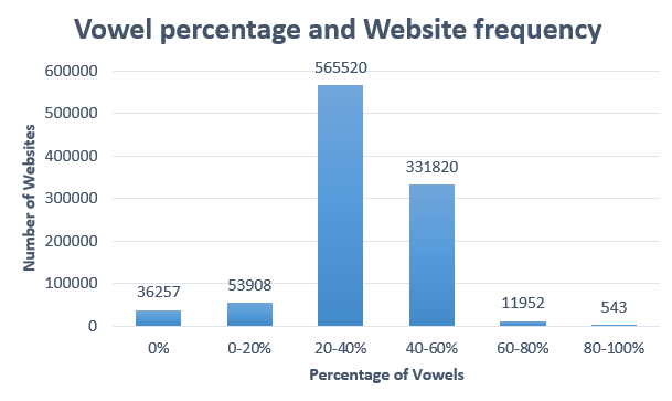
One look at Vowel percentage and website frequency data would tell us that for most websites, 40 percent of the word length is a vowel and 60% is a consonant.

Vowel percentage and website frequency


Moving towards the exceptions, more than 500 websites in our data-set contains 80-100 percent vowels. Also, as mentioned above, 36,000 websites do not have any vowels at all, i.e. 3.6%. Finally, around 90% of websites lie in the band of 0.2 to 0.6.

In Conclusion,

After analyzing the top million websites we find that,
  1. Most websites have a word length of 8 words
  2. Most websites have a vowel length of 3 words
  3. Most websites have 20-40% of their name as vowel
Finally, You can still have an amazing website even when your website name does not have a vowel or is filled with vowels.

Related Reading,

Check out Part 2 of the series, Length of the Top Million Website Names
Check out Part 3 of the series, Vowel Length of the Top Million Website Names

This was all about,
Vowels in the top million websites mohitchar

Nov 11, 2015

An experiment on user response to Colors

An experiment on user response to Colors
This is an ongoing study on the change in perception of users to colors. An excellent infographic from kissmetrics and webscout implored for a change in color combinations on webpages to elicit certain responses from the viewers. 

To exemplify, red denotes energy and passion, however, yellow displays enthusiasm. So one can use such colors based on the visitor demographics you receive. For websites catering to passionate readers, red or black could be the ideal color choice. You could utilize such colors on areas that require action such as "Buy Now" buttons or "Subscribe Now" Buttons. 

On the other hand, if you cater to a more refined and mature audience, the usage of extreme colors might actually hamper changes of conversion. E-commerce websites have been using such methods from time immemorial in the hopes of luring impulsive buyers.

Banner BeforeBanner After

However, such a technique was attempted on codemakit.com itself when the banner color was changed. The banner color was initially an 8 bit variation of black itself. To include the above mentioned strategy, the banner color was changed to varients of red and blue.

The modification in the color of the main banner was made on 18th of August 2015. Data analysed were for a month before the modification and a month after. Hence the data corresponds to number of sessions and the bounce rates for 60 days.

Relation between Variables before and after Change


As can be seen, there was mild increase in the number of sessions per day and a slight decrease in the bounce rate. 

Though the change corresponded to a positive effect, It is not substantial and more changes are required,

Further Reading.

You can read more about colors and how they affect websites from our previous articles.

Interested about colors? Find how change in font colors can affect your reader mood?

This was,
An experiment on user response to Colors MohitChar

Apr 27, 2015

Relation Between Page Views and Syllables, A Comparison

Page Views and Syllables, A Comparison
How do syllables lead to difference in page views? Does the number of syllables in a passage actually make the reader's job difficult or easy? 

There aren't enough things that can be modified by a writer. But the short list would include definitely include syllables.

Syllable in the simplest of form can be called as a unit of tone itself. When you pronounce 'SOBER' you actually combine two different syllables, 'SO' and 'BER'. 

How does it matter you ask?

Many people when reading often voice the text, which means they do not simply ingest the text through their eyes, but also pronounce the words in their mind. Hence, the words employing large number of text might pose a problem.
This might seem true logically, but there is another reasonining that might put you in a difficult position. Lower number of syllables might lead to a rough and dull passage, giving rise to lower readership.

So what should you do, let us find out through an experiment.

The Experiment,

28 separate articles, published on codemakit.com at different times in 2014 were tested using a simple readability scanner. The text in each article was scanned to find out the average number of syllables per unit word.

We'll now discuss the role, syllables play in gathering page views, which would be found out by checking if increasing the number of syllables per unit word leads to higher or lower page views.


Relation between Syllables per word and page views

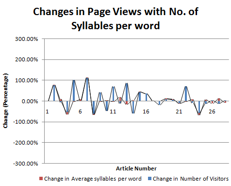
The provides a very different picture altogether about how the changes in syllables can lead to differences in the page views (pageviews)

Relation between Syllables per word and page views Graph

TO understand it further, we need to compare it quantitatively.

Changes in page Views with No. of Syllables per word


Total number of articles compared = 28

Number of articles were number of syllables per word were proportional to page views = 11
Percentage of instances where number of sentences were proportional to page views = 11/28 = 40%
So, percentage of instances where Average number of syllables per word were proportional to page views = 17/28 = 60%

Thus the average number of syllables per word can be directly proportional to the page views. However, this must be seen in moderation and cannot be taken as a rule of thumb.

Conclusion,

Number of Syllables per unit word is directly proportional Page views.

Related Reading

To find more about the above topic, you can check out The Relation between Reading ease and Viewership through an experiment on Reading ease.
Do you want to know, how to calculate the readability of a passage?

You can also find simple relations like,
The relation between Page Views and Sentence Length,

This was about,
Page Views and Syllables, A Comparison MohitChar

Apr 20, 2015

Relation Between Page Views and Sentence Length, A Comparison

Page Views and Sentence Length, A Comparison
Can you read really long sentences? Can you digest a sentence containing 50 words? We have seen in a previous article that higher complexity leads to lower number of visitors. 


What happens when you use long sentences in a webpage? What is the optimum number of words a sentence must contain to ensure maximum user retention and interaction? Let us start with an example.


Sample A

Here is a really long sentence,

"The amount of visitors on a webpage is actually dependent on a number of factors which include the web owner's search engine optimization practices, his writing quality and his repo with the swarming visitors at his personal blog"

Let us analyze Sample A.
Sample A is a single sentence containing 38 words. A normal sentence that can be easily understood by a reader can range from 10-20 words. Usually a sentence with a large number of words and phrases taxes and stretches a reader's brain.
More often than not, a sentence with large number of words is avoided by readers. Also such sentences are absolutely abhorred by readers looking for a light reading.
The sample was excruciatingly long and might have prevented many of my readers to go and read sample B which further increased this page's bounce rates ##;


Sample B

Here is the short version of the above text,

"Number of visitors is proportional to SEO, content and visitor interactions"

Let us analyze Sample B.
Sample B contains 11 words which is easily digestible. The reader can easily deduce that page views depend on the 3 factors only. People looking for a light reading will not be disappointed by the text and might even look forward to reading more.

The Experiment,

Moving back to the experiment, 28 articles, published on codemakit.com in 2014 were tested using a readability scanner. This article would talk about the role, the number of sentences play in gathering page views.
We would check if increasing the number of sentences or number of words would lead to higher or lower page views.

Relation Between number of sentences or words and page views

The number of sentences and page views can be compared using the graph above. As is evident, sans a few irregularities, the numbers of sentences do correlate with the number of page views. TO delve into it further, it is required to understand the problem, quantitatively,

Relation Between number of sentences and page views Graph


Total number of articles compared = 28

Number of articles were number of sentences were proportional to page views = 15
Percentage of instances where number of sentences were proportional to page views = 15/28 = 53%

Relation Between number of words and page views

Changes in Page Views with Number of Words

Number of articles were number of words were proportional to page views = 13
Percentage of instances where number of words were directly proportional to page views = 13/28 = 39%
So, percentage of instances where number of words were inversely proportional to page views = 13/28 = 61%

Thus it can be clearly deduced from both sentences that the number of sentences/ words has nothing to do with respect to pages views and that a really long sentence is equally probable to receive thundering applause as a really short one.

So lowering the number of sentences / Words at your blog can be disastrous as Google's panda updates view them seriously and often impose large penalties on WebPages publishing pages after pages with a really small amount of content.

But simply considering the number of sentences as the defining parameter in a text can be disastrous.
Consider the case of a webpage which contains sentences of the length of Sample A. Evaluating such long sentences would ensure huge number of words but would undermine the fact that the number of sentences have reduced drastically. Hence we need another type of parameter that assesses both the number of words and the number of sentences.

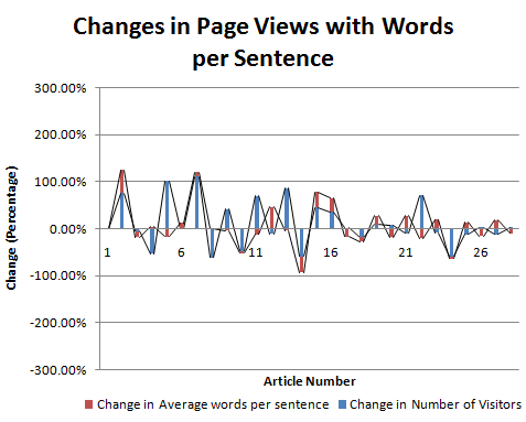
Relation between average number of words per sentence and page views

Graph Relation between average number of words per sentence and page views

Changes in pageviews with words per sentence

Hence comparing the average number of words per sentence page views was required. Average number of words per sentence is actually equal to the ratio of number of words and number of sentences. It tells about the number of words per unit sentence.

Formula image Relation between average number of words per sentence and page views

Number of articles were number of sentences were proportional to page views = 15
Percentage of instances where number of sentences were proportional to page views = 11/28 = 61%

Thus the average number of words per unit sentence can be effectively said to be directly proportional to the page views. However, this must be seen in moderation and cannot be taken as a rule of thumb.

Conclusion,

Page Views are directly proportional to the number of words.
Page views are also directly proportional to the number of words per unit sentences.

Related Reading

Learn how to calculate the readability of your blog or website pages, you could also mechanically grade your essays too!

This was about,

Mar 23, 2015

An Experiment on the Ease of Reading Text

An Experiment on the Ease of Reading Text Front
Though it is true that the real information about the quality of text can be collected by reading it, there exist better empirical ways to do that for you. To judge the text in accordance with such empirical methods require some raw data. 

For instance, the average number of words per unit sentence, the percentage of complex words in the text, and the average number of syllables per word.

To understand this even further, you would need to know what a syllable is. A syllable is basically a unit of sound in a word. Let us take an example; If you say the word 'maker', you are combining two syllables, 'ma' and 'ker'.
Now, the texts for this experiment were taken from various sources in different period of times.

The Study Participants

First we have Harold Pinter, Nobel Prize in Literature in 2005. The text was taken from his Noble Prize acceptance speech.
Second we have, Alison Munro, another noble laureate in the field of literature, who received the prize in 2013. Her style of writing is short stories and the text was taken from 'Passion' one of her popular short stories.
Third we have Amartya Sen, the Indian economist who received the Sveriges Riksbank Prize in Economic Sciences in 1998. The text was taken from his book, 'The Idea of Justice'.
Lastly, we have Oliver E Williamson, who received the Sveriges Riksbank Prize In Economic Sciences in 2009. He wrote a book on Transaction-Cost Economics: The Governance of Contractual Relation, from which the text was taken.

The Study

Now that we have introduced the participants of the study, we need to understand the reason for their selection. For both literature and economic laureates the idea was to include two types of passage with the amount of time varying as between 10 to 15 years. Also, the participants were to belong to different countries. This idea however proved inefficient as the noble laureates in Literature from different countries than US and England tend to write in languages different than English. Hence finding a laureate with major works in English was exceptionally difficult.

Analysis of the Results

It is true, not all text excerpts were of the same size, which is partly because of the difference in media and mode of text found. Speeches in particular need to be taken as a whole instead of small excerpts (Full chapter) from a book. Similarly, short stories should also be considered as a whole instead of a part.


Name of The nobel Laureate(Award Details) Harold Pinter (Nobel Prize in Literature 2005) Alison Munro(Nobel Prize in Literature 2013) Amartya Sen (The SverigesRiksbank Prize in Economic Sciences in Memory of Alfred Nobel 1998) Oliver E. Williamson (TheSveriges Riksbank Prize In Economic Sciences In Memory Of Alfred Nobel 2009)
Source of Text Nobel Lecture (Speech) December 7, 2005 Passion (Short Story), fromMarch 22, 2004 Issue of New Yorker The Idea of Justice (Book), The Belknap Press of Harvard University Press Cambridge, Massachusetts. Transaction-Cost Economics:The Governance Of Contractual Relation (Book), Oliver E. Williamson University Of Pennsylvania
Number of sentences 367 956 20 24
Number of words 4698 11460 636 527
Number of complex words 650 640 122 159
Percentage of complex words 13.84% 5.58% 19.18% 30.17%
Average words per sentence 12.8 11.99 31.8 21.96
Average syllables per word 1.53 1.3 1.64 1.94
Minimum age required to understand the text 13-14 Years 11-12 Years 21-22 Year 22-23 Years

As is evident, the percentage of complex words (methodology of counting which is still unknown) is considerably higher in the case of economists in comparison to the literature laureates. Similarly the average number of words per sentence too is about 3 times the ones used by laureates in literature.
Though the average syllables per word tends to increase as you use higher/ complex words, the average syllables per word for all four of our participants were comparable.

Hence According to the tests through read-able.com, the minimum age of any reader trying to read one of their typical texts range from 11 to 14 years for literature laureates. Hmm, their writings do not seem so tough to understand now. Also, the writings of economics laureates tend to fall within the range of 21 to 23 years.

Based on the raw data found in the previous table, one can determine these important indices to examine the text sample.

Advanced Tests

As per the results of Flesch Kincaid Reading Ease test, where a higher score means that the text is easier to read, you can see that due to the number of complex words, the score for economics Nobel laureates are considerably lower than their literature counterparts.

According to SMOG Index, Alison Munro's piece on passion depicted the use of simple words, thereby leading to better understanding of the text. The same can be correlated with the Coleman Liau Index with the highest for Oliver E. Williamson.

Parameter Nobel Laureates
Name Name of The nobel Laureate (Award Details) Harold Pinter (Nobel Prize in Literature 2005) Alison Munro (Nobel Prize in Literature 2013) Amartya Sen (The Sveriges Riksbank Prize in Economic Sciences in Memory of Alfred Nobel 1998) Oliver E. Williamson (The Sveriges Riksbank Prize In Economic Sciences In Memory Of Alfred Nobel 2009)
Source of Text Type of Text, Date/ source Nobel Lecture (Speech) December 7, 2005 Passion (Short Story), from March 22, 2004 Issue of New Yorker The Idea of Justice (Book), The Belknap Press of Harvard University Press Cambridge, Massachusetts. Transaction-Cost Economics: The Governance Of Contractual Relation (Book), Oliver E. Williamson University Of Pennsylvania
Flesch Kincaid Reading Ease (A high score means the text is easier to read) 64.4 84.6 35.4 20.2
SMOG Index Greater the Score, tougher the text 7.8 5 14.2 14.8
Coleman Liau Index Shows the Grade of student required 10.8 8.1 13.4 17.8

Related Reading

You can check out our article on the relationship between reading ease and viewership here.

This was,
MohitChar An Experiment on the Ease of Reading Text

Mar 10, 2015

The Relation between Reading ease and Viewership

Ever wondered, how your writing style affects the number of visitors at your blog? 

We often wonder what do people mean when they say, quality trumps quantity. Or when people say, "You need to focus on your content to leverage your SEO practices".

Who knows what type of content qualifies as quality content? So we at codemakit, performed an experiment to find out "How does page views relate to the readability of a text?". 

The Premise

A complete set of all articles published at codemakit.com was collected for the year 2014. Every article written in 2014 was passed through a readability scanner and values for the above mentioned parameters were found. The page-view data for each article was obtained from blogger's stats page. Finally each article was compared on the basis of the specific parameter and the number of page views garnered by the article during that period.

It might be possible that some articles discussed in the experiment were too recent to be able to check for absolute page views i.e. the recent articles might have lesser page views and still be attracting visitors while the older articles might have a large number of page views and have stopped gather more due to lack of updation. However through subsequent tests, it was found that a normal article stops gathering substantial page views after a period of a month. Any page views after a month of publication is quite small and can be neglected in the study.

The Results

The readability of any text can be determined very easily. You just need to consider some parameters and find the relation between them and the number of page views received by your blog.
Further articles will delve into different relations between the following parameters,

Changes in Page-views with number of words
Changes in Page-views with number of sentences in an article
Changes in Page-views with number of syllables per word in a passage
Changes in Page-views with average number of words per sentence
Changes in Page-views with the number of Complex Words in a text
Changes in page views with percentage of complex words in an article

Such simple and elementary comparisons between the parameters will help us understand what type of writing does a normal user and a normal search engine like.

Related Reading,

Just like the articles above, we have an answer to another question, Do pages with questions as title receive more clicks? You can check out the simple version of article on titles as questions too.

We also have similar article sets which talk about higher blog visitors with a focus on everything by content.

If you're unsure about what content would suit your blog, you can check a dumbed-down version of everything that Google considers superior.

This was,

Feb 9, 2015

What happened when I increased Font Sizes

What happens when I increased Font Sizes Front
Website font sizes are an important factor in determining if a visitor leaves your website happy or sad. The current study will help you figure out what effect increasing your website's font size will have on the overall quality and quantity of visitors.

One of the most popular articles on codemakit was based on a study which answered a simple question. One which has been asked by numerous webmasters, designers and bloggers worldwide. The question was "What is the best font size?" it could be rephrased as "Which font size would lead to highest user interaction?" or "Which of these should I choose, 12px, 14px, or 16px?"

During the research, I came across several opinions. Some wanted to "Follow your heart!" (I don't know how their websites are read), Some said "The size depends on the type of website" (Which is why I conducted the study). You can still check out the complete study on Type of Fonts, Size of Fonts and Color of Fonts. But, after the study, the result were condensed into simple 4 letters ; 14px.

The preface

Based on the previous study, codemakit changed the default font size from its 12px to 14px. Then the blog was observed for 30 days during which several parameters were monitored closely. The following parameters were studied.

  • Number of Visitors (Page views)
  • Bounce Rates (%)
  • Pages per Session
  • Percentage New Sessions


The Results

The following data was observed from the blog after the change in text size was made.
After the change in font size was made, Several parameters were observed for a period of 17 days.

Changes in Page Views

Regarding the changes in page views. It is abundantly clear that the number of page views increased after the changes were made. A rough estimation points out that the increase in page views were upwards of 35 percentage. Though the direct increase in the number of page views is often attributed to marketing strategies and Search Engine Optimization, the sudden increase in the number of page views can be indirectly caused by an increase in returning visitors and the increase in the number of pages viewed in one session. Those parameter shall be discussed separately later.

The following Graph depicts the changes in the number of page views in the 43 day period. Kindly keep in mind that the changes in the font size were completed on 25th December 2014. The repercussions from it are depicted in the later part of the graph.

Changes in Page Views


Bounce Rate

It was found that the overall bounce rate of the blog decreased. Though bounce rates are never a perfect indicator of a blog's health, they are still a good indicator of what your visitors do when they enter your website. A lower bounce rate would inevitably be better than a higher one. A question arises, Is it possible that the bounce rate was decreasing from before the time the changes were made? 

Though it is possible for a growing and improving blog, one can still find out if the change in the bounce rate was premeditated by the change in font size. Hence we take two different data sets, One from the bounce rates of the blog before changes were made and another, bounce rates at the blog after the changes were made.

Bounce Rate


With the help of excel trend-line function, trend lines were created for both the data sets. It was found that the bounce rate decreased from 87.7% to 86.4%, i.e. a 1.5% decrease. However one look at the data after changes were made would show that the bounce rate decreased from 89.5% to 77.1% i.e. 14% decrease. This proves that increasing the font size decreases bounce rate at a much higher rate than better content quality management practices.

Percentage New Sessions

Percentage New sessions are the total percentage of sessions opened with new users. decreasing this number from 100 would give you the percentage of users which came to the website for more than one time. A higher percentage new sessions might mean that most of your readers are first timers. A lower percentage new sessions would indicate the presence of loyal returning visitors who come back to the blog because of sheer content quality or better marketing practices.

Percentage New Sessions


Percentage new Sessions in the experiment decreased from 90% to 88%. Though the decrease is a meager 2.2 percent, this might indicate an increase in returning visitors as a result of the changes made. Further analysis from data sets created before the experiment and after the experiment said that the % new sessions increased before and after the changes. But the changes led to an initial lowering of the values. In short, the effects of the changes made could not be analysed properly and can be termed inconclusive.

Pages per Session

The pages per session is the number of webpages opened by the user during his visit. The only anomaly observed in the experiment was that the pages per session actually decreased during time. Though the decrease was a meager 0.1 which is a decrease of 6%, a value much higher to be discarded. No logical reason explains this phenomena.

Pages per Session


It is thought that more data for Percentage New Sessions and Pages per Session are required before venturing into an in-depth analysis of the reasoning of the phenomena.

Related Reading

You might want to understand why we chose 14px from our quest to determine the best website Font Sizes.

Are you aware of the best practices for Website Fonts, read this and you will be.

If you have doubts about some of the terms used here, you can check out this bounce rate article on how bounce rates are calculated or this one on how a blog dies.

We also did a similar article where a parameter in the blog was changed and its data was analysed. It actually doubled the number of page views.

This answered,
What happens when I increased Font Sizes MohitChar

Jan 19, 2015

How will my Blog Die? (New and Returning Visitors)

How will my Blog Die? (New and Returning Visitors) Front
There are two types of visitors on a blog, an impressed one which has returned to the website and an unimpressed one which has arrived for for the first time.

Note. If you think you've missed the previous part, check out the 'When will my blog die?' study from the start.

Several parameters define the quality of visitors on a website, percentage new sessions and percentage returning sessions are some of them. Percentage New Session and Percentage returning sessions are basically two interdependent parameters which depict the percentage of new users entering the website and the percentage of returning users entering the website respectively.

The Results

For example, if the percentage of New session is 80%, then the percentage of returning sessions would amount to 20%. This means 80% of the users on your website would be new users who have not visited the website before. 20%  would be the ones that have visited your website before and have come for more. 

Change in new and returning Visitors with time

There is one fundamental difference between sessions and users. A session is the time, a user spends on the website before closing the window or leaving it.

Correlation Between Average Session time and Percentage Returning Sessions.

It is interesting to correlate the average session time and percentage returning sessions. As seen in the graph given below, it becomes very clear that the average session time varied quite proportionally to the percentage returning sessions. This is logical as the returning number of visitors are expected to spend more time on the website. Which is because, new visitors often spend lesser time if they do not agree with the overall layout, design (Font Size, Font Type and Font color) or the writing style of the author. Returning visitors do agree with them and hence are expected to stay.

graph Correlation Between Average Session Time and Percentage Returning Sessions

Correlation of Bounce Rate and Percentage New Sessions

One thing that can be correlated effectively with Percentage of new sessions is bounce rate. It was interesting to find out the correlation between bounce rates and percentage new sessions. 
It is however very interesting to note that the Bounce Rate actually follows the percentage new Sessions values until day 35. After 5th Week, it looks as if the relation between Bounce rates and Percentage new Sessions is inverted. Higher the Percentage of new Sessions lower is the bounce rate, which also means lower the percentage of  returning visitors lower is the bounce rates. Since the study was stopped after day 44, It is not clear, how long will the trend continue.

Correlation between Bounce Rates and percentage new Sessions

Correlation between Effective Bounce Rate and the difference of Bounce Rate and percentage new Session

Since any definite trend cannot be found out from the particular graph, It was decided to go further with the graph between Bounce Rate (B) and The percentage new sessions (PN). Instead a graph was plotted between Bounce Rate (B) and the difference between Bounce Rate and Percentage of new sessions (B-PN). The following is the graph between (B) and (B-PN).

Correlation between Effective Bounce Rate and the difference of Bounce Rate and percentage new Session

Though generalizations cannot be accurately made from the data, It is found that more positive difference between Bounce Rate (B) and the Percentage of New Sessions (PN) would mean Lesser Bounce Rate.

The Complete Study

The Complete 5 Part Study can be accessed from here as it is published,

[Published on 8th Dec 2014]

[Published on 15th Dec 2014]

[Published on 22th Dec 2014]

[Published on 29th Dec 2014]

[Published on 5th Jan 2015]

This answered,
How will my Blog Die? (New and Returning Visitors) MohitChar