Showing posts with label Website Enhancement. Show all posts

Feb 18, 2016

Character Length of the Top Million Website Names

Length of the Top Million Website Names
How do you choose your website name? Is there a thumb-rule? How do you ensure that your website is among the top million websites around the world?


So, apart from the exceptional content, intelligent digital marketing and beautiful design, you now have another parameter to worry about. It is worth mentioning that I haven't even started with the number of internal and external links required or the SEO strategy or even google analytics.

Adding another parameter like, website name ofcourse puts any professional on a backfoot as the name of the website in a URL seldom changes and for 99% of the cases is fixed. So.. No Pressure.

The Premise

But what you CAN change is the website URL name for any future projects that you work upon. What is really interesting is the near mathematical graph followed in our analysis in this post. 

As discussed in the first part of this series on the word length of top million website names, the averge word length of a website is 7 words. Also the average number of vovels in the URL name of top million websites in the world is just 3.

The Experiment

We would try and segregate the data into ranges to get a better idea of trends and create thumbrules out of it.

For the sake of discussion, we'll divide the complete data into chunks of 100,000 each. Top 100,000 websites among the million will be displayed as "0 to 100,000".

Length of the Top Million Website Names Graph

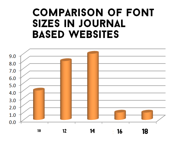
As depicted in the graph, the total length of most websites in the top 100,000 websites is 8.85.
What seems interesting is that as you move towards the lower ranked websites, the average length of the website name increases.

Length of the Top Million Website Names Table

In the range 100,000-200,000 the average touched 9 letters and in the range 200,000-300,000 the average touched 10 letters. The trend follows an increasing parabolic path and it seems from first look that increasing the length of your website name might put you at a disadvantage.

Conclusions

Lesser number of letters in a website denotes efficiency. It also lessens the reader's burden of remembering the word or the name itself.

Hence one must strive towards lesser number of words.

Related Reading,

Check out Part 1 of the series, Website Name Trends in the Top Million Websites
Check out Part 3 of the series, Vowel Length of the Top Million Website Names


This was about,
Length of the Top Million Website Names MohitChar

Apr 27, 2015

Relation Between Page Views and Syllables, A Comparison

Page Views and Syllables, A Comparison
How do syllables lead to difference in page views? Does the number of syllables in a passage actually make the reader's job difficult or easy? 

There aren't enough things that can be modified by a writer. But the short list would include definitely include syllables.

Syllable in the simplest of form can be called as a unit of tone itself. When you pronounce 'SOBER' you actually combine two different syllables, 'SO' and 'BER'. 

How does it matter you ask?

Many people when reading often voice the text, which means they do not simply ingest the text through their eyes, but also pronounce the words in their mind. Hence, the words employing large number of text might pose a problem.
This might seem true logically, but there is another reasonining that might put you in a difficult position. Lower number of syllables might lead to a rough and dull passage, giving rise to lower readership.

So what should you do, let us find out through an experiment.

The Experiment,

28 separate articles, published on codemakit.com at different times in 2014 were tested using a simple readability scanner. The text in each article was scanned to find out the average number of syllables per unit word.

We'll now discuss the role, syllables play in gathering page views, which would be found out by checking if increasing the number of syllables per unit word leads to higher or lower page views.


Relation between Syllables per word and page views

The provides a very different picture altogether about how the changes in syllables can lead to differences in the page views (pageviews)

Relation between Syllables per word and page views Graph

TO understand it further, we need to compare it quantitatively.

Changes in page Views with No. of Syllables per word


Total number of articles compared = 28

Number of articles were number of syllables per word were proportional to page views = 11
Percentage of instances where number of sentences were proportional to page views = 11/28 = 40%
So, percentage of instances where Average number of syllables per word were proportional to page views = 17/28 = 60%

Thus the average number of syllables per word can be directly proportional to the page views. However, this must be seen in moderation and cannot be taken as a rule of thumb.

Conclusion,

Number of Syllables per unit word is directly proportional Page views.

Related Reading

To find more about the above topic, you can check out The Relation between Reading ease and Viewership through an experiment on Reading ease.
Do you want to know, how to calculate the readability of a passage?

You can also find simple relations like,
The relation between Page Views and Sentence Length,

This was about,
Page Views and Syllables, A Comparison MohitChar

Apr 20, 2015

Relation Between Page Views and Sentence Length, A Comparison

Page Views and Sentence Length, A Comparison
Can you read really long sentences? Can you digest a sentence containing 50 words? We have seen in a previous article that higher complexity leads to lower number of visitors. 


What happens when you use long sentences in a webpage? What is the optimum number of words a sentence must contain to ensure maximum user retention and interaction? Let us start with an example.


Sample A

Here is a really long sentence,

"The amount of visitors on a webpage is actually dependent on a number of factors which include the web owner's search engine optimization practices, his writing quality and his repo with the swarming visitors at his personal blog"

Let us analyze Sample A.
Sample A is a single sentence containing 38 words. A normal sentence that can be easily understood by a reader can range from 10-20 words. Usually a sentence with a large number of words and phrases taxes and stretches a reader's brain.
More often than not, a sentence with large number of words is avoided by readers. Also such sentences are absolutely abhorred by readers looking for a light reading.
The sample was excruciatingly long and might have prevented many of my readers to go and read sample B which further increased this page's bounce rates ##;


Sample B

Here is the short version of the above text,

"Number of visitors is proportional to SEO, content and visitor interactions"

Let us analyze Sample B.
Sample B contains 11 words which is easily digestible. The reader can easily deduce that page views depend on the 3 factors only. People looking for a light reading will not be disappointed by the text and might even look forward to reading more.

The Experiment,

Moving back to the experiment, 28 articles, published on codemakit.com in 2014 were tested using a readability scanner. This article would talk about the role, the number of sentences play in gathering page views.
We would check if increasing the number of sentences or number of words would lead to higher or lower page views.

Relation Between number of sentences or words and page views

The number of sentences and page views can be compared using the graph above. As is evident, sans a few irregularities, the numbers of sentences do correlate with the number of page views. TO delve into it further, it is required to understand the problem, quantitatively,

Relation Between number of sentences and page views Graph


Total number of articles compared = 28

Number of articles were number of sentences were proportional to page views = 15
Percentage of instances where number of sentences were proportional to page views = 15/28 = 53%

Relation Between number of words and page views

Changes in Page Views with Number of Words

Number of articles were number of words were proportional to page views = 13
Percentage of instances where number of words were directly proportional to page views = 13/28 = 39%
So, percentage of instances where number of words were inversely proportional to page views = 13/28 = 61%

Thus it can be clearly deduced from both sentences that the number of sentences/ words has nothing to do with respect to pages views and that a really long sentence is equally probable to receive thundering applause as a really short one.

So lowering the number of sentences / Words at your blog can be disastrous as Google's panda updates view them seriously and often impose large penalties on WebPages publishing pages after pages with a really small amount of content.

But simply considering the number of sentences as the defining parameter in a text can be disastrous.
Consider the case of a webpage which contains sentences of the length of Sample A. Evaluating such long sentences would ensure huge number of words but would undermine the fact that the number of sentences have reduced drastically. Hence we need another type of parameter that assesses both the number of words and the number of sentences.

Relation between average number of words per sentence and page views

Graph Relation between average number of words per sentence and page views

Changes in pageviews with words per sentence

Hence comparing the average number of words per sentence page views was required. Average number of words per sentence is actually equal to the ratio of number of words and number of sentences. It tells about the number of words per unit sentence.

Formula image Relation between average number of words per sentence and page views

Number of articles were number of sentences were proportional to page views = 15
Percentage of instances where number of sentences were proportional to page views = 11/28 = 61%

Thus the average number of words per unit sentence can be effectively said to be directly proportional to the page views. However, this must be seen in moderation and cannot be taken as a rule of thumb.

Conclusion,

Page Views are directly proportional to the number of words.
Page views are also directly proportional to the number of words per unit sentences.

Related Reading

Learn how to calculate the readability of your blog or website pages, you could also mechanically grade your essays too!

This was about,

Apr 6, 2015

How to calculate the readability of a passage


The engine at read-able.com performs its function flawlessly when you add some text to be analyzed. 


The following text is from an article on "4 crucial facts Google Analytics can tell about your readers". And the following are the results after assessing the piece of text.

As can be seen from the table itself, several parameters are calculated on the text. An explanation with the formula for each parameter can be found below.


Simple Textual Properties of the passage


Text Statistics Value
No. of sentences 7
No. of words 163
No. of complex words 16
Percent of complex words 9.82%
Average words per sentence 23.29
Average syllables per word 1.45

No. of sentences
Simply counting the number of full stops along with an algorithm

No. of words
Simply counting the number of spaces along with an algorithm

No. of complex words
I have no Idea, what can be construed as a complex word and what cannot. In my opinion, there must be a threshold number of characters in a word, exceeding which; the word can be construed as a complex word.

Percent of complex words
It can be calculated with the ratio of number of complex words to the number of total words.
The following is a valid formula for the same,
Percentage of Complex Words = ( ( number of complex words / Total Number of Words ) x 100 )

Average words per sentence
It can be calculated simply by dividing the number of words with the number of sentences
Average Words Per sentence = ( Number of Words / Number of sentences )

Average syllables per word
Syllable is a single unit of a word, separated in accordance with its sound. If you type 'Gutter" you have two syllables "Gut" and "ter". So the word "Gutter" will have two syllables.
A valid formula for the same can be

Scores found through empirical Formulas


Readability Indices Value
Flesch Kincaid Reading Ease 60.7
Flesch Kincaid Grade Level 10.6
Gunning Fog Score 13
SMOG Index 8.8
Coleman Liau Index 11.1
Automated Readability Index 11.7

Flesch–Kincaid Scores
Flesch–Kincaid readability test indicates the difficulty in understanding a text. They use word length and sentence length as parameters for their calculations.
The scale ranges from 0 to 100. Higher the score, easier is the text to read. If you receive a really low score, it means that the text is really complicated and hard to understand.
Flesch–Kincaid Score = 206.835 - 1.015 x (Words/sentences) - 84.6 x (Syllables/words)

Gunning Fog Score
Gunning Fog Index is simply the number of years of formal study; a typical US student would have undergone to understand the text written. So if you get a fog index of 11, it would mean that a typical US student of about 17 years would comprehend the subject completely.
The following is the formula for the same.
Fog Index = 0.4 x ( (Words/sentences) + 100 x (complex Words/Words) )

SMOG Grade
SMOG is a short form of Simple Measure of Gobbledygook. Just as Fog index measured the years of schooling required to interpret a piece of text for US based students, SMOG index can be applied anywhere.
The following is a formula for the same.
SMOG Index = 1.0430 x square root (30 x complex Words/sentences) + 3.1291

Coleman–Liau index
This index is also used to determine the difficulty of text. It uses only the number of letters per 100 words and the average number of sentences per 100 words.
The following is a formula for the same.
Coleman–Liau index = 0.0588(letters per 100 words) - 0.296(sentences per 100 words) - 15.8

Automated Readability Index
It takes in parameters as average characters per unit word and the average number of words per unit sentences.
Automated Readability Index = 4.71 (Characters/Words) + 0.5(Words/Sentences) - 2.43

Related Reading,

Here's a codemakit research article on the relation between readability and viewership.

This was about,

Mar 2, 2015

4 Crucial facts Google Analytics can tell about your readers

4 Crucial facts Google Analytics can tell about your readers
Here are 4 crucial cues about your readers that you can get by observing your Google Analytics data.


Just like in any project, knowing who you cater to helps you in increasing your work's quality.

Google Analytics help you bridge that gap by answering your most asked questions.


Why Google Analytics?

GA will help you understand where your website or blog visitors come from. Let us think how that information can be helpful to us. An example, you're standing in a garden at night and suddenly you're hit by a ball. You don't know where it came from. After 5-6 hits you have a faint idea where does it come from, at what height and at what speed. After 10 hits you'll be proficient at ducking them and even catching them.

I wonder where that came from

Who are they?

This is exactly how Google Analytics would help you understand visitors at your website. GA would help you find out the following points,

1. What age group do they belong to?
2. Their Gender
3. Their preferences
Using such information you can actually modify your website according to the readers/ visitors and enhance their experience.

For example, What if you write a blog about biking equipment and find out that most of your visitors are of the female gender with ages 15 to 30. Here you have an opportunity which can be capitalized. How? Let’s find out. 

Using the information you received you can write a blog about certain widgets used in bikes for females. You can experiment with your blog colors and use compatible fonts with best practices to please your intended readers. You could also loop-in a guest post from a prominent blogger who belongs in their age group and gender.

Google Analytics Dashboard


Where do they come from and what do they speak

Owning an international blog fills you with pride. What good is it, if you cannot cater to your international viewers properly? Not all visitors will be from your own country (though you’ll have to check if some countries have not blocked your website). They might even be from your neighboring countries or even from far off islands. 

Google analytics will help you determine which country's residents find your website most appealing. When you have that information, you can extrapolate to what language most residents in that country read (Remember there is a huge difference in most countries in the language they speak, write and read). If you find that many users come from countries whose primary language isn't English, you can try for a multilingual website. If that seems unreasonable, at least add a Google translate toolbar to help visitors read your content in the language they're most comfortable with.

Google Analytics Dashboard


How do they get here?

This is usually found out in the following ways.
Google analytics would tell you which browser the user was using when he/she visited your website. Using such information you can streamline your website to be run smoothly on the particular browser. 

If your website is read by a certain section of society which uses internet explorer, you can either modify the website in such a way that there are no lags or errors when they open your website in IE OR you could try answering the question why do users from Chrome or Firefox, not visit your website often. Is it because there is an inherent error which crops up when your website is viewed at those browsers or is it because the positions of elements get messed up and it looks like a grotesque pixie.

Google analytics would also tell you what device the users use when viewing your website. Certain users might use an iPad, certain might use PC and some mobile devices. It would be a good practice to check if your website works perfectly at these devices.

From where do they get here?

Another way Google analytics can help you is by finding out how did the visitors land at your website. Using GA would help you isolate (Or what I would like to say stalk) your visitor entry methods at your website. You would find out which website led them here. 

For example if you find that majority of viewers come to your website from your facebook page you would think if you could utilize that opportunity to optimize facebook advertising or adjusting your strategy there. You could also think why visitors come from facebook when you have a twitter handle too.

Though there are several Google products which can help your website like Google Adsense or Google Adwords, none of them come close to the quality of data provided by Google Analytics. Top 500 websites on the web are often found using similar tools to get more information about their viewers or find more ways to impress and retain them.

These were,
4 Crucial facts Google Analytics can tell about your readers MohitChar

Feb 16, 2015

An introduction to Content Marketing

Content Marketing or Internet Marketing is basically advertising whose main job is to direct traffic from one website to another. This might include direction of traffic from a blog to an eCommerce website or from a social network to a blog/ website. 

More often than not, advertisements lead to a series of events not envisioned even by the web owner.

A very simple example can be a situation where a user sees an advertisement on Facebook which he clicks on. This leads him to the particular blog. An advertisement about headphones pulls his focus and he clicks it which leads him towards amazon, where he buys a headphone.
There are three types of internet marketing,

Email Marketing,

You know the advertisements and the content you receive at your inbox. Often this invariably leads to maximum buying behavior. This may be related to the psychological behavior which goes like this. "If you see a coca cola advertisement in your living room you are more likely to buy a coca cola than when you see one at a banner outside. But this does not mean you should resort to phishing scams.

Web Marketing,

This includes e-commerce, website promotions, search engine advertising, affiliate marketing and search engine optimization practices. This also includes stuff like which font should you use for better visitor interaction or certain website best practices.

Social Media Marketing,

This involves marketing efforts from websites like Facebook, Twitter (though it is not better than facebook) etc. where you try to increase your social media efficiency. Marketing efforts at such websites are so popular mainly due to the unprecedented amount of visitor interactions present at them.

This was about,

Jan 12, 2015

Best Practices for Website Fonts

Best Practices for Website Fonts Front
Arial, Verdana, Georgia, Helvetica; which font is the best for websites? Which font sizes will guarantee that your website will prevail? Which font color is the best? We'll be trying to answer this question in a series of articles.

The articles shall try to answer each of the above questions as lucidly as possible. As a part of research, I came across the following interesting articles. A SixRevisions Article on user experience (Did I mention, The founder of sixrevisions gave an interview to codemakit.com, Read the interview with Jacob Gube!), the dude in that article did a split test on which font types and size would be the most effective in conversion. His results included that among 10px, 14px, 18px and 21px, users connected most with 14px fonts.

One of the best places to get a customized answer for your question is Google forum. There I asked the following question, "Which font leads to maximum User Interaction?", there I found some of the most ingenuous methodologies and concepts that many wouldn't even dream of. The solutions are incorporated into the articles.

However, every one of them stopped at one single point, as if everyone finally concludes with, ".. Any font of any size would do great, provided you choose them in accordance with your website type and content."

Though I agree font type and size must change with the type of website, (i.e. a funny comic blog can be embellished with comic sans or an official looking website to be adorned with Georgia/Arial etc), but still which font would do great for News website or a blog? There are plethoras of official looking fonts which give the feeling of authenticity to the text. But which one strikes a chord with the user? Hence this research.

Study methodology

The Study methodology is simple enough, you visit several popular websites based on either alexa rank or Pagerank or a 'list of' and check out three font parameters from the text. The parameters are Font Type (Which Font family it belongs to), Font Size (In Pixels) and Font Color (Hex Colors. Then the data is divided into 4 categories i.e. Blogs, News based Websites, Academic Journal Based Websites and Information Based websites.


Type

Website

Font Type

Font Size
Font Color (RGB)
Red Green Blue
blog 1stwebdesigner Helvetica 14 34 34 34
blog Treehugger.com Arial 11.5 0 0 0
blog Mashable.com Helvetica 11.5 85 85 85
blog Crooksandliars.com Arial 10 34 34 34
blog copyblogger.com Helvetica 13.5 51 51 51
blog thefword.org.uk Trebuchet MS 13 102 102 102
Information Wikipedia.org Arial 12.5 37 37 37
Information support.google.com Helvetica 11.5 68 68 68
Information Encyclopedia Britanica Arial 10 68 68 68
Journal Psycology today Arial 12.5 0 0 0
Journal Scientific America Geogia 14 0 0 0
Journal MIT Technology Review Helvetica 10.5 0 0 0
Journal ASCE Arial 8.5 88 89 91
News The Economist Arial 13.5 74 74 74
News NyTimes Geogia 14 51 51 51
News Forbes Geogia 16 0 0 0
News Wired Geogia 11.5 51 51 51
News The Hindu Geogia 11 59 58 57
News Reuters Geogia 11.5 0 0 0
News AlJazeera Arial 12.5 0 0 0
News Fox News Helvetica 12.5 34 34 34
News CNN Arial 10 0 0 0
News Wall Street Journal Arial 10 51 51 51

Here is a pdf codemakit document of some of the samples collected for the study.

The study is based on the assumption that, since the websites are one of the best in their field, the font parameters would also be the top as per industry standards. Though there are a few studies in which font size or color should you use? There is a general dearth of a good quality study that would lead by example instead of just pointing out the facts.

In Conclusion,

Finally, I would like to point out the following conclusions based on previous studies by codemakit.
Based on codemakit's study, "Which Font Size is the Best?", I would highly recommend a 14 px size for better readability and ease.

Based on codemakit's study, "Which Font Type is the Best?", I would advice for a Georgia for Blogs and Arial for News Journal based Websites. Also never use your custom font or a handwritten font in the body content part of your blog, use it in titles and stuff. This would ensure best fit.

Based on codemakit's study, "Which Font Color is the Best?", I would say, #222222 for Blogs and #333333 for any other website. If you find the hexadecimal values upsetting, you can visit the article for a better feel of the color.

This showed you,
Best Practices for Website Fonts MohitChar

Dec 12, 2014

Check your Website for Mobile Compatibility Part 2

Check your Website for Mobile Compatibility Part 2
A Website can be easily converted into a mobile Website. A blogger based blog, still easier. What after the conversion? How do you reckon that the website is now mobile friendly and none of any readers will have problems opening the website in their PDA.

A previous article by codemakit talked on compatibility of websites for its use in mobile devices. The article talked of GoMo which developed a tool known as GoMometer which analyses the websites and reports its findings. 

Forever alone guyA major disadvantage in GoMo is that you need a person to give the feed-back. In Short, you need to ask a person to visit your website and fill the GoMo form. When many of them view and report their satisfaction/dissatisfaction, you'll get a fair idea about the website in question. But what should you do when you do not have enough beta testers, or if you're alone, you’ll need something better and faster. 

Behold! Out from the ashes, emerge, "Google Webmasters Mobile Friendly Test"! There exists a bar where you need to enter your website's URL and click analyze. To think of it, it is very similar to the page speed analysis page.

Best Practices for Mobile Compatibility

Though Google has enlisted some stuff which has to be thought of before you consider it as a mobile website, you can still view the condensed version of Google's Webmaster mobile best practices.

First codemakitcodemakit Example
Large Sizes


The worst thing about viewing a website from a mobile device is the strain your eyes have to endure while reading. A lower font size not only increases eye strain but also lowers the reader's interest leading to higher bounce rates and lesser session duration & Pages per session. If you're not sure which font size is the best, check out codemakit's study on the best font sizes for websites and the best font types for better user interaction.


Second codemakit
Low Flash


your website must have minimum of Flash content as it creates complications in mobile environment. Actually too much of flash content is not good for any website. 
Though Flash content looks more beautiful than most non-flash websites, the flash content is rarely read by bots and hence it is not indexed. 


Third codemakit
Viewports

The Ability of the website to scale itself, since the website will be opened in Tablets, Desktop computers, mobile devices etc. you cannot expect the text box in the website to be the same throughout. You'll need to configure your website's viewport so that the website content is modified to find with different screen widths. (For more information check out Google’s support page on setting the Viewport)

Checking Mobile Compatibility

If you have followed the three steps enumerated above and you're still not sure about how google sees your mobile website, you can have a look at Webmaster's mobile friendly tools.

Webmaster's mobile friendly tools

Though Google is reliable, what is more reliable than the creators of the internet, W3C or World Wide Web consortium too has an awesome mobile check tool, where after analyzing a URL, it will display the areas in which the website is weak and need improvement. Being a purely technical checking tool, the W3c mobile Checker can be a harsh checker. (It gives a score of 37% out of 100 to facebook.com) But it has the ability to point out separate problems in the website.

W3c mobile Checker

Related Reading,

You can check Google's mobile usability tips from Google Support

This was about,
Check your Website for Mobile Compatibility Part 2 MohitChar

Sep 14, 2014

Which Font Size is the Best?

How do you know if your font size is readable enough?

What font can be called too large and how many pixels are too small? 

Learn what font sizes are used by award winning websites. Also find out how people improve readability and retention of their text by modifying the font size.


Blogs

If yours is a personal or a professional blog, written by on or many authors about one particular subject and the views are of the author only, then it’s a blog.

The size of font used by the sample of bloggers considered in the research was perfectly conclusive. After the study, It was like a known fact, that a 14px font. More than 40 percent of bloggers thought 14Px is the magical number one should size their text on. 

Another interesting fact which popped out of this graph is that more than 80 percent of bloggers thought, font size must be greater than 12px. This might be attributed to the major aim of filling more space with lesser text. 

Another reason could be that people respond positively towards things they can understand (Remember the face your teacher or boss makes when you rant on something you’re not clear on). A larger font would surely help in that.

News based websites

If you are not into information or Ideas, and just want to talk about current affairs (i.e.) what is happening currently in the world, country or your locality, you my friend, have a news website.

News websites too showed similar trend i.e. about half news websites had a font of 14 pixels and more than 70% websites thought any size more than 12 pixels is good enough for text to look readable. Least preferred font size was anything more than 16 pixels (You’ve got to stop somewhere).


Academic Journal Websites

If you do not blog or write about facts and events, but like to experiment and jot your results down for others to see, then your website is an academic journal. Examples include anything from journals to private research diary.

Journal websites were by far the most unpredictable as far as the study goes. Their values were erratic and difficult to extrapolate. Font size for most journals based websites never exceeded 14 pixels. 
About 92 percent of journal based websites had a font size less than (or equal) 14 pixels, as opposed to a paltry 60 percent in blogs. Just 8 percent journal websites had a font size of more than 14 pixels. Surprisingly the higher font size was mostly found in medical journals.


Information based websites

And if you are none of the above, you're involved in an information based website.

Information based websites followed the trend of journals, 80% of information based websites thought it would be better if they kept their font size less than (or equal) to 14 pixels. Just 20 percent thought of exceeding the 14px mark.

Findings Explained

Some notes on Font sizes

Now there is a reason why everybody is so gung-ho on keeping their fonts near 14 pixels. Though Bonn, from smashing magazine contests that 16px isn't too bad, but let’s face it, it is a magazine. 

Ergonomics

You should not keep your font less than 12px. The reason being, your websites are to be accessed on desktops too, lesser font sizes would put strain on the users eyes.

According to smashing magazine, most people sitting comfortably are about 20 inches (about half a meter) from their computer screen.

Why Font Sizes matter

People can argue saying, Font size doesn’t matter, on can obviously zoom and change the size.
Of course users can zoom their screen by holding control key and scrolling upwards, but most people do not know the feature (not all are computer geniuses like you)

Conclusions

So all-in-all, here are the conclusions,

  1. If you're a blog, best font size you could use is 14px to 16px. In a blog if you don't write much and expect people to get your meaning in few lines 16px might just be fine.
  2. If you are into news 14px is the best you can do. A larger font size might mean you do not have enough to show and anything smaller would hamper the reading. 
  3. If yours is a research journal (Which is mine too partially), it is better to follow the trend and have the font size in the range of 12px and 13px. I guess the concept of “using large fonts if you do not have anything" hasn’t really caught on in the minds of people wearing lab coats. 
  4. If you plan on starting an information based website, i.e. a dictionary website, or a private encyclopedia, your best bet would range in 13px or 14px.
  5. If you still haven't decided on which category your website falls in, close your eyes and keep 14 as the font size. 


Further reading,

You could have a look at W3C's advice on font sizes too
Stackexchange on User experience too hosts a series of interesting conversations between knowledgeable participants on the optimal font size

More in font research Series

Find out Which Font Color is the best? - Did you know font colors can alter moods? Learn how professional award winning websites change text colors to ensure maximum user interaction and understanding.

Find out Which Font Type is the best? - Which font type is most favored by readers? Which font would keep them hooked to your website?

Find out Which Font Size is the best? - How do you know if your font size is readable enough? What font can be called too large and how many pixels are too small? 


This answered your question,

Jun 30, 2014

Optimum Number of Images for a Webpage

Optimum Number of Images for a Webpage
Text has been the pioneer in information dissemination. But the ball has now left the court. In the digital age of high speed broadband internet, Text based websites are soooo 1980s.

A post from yola.com depicted clearly, the need to strike a balance between visual and text content on a website.

It is said that your readers often create impressions about your website in just 50 milliseconds, so do you think huge chunk of text is going to help the reader to form a really nice opinion about your website, instead a nice image would attract attention and if the reader likes it, he/she would move further. 

This technique is risky, because if the reader does not like the image, you'll receive a "hmmf" and the reader will move along.  As is evident, until now, the article is actually in confirmation to a few concepts of Website/ SEO Psychology.

However, It has a much higher probability of luring the readers into reading/ using your website than a chunk of smart looking text.

Ask Yourself What did you see first


But you know, anything in excess is never good. So how do you know, if you've over-rainbowed your website. How do you know when your website stops being an informative/productive/inspiring website and starts becoming an abomination made by an overweight pixie puking colorful paste?

Too many Images? BLUNDER!

In simple words, Adding too many images for a webpage (not a website) can cause some serious repercussions,
  1. Image will load glacially slow (That means so slow, that you’ll grow a beard). Your page speed will suffer and so will you.
  2. If you do not use a free resource like blogger, you’ll need to host the images somewhere, hosting needs space for storage and that would require money which will be taken from your pocket.
  3. Also too many images sometime puts off the readers. They get the impression that you did not have enough content and so you’re compensating by adding lots and lots of images.

Too less Images? BLOOPER!

But if you have too less images, it can cause some serious damage too.

  1. Less images would bore your visitors, If numerous images would have you growing flowing beard then after 5 minutes of lengthy article without images, you will have a bored skeleton sitting in front of a computer.
  2. Lesser images without significant breaks lead to people skipping some juicy parts of your article.


Images on Website Type?

Just like your Bounce rate depends of the type of website you have, similarly in the case of images, it all depends on the type of work you do. If you're a photographer or a design enthusiast, your website will have to show in the same manner. If you're a brooding extra mindful persona, you'll automatically use”no nonsense full of text” methodology. The eye tracking study of web readers by nngroup claim that users will read more text on newspaper websites than they do at any websites.

Psychologically, this is because they actually visit the newspaper websites to gain information, to know about things and also because many people sitting at offices are not able to visit many websites and hence resort to the ones that are not blocked by their IT dept./Government (Digress..) The same analogy can be seen in links too. People often say, the higher the number of links you have better is your page, but it’s not true every time.

The Results

My philosophy is to micromanage and document. At codemakit I tend to delve deep and after research I put forward values and processed data. For Example, The Ideal blog posting schedule for a week  or The one about what page rank should you have to reach top 500 of all websites, So here I have attempted to micromanage and tell how many images are optimum for a webpage (for different types of webpages).

Mind you, the table is created after hours of grueling research, using two different methods for the analysis and comparing. The study revolved around the top 500 websites of the world by Alexa as per 11th June 2014. Several websites were selected. Ones in language other than English were rooted out. Ones that need authentication (like Facebook, Reddit etc.) before letting the visitors enter were removed. Ones with objectionable content were not considered.


Finally the values are arrived by using weighted average method. The complete Study on "The Optimum Number of Images for a Website Type" is available now in pdf.


Type Images
Forum Type Websites 7
Photosharing Websites 10
Brand Specific Websites 10
Banking Websites 12
Shopping Websites 35
Product review Websites 56
Group Blogs 83
Newspaper Group Websites 130
Entertainment Websites 145

So what is bad? Bad is when you mix things up. When a simple blogger uses so many images that the page uses an hour to load on the reader's computer. When loaded the page greets the user now sitting with a face full of white beard. If you’re so hell bent on using images for every little piece of text you have, use it in awesome ebook covers and magazines. But remember “The moment you overdo anything, you're in trouble.”

Note,

Google webmaster guidelines clearly state, you should not embed important text in images, use alt text for images, also the image must be conducive to the text you've published (You do not see an image of a puppy in this webpage, because it is out of context)

But nowhere has anything been mentioned about the optimum number of images a webpage might have (Not even the hyped “How search Works” by Google. So, I posted a question at Google’s Webmaster Forum in search of professional opinion. You can see the topic here, But There was no response from that side. Maybe my question was convoluted. :-(

This was about,
Optimum Number of Images for a Webpage MohitChar