Showing posts with label Digital Marketing. Show all posts

Feb 18, 2016

Character Length of the Top Million Website Names

Length of the Top Million Website Names
How do you choose your website name? Is there a thumb-rule? How do you ensure that your website is among the top million websites around the world?


So, apart from the exceptional content, intelligent digital marketing and beautiful design, you now have another parameter to worry about. It is worth mentioning that I haven't even started with the number of internal and external links required or the SEO strategy or even google analytics.

Adding another parameter like, website name ofcourse puts any professional on a backfoot as the name of the website in a URL seldom changes and for 99% of the cases is fixed. So.. No Pressure.

The Premise

But what you CAN change is the website URL name for any future projects that you work upon. What is really interesting is the near mathematical graph followed in our analysis in this post. 

As discussed in the first part of this series on the word length of top million website names, the averge word length of a website is 7 words. Also the average number of vovels in the URL name of top million websites in the world is just 3.

The Experiment

We would try and segregate the data into ranges to get a better idea of trends and create thumbrules out of it.

For the sake of discussion, we'll divide the complete data into chunks of 100,000 each. Top 100,000 websites among the million will be displayed as "0 to 100,000".

Length of the Top Million Website Names Graph

As depicted in the graph, the total length of most websites in the top 100,000 websites is 8.85.
What seems interesting is that as you move towards the lower ranked websites, the average length of the website name increases.

Length of the Top Million Website Names Table

In the range 100,000-200,000 the average touched 9 letters and in the range 200,000-300,000 the average touched 10 letters. The trend follows an increasing parabolic path and it seems from first look that increasing the length of your website name might put you at a disadvantage.

Conclusions

Lesser number of letters in a website denotes efficiency. It also lessens the reader's burden of remembering the word or the name itself.

Hence one must strive towards lesser number of words.

Related Reading,

Check out Part 1 of the series, Website Name Trends in the Top Million Websites
Check out Part 3 of the series, Vowel Length of the Top Million Website Names


This was about,
Length of the Top Million Website Names MohitChar

Nov 11, 2015

An experiment on user response to Colors

An experiment on user response to Colors
This is an ongoing study on the change in perception of users to colors. An excellent infographic from kissmetrics and webscout implored for a change in color combinations on webpages to elicit certain responses from the viewers. 

To exemplify, red denotes energy and passion, however, yellow displays enthusiasm. So one can use such colors based on the visitor demographics you receive. For websites catering to passionate readers, red or black could be the ideal color choice. You could utilize such colors on areas that require action such as "Buy Now" buttons or "Subscribe Now" Buttons. 

On the other hand, if you cater to a more refined and mature audience, the usage of extreme colors might actually hamper changes of conversion. E-commerce websites have been using such methods from time immemorial in the hopes of luring impulsive buyers.

Banner BeforeBanner After

However, such a technique was attempted on codemakit.com itself when the banner color was changed. The banner color was initially an 8 bit variation of black itself. To include the above mentioned strategy, the banner color was changed to varients of red and blue.

The modification in the color of the main banner was made on 18th of August 2015. Data analysed were for a month before the modification and a month after. Hence the data corresponds to number of sessions and the bounce rates for 60 days.

Relation between Variables before and after Change


As can be seen, there was mild increase in the number of sessions per day and a slight decrease in the bounce rate. 

Though the change corresponded to a positive effect, It is not substantial and more changes are required,

Further Reading.

You can read more about colors and how they affect websites from our previous articles.

Interested about colors? Find how change in font colors can affect your reader mood?

This was,
An experiment on user response to Colors MohitChar

Aug 3, 2015

Why do Black and White images look awesome?

Why do Black and White images look awesome? Front
In the world of filters I had often wondered why do black and white images look so cool. You would find them on website front pages, birthday cards, magazines and what not.


But the mystery surrounding the human obsession about the binary colors seem unexplained at best. What is it in those colors that attracts us?

Why do pictures in black and white look more beautiful than their colored counterparts?

There are several reasons to begin with, Lets have a look at some of them.

Uncluttered,

Images in black and white are so uncluttered, clear and devoid of unnecessary distractions. The crux of the image or the main focus becomes painfully obvious when seen in black and white. In colored images the said crux is easy to mix. This phenomenon can be extrapolated to explain why paintings with minimal colors are often the ones valued extraordinarily.

See beyond,

Images in black and white are often used to help viewers see beyond the image itself. The patterns, textures and depth suddenly becomes obvious in a BW picture. Suddenly the curves, valleys and peaks become relevant and provide a new perspective to the image.

More Objectivity

We often attribute many of our emotions to the things we see around us. It is said that we subconsciously attribute our emotions to colors around us. For Example, red is often attributed to passions, green is attributed to envy, yellow with prosperity (or at least that is what we are led to believe in India). When looking at BW images, we are free of our individual biases and hence see the subject with much clarity.

Why do Black and White images look awesome?

Higher Visual interaction

Though partially correct, there is more to the explanation given above than that seems on surface. When seeing a B/W image, we see what we want to and not what the photographer wanted us to. This leads to a much higher visual interaction than the brain planned on having with the image. This is what interests it and the image suddenly looks a lot beautiful because now it means something. To illustrate the idea further, let us consider an image of a fruit basket, when you look at it, your mind will immediately start filling the requisite colors in the image and piece together information from your past experiences to make the picture look whole again, this will inevitably lead to higher brain functioning than expected and thereby lead to a piqued interest altogether.

Related Reading,

Using the concepts above, you too can create an awesome ebook cover,


This was an answer to,
Why do Black and White images look awesome? MohitChar

Apr 27, 2015

Relation Between Page Views and Syllables, A Comparison

Page Views and Syllables, A Comparison
How do syllables lead to difference in page views? Does the number of syllables in a passage actually make the reader's job difficult or easy? 

There aren't enough things that can be modified by a writer. But the short list would include definitely include syllables.

Syllable in the simplest of form can be called as a unit of tone itself. When you pronounce 'SOBER' you actually combine two different syllables, 'SO' and 'BER'. 

How does it matter you ask?

Many people when reading often voice the text, which means they do not simply ingest the text through their eyes, but also pronounce the words in their mind. Hence, the words employing large number of text might pose a problem.
This might seem true logically, but there is another reasonining that might put you in a difficult position. Lower number of syllables might lead to a rough and dull passage, giving rise to lower readership.

So what should you do, let us find out through an experiment.

The Experiment,

28 separate articles, published on codemakit.com at different times in 2014 were tested using a simple readability scanner. The text in each article was scanned to find out the average number of syllables per unit word.

We'll now discuss the role, syllables play in gathering page views, which would be found out by checking if increasing the number of syllables per unit word leads to higher or lower page views.


Relation between Syllables per word and page views

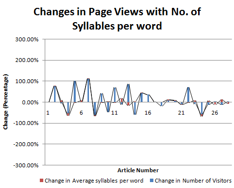
The provides a very different picture altogether about how the changes in syllables can lead to differences in the page views (pageviews)

Relation between Syllables per word and page views Graph

TO understand it further, we need to compare it quantitatively.

Changes in page Views with No. of Syllables per word


Total number of articles compared = 28

Number of articles were number of syllables per word were proportional to page views = 11
Percentage of instances where number of sentences were proportional to page views = 11/28 = 40%
So, percentage of instances where Average number of syllables per word were proportional to page views = 17/28 = 60%

Thus the average number of syllables per word can be directly proportional to the page views. However, this must be seen in moderation and cannot be taken as a rule of thumb.

Conclusion,

Number of Syllables per unit word is directly proportional Page views.

Related Reading

To find more about the above topic, you can check out The Relation between Reading ease and Viewership through an experiment on Reading ease.
Do you want to know, how to calculate the readability of a passage?

You can also find simple relations like,
The relation between Page Views and Sentence Length,

This was about,
Page Views and Syllables, A Comparison MohitChar

Apr 20, 2015

Relation Between Page Views and Sentence Length, A Comparison

Page Views and Sentence Length, A Comparison
Can you read really long sentences? Can you digest a sentence containing 50 words? We have seen in a previous article that higher complexity leads to lower number of visitors. 


What happens when you use long sentences in a webpage? What is the optimum number of words a sentence must contain to ensure maximum user retention and interaction? Let us start with an example.


Sample A

Here is a really long sentence,

"The amount of visitors on a webpage is actually dependent on a number of factors which include the web owner's search engine optimization practices, his writing quality and his repo with the swarming visitors at his personal blog"

Let us analyze Sample A.
Sample A is a single sentence containing 38 words. A normal sentence that can be easily understood by a reader can range from 10-20 words. Usually a sentence with a large number of words and phrases taxes and stretches a reader's brain.
More often than not, a sentence with large number of words is avoided by readers. Also such sentences are absolutely abhorred by readers looking for a light reading.
The sample was excruciatingly long and might have prevented many of my readers to go and read sample B which further increased this page's bounce rates ##;


Sample B

Here is the short version of the above text,

"Number of visitors is proportional to SEO, content and visitor interactions"

Let us analyze Sample B.
Sample B contains 11 words which is easily digestible. The reader can easily deduce that page views depend on the 3 factors only. People looking for a light reading will not be disappointed by the text and might even look forward to reading more.

The Experiment,

Moving back to the experiment, 28 articles, published on codemakit.com in 2014 were tested using a readability scanner. This article would talk about the role, the number of sentences play in gathering page views.
We would check if increasing the number of sentences or number of words would lead to higher or lower page views.

Relation Between number of sentences or words and page views

The number of sentences and page views can be compared using the graph above. As is evident, sans a few irregularities, the numbers of sentences do correlate with the number of page views. TO delve into it further, it is required to understand the problem, quantitatively,

Relation Between number of sentences and page views Graph


Total number of articles compared = 28

Number of articles were number of sentences were proportional to page views = 15
Percentage of instances where number of sentences were proportional to page views = 15/28 = 53%

Relation Between number of words and page views

Changes in Page Views with Number of Words

Number of articles were number of words were proportional to page views = 13
Percentage of instances where number of words were directly proportional to page views = 13/28 = 39%
So, percentage of instances where number of words were inversely proportional to page views = 13/28 = 61%

Thus it can be clearly deduced from both sentences that the number of sentences/ words has nothing to do with respect to pages views and that a really long sentence is equally probable to receive thundering applause as a really short one.

So lowering the number of sentences / Words at your blog can be disastrous as Google's panda updates view them seriously and often impose large penalties on WebPages publishing pages after pages with a really small amount of content.

But simply considering the number of sentences as the defining parameter in a text can be disastrous.
Consider the case of a webpage which contains sentences of the length of Sample A. Evaluating such long sentences would ensure huge number of words but would undermine the fact that the number of sentences have reduced drastically. Hence we need another type of parameter that assesses both the number of words and the number of sentences.

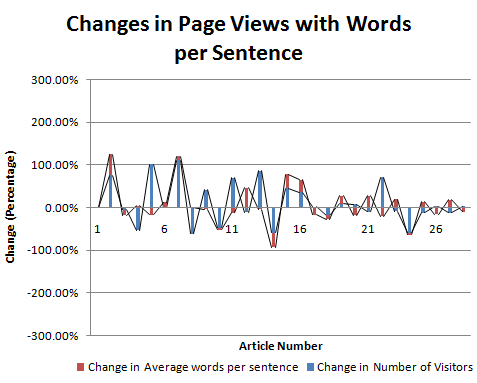
Relation between average number of words per sentence and page views

Graph Relation between average number of words per sentence and page views

Changes in pageviews with words per sentence

Hence comparing the average number of words per sentence page views was required. Average number of words per sentence is actually equal to the ratio of number of words and number of sentences. It tells about the number of words per unit sentence.

Formula image Relation between average number of words per sentence and page views

Number of articles were number of sentences were proportional to page views = 15
Percentage of instances where number of sentences were proportional to page views = 11/28 = 61%

Thus the average number of words per unit sentence can be effectively said to be directly proportional to the page views. However, this must be seen in moderation and cannot be taken as a rule of thumb.

Conclusion,

Page Views are directly proportional to the number of words.
Page views are also directly proportional to the number of words per unit sentences.

Related Reading

Learn how to calculate the readability of your blog or website pages, you could also mechanically grade your essays too!

This was about,

Apr 6, 2015

How to calculate the readability of a passage


The engine at read-able.com performs its function flawlessly when you add some text to be analyzed. 


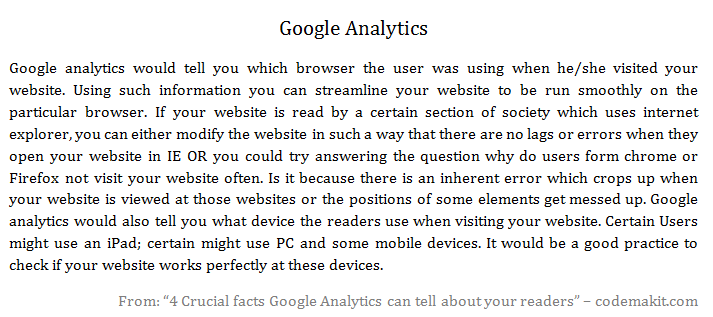
The following text is from an article on "4 crucial facts Google Analytics can tell about your readers". And the following are the results after assessing the piece of text.

As can be seen from the table itself, several parameters are calculated on the text. An explanation with the formula for each parameter can be found below.


Simple Textual Properties of the passage


Text Statistics Value
No. of sentences 7
No. of words 163
No. of complex words 16
Percent of complex words 9.82%
Average words per sentence 23.29
Average syllables per word 1.45

No. of sentences
Simply counting the number of full stops along with an algorithm

No. of words
Simply counting the number of spaces along with an algorithm

No. of complex words
I have no Idea, what can be construed as a complex word and what cannot. In my opinion, there must be a threshold number of characters in a word, exceeding which; the word can be construed as a complex word.

Percent of complex words
It can be calculated with the ratio of number of complex words to the number of total words.
The following is a valid formula for the same,
Percentage of Complex Words = ( ( number of complex words / Total Number of Words ) x 100 )

Average words per sentence
It can be calculated simply by dividing the number of words with the number of sentences
Average Words Per sentence = ( Number of Words / Number of sentences )

Average syllables per word
Syllable is a single unit of a word, separated in accordance with its sound. If you type 'Gutter" you have two syllables "Gut" and "ter". So the word "Gutter" will have two syllables.
A valid formula for the same can be

Scores found through empirical Formulas


Readability Indices Value
Flesch Kincaid Reading Ease 60.7
Flesch Kincaid Grade Level 10.6
Gunning Fog Score 13
SMOG Index 8.8
Coleman Liau Index 11.1
Automated Readability Index 11.7

Flesch–Kincaid Scores
Flesch–Kincaid readability test indicates the difficulty in understanding a text. They use word length and sentence length as parameters for their calculations.
The scale ranges from 0 to 100. Higher the score, easier is the text to read. If you receive a really low score, it means that the text is really complicated and hard to understand.
Flesch–Kincaid Score = 206.835 - 1.015 x (Words/sentences) - 84.6 x (Syllables/words)

Gunning Fog Score
Gunning Fog Index is simply the number of years of formal study; a typical US student would have undergone to understand the text written. So if you get a fog index of 11, it would mean that a typical US student of about 17 years would comprehend the subject completely.
The following is the formula for the same.
Fog Index = 0.4 x ( (Words/sentences) + 100 x (complex Words/Words) )

SMOG Grade
SMOG is a short form of Simple Measure of Gobbledygook. Just as Fog index measured the years of schooling required to interpret a piece of text for US based students, SMOG index can be applied anywhere.
The following is a formula for the same.
SMOG Index = 1.0430 x square root (30 x complex Words/sentences) + 3.1291

Coleman–Liau index
This index is also used to determine the difficulty of text. It uses only the number of letters per 100 words and the average number of sentences per 100 words.
The following is a formula for the same.
Coleman–Liau index = 0.0588(letters per 100 words) - 0.296(sentences per 100 words) - 15.8

Automated Readability Index
It takes in parameters as average characters per unit word and the average number of words per unit sentences.
Automated Readability Index = 4.71 (Characters/Words) + 0.5(Words/Sentences) - 2.43

Related Reading,

Here's a codemakit research article on the relation between readability and viewership.

This was about,

Mar 2, 2015

4 Crucial facts Google Analytics can tell about your readers

4 Crucial facts Google Analytics can tell about your readers
Here are 4 crucial cues about your readers that you can get by observing your Google Analytics data.


Just like in any project, knowing who you cater to helps you in increasing your work's quality.

Google Analytics help you bridge that gap by answering your most asked questions.


Why Google Analytics?

GA will help you understand where your website or blog visitors come from. Let us think how that information can be helpful to us. An example, you're standing in a garden at night and suddenly you're hit by a ball. You don't know where it came from. After 5-6 hits you have a faint idea where does it come from, at what height and at what speed. After 10 hits you'll be proficient at ducking them and even catching them.

I wonder where that came from

Who are they?

This is exactly how Google Analytics would help you understand visitors at your website. GA would help you find out the following points,

1. What age group do they belong to?
2. Their Gender
3. Their preferences
Using such information you can actually modify your website according to the readers/ visitors and enhance their experience.

For example, What if you write a blog about biking equipment and find out that most of your visitors are of the female gender with ages 15 to 30. Here you have an opportunity which can be capitalized. How? Let’s find out. 

Using the information you received you can write a blog about certain widgets used in bikes for females. You can experiment with your blog colors and use compatible fonts with best practices to please your intended readers. You could also loop-in a guest post from a prominent blogger who belongs in their age group and gender.

Google Analytics Dashboard


Where do they come from and what do they speak

Owning an international blog fills you with pride. What good is it, if you cannot cater to your international viewers properly? Not all visitors will be from your own country (though you’ll have to check if some countries have not blocked your website). They might even be from your neighboring countries or even from far off islands. 

Google analytics will help you determine which country's residents find your website most appealing. When you have that information, you can extrapolate to what language most residents in that country read (Remember there is a huge difference in most countries in the language they speak, write and read). If you find that many users come from countries whose primary language isn't English, you can try for a multilingual website. If that seems unreasonable, at least add a Google translate toolbar to help visitors read your content in the language they're most comfortable with.

Google Analytics Dashboard


How do they get here?

This is usually found out in the following ways.
Google analytics would tell you which browser the user was using when he/she visited your website. Using such information you can streamline your website to be run smoothly on the particular browser. 

If your website is read by a certain section of society which uses internet explorer, you can either modify the website in such a way that there are no lags or errors when they open your website in IE OR you could try answering the question why do users from Chrome or Firefox, not visit your website often. Is it because there is an inherent error which crops up when your website is viewed at those browsers or is it because the positions of elements get messed up and it looks like a grotesque pixie.

Google analytics would also tell you what device the users use when viewing your website. Certain users might use an iPad, certain might use PC and some mobile devices. It would be a good practice to check if your website works perfectly at these devices.

From where do they get here?

Another way Google analytics can help you is by finding out how did the visitors land at your website. Using GA would help you isolate (Or what I would like to say stalk) your visitor entry methods at your website. You would find out which website led them here. 

For example if you find that majority of viewers come to your website from your facebook page you would think if you could utilize that opportunity to optimize facebook advertising or adjusting your strategy there. You could also think why visitors come from facebook when you have a twitter handle too.

Though there are several Google products which can help your website like Google Adsense or Google Adwords, none of them come close to the quality of data provided by Google Analytics. Top 500 websites on the web are often found using similar tools to get more information about their viewers or find more ways to impress and retain them.

These were,
4 Crucial facts Google Analytics can tell about your readers MohitChar

Feb 16, 2015

An introduction to Content Marketing

Content Marketing or Internet Marketing is basically advertising whose main job is to direct traffic from one website to another. This might include direction of traffic from a blog to an eCommerce website or from a social network to a blog/ website. 

More often than not, advertisements lead to a series of events not envisioned even by the web owner.

A very simple example can be a situation where a user sees an advertisement on Facebook which he clicks on. This leads him to the particular blog. An advertisement about headphones pulls his focus and he clicks it which leads him towards amazon, where he buys a headphone.
There are three types of internet marketing,

Email Marketing,

You know the advertisements and the content you receive at your inbox. Often this invariably leads to maximum buying behavior. This may be related to the psychological behavior which goes like this. "If you see a coca cola advertisement in your living room you are more likely to buy a coca cola than when you see one at a banner outside. But this does not mean you should resort to phishing scams.

Web Marketing,

This includes e-commerce, website promotions, search engine advertising, affiliate marketing and search engine optimization practices. This also includes stuff like which font should you use for better visitor interaction or certain website best practices.

Social Media Marketing,

This involves marketing efforts from websites like Facebook, Twitter (though it is not better than facebook) etc. where you try to increase your social media efficiency. Marketing efforts at such websites are so popular mainly due to the unprecedented amount of visitor interactions present at them.

This was about,
Jan 12, 2015

Best Practices for Website Fonts

Best Practices for Website Fonts Front
Arial, Verdana, Georgia, Helvetica; which font is the best for websites? Which font sizes will guarantee that your website will prevail? Which font color is the best? We'll be trying to answer this question in a series of articles.

The articles shall try to answer each of the above questions as lucidly as possible. As a part of research, I came across the following interesting articles. A SixRevisions Article on user experience (Did I mention, The founder of sixrevisions gave an interview to codemakit.com, Read the interview with Jacob Gube!), the dude in that article did a split test on which font types and size would be the most effective in conversion. His results included that among 10px, 14px, 18px and 21px, users connected most with 14px fonts.

One of the best places to get a customized answer for your question is Google forum. There I asked the following question, "Which font leads to maximum User Interaction?", there I found some of the most ingenuous methodologies and concepts that many wouldn't even dream of. The solutions are incorporated into the articles.

However, every one of them stopped at one single point, as if everyone finally concludes with, ".. Any font of any size would do great, provided you choose them in accordance with your website type and content."

Though I agree font type and size must change with the type of website, (i.e. a funny comic blog can be embellished with comic sans or an official looking website to be adorned with Georgia/Arial etc), but still which font would do great for News website or a blog? There are plethoras of official looking fonts which give the feeling of authenticity to the text. But which one strikes a chord with the user? Hence this research.

Study methodology

The Study methodology is simple enough, you visit several popular websites based on either alexa rank or Pagerank or a 'list of' and check out three font parameters from the text. The parameters are Font Type (Which Font family it belongs to), Font Size (In Pixels) and Font Color (Hex Colors. Then the data is divided into 4 categories i.e. Blogs, News based Websites, Academic Journal Based Websites and Information Based websites.


Type

Website

Font Type

Font Size
Font Color (RGB)
Red Green Blue
blog 1stwebdesigner Helvetica 14 34 34 34
blog Treehugger.com Arial 11.5 0 0 0
blog Mashable.com Helvetica 11.5 85 85 85
blog Crooksandliars.com Arial 10 34 34 34
blog copyblogger.com Helvetica 13.5 51 51 51
blog thefword.org.uk Trebuchet MS 13 102 102 102
Information Wikipedia.org Arial 12.5 37 37 37
Information support.google.com Helvetica 11.5 68 68 68
Information Encyclopedia Britanica Arial 10 68 68 68
Journal Psycology today Arial 12.5 0 0 0
Journal Scientific America Geogia 14 0 0 0
Journal MIT Technology Review Helvetica 10.5 0 0 0
Journal ASCE Arial 8.5 88 89 91
News The Economist Arial 13.5 74 74 74
News NyTimes Geogia 14 51 51 51
News Forbes Geogia 16 0 0 0
News Wired Geogia 11.5 51 51 51
News The Hindu Geogia 11 59 58 57
News Reuters Geogia 11.5 0 0 0
News AlJazeera Arial 12.5 0 0 0
News Fox News Helvetica 12.5 34 34 34
News CNN Arial 10 0 0 0
News Wall Street Journal Arial 10 51 51 51

Here is a pdf codemakit document of some of the samples collected for the study.

The study is based on the assumption that, since the websites are one of the best in their field, the font parameters would also be the top as per industry standards. Though there are a few studies in which font size or color should you use? There is a general dearth of a good quality study that would lead by example instead of just pointing out the facts.

In Conclusion,

Finally, I would like to point out the following conclusions based on previous studies by codemakit.
Based on codemakit's study, "Which Font Size is the Best?", I would highly recommend a 14 px size for better readability and ease.

Based on codemakit's study, "Which Font Type is the Best?", I would advice for a Georgia for Blogs and Arial for News Journal based Websites. Also never use your custom font or a handwritten font in the body content part of your blog, use it in titles and stuff. This would ensure best fit.

Based on codemakit's study, "Which Font Color is the Best?", I would say, #222222 for Blogs and #333333 for any other website. If you find the hexadecimal values upsetting, you can visit the article for a better feel of the color.

This showed you,
Best Practices for Website Fonts MohitChar

May 26, 2014

Why some countries hate your website

Why some countries hate your website front
Its 2:00 AM and you're sitting in front of your computer with chips in one hand and a beverage in another. You are reviewing the analytics data. Where do the visitors come from? Where do they go?  Which pages they visit and for what time etc. 

You start thinking, "Hey! Why are my visitors more from US than UK. Why are there minimal visitors in China and why are hordes of them in Australia?"

The answer though mind boggling, is quite simple indeed. Before getting into the details of the visitor demographics Let us get rid of some irrelevant factors.

Is it Blocked?

There is a lot of speculation regarding website metrics in China. Some report large number of visitors some report a fraction of its fraction. With the government exercising excessive control over what can be published or what can be viewed, one thing can be concluded with surety, it is not your fault if your website does not receive thundering applause from china or any other country.

Chances are your website has been blocked there. (However, there is a way to find if your website is blocked). Same might be the case with some Middle East countries too. Though you can still move around it, but that’s not the point.

New Google Algorithm?

"Change must always be embraced", the supposed motto of the people working at Google Search, The Guys sitting there are responsible for any modification in the search algorithm used by Google.

With a simple change from their side, cause great repercussions in the visitor inflow in our websites. So that cannot be ruled out. You can actually see through a case study, how Google's algorithm change lead to the change in visitors geographically.

The Actual Reason

Now that we've removed them from our scope, we can focus on much more pressing issues on hand. Why do some countries love your articles and some do not? Do you offend the countries? Or is there some problem with your language? (As an accent cannot be a problem in written content). The answer is really simple. "Spelling".

Color or Colour or Couleur?

It is the way you spell your words that makes the difference. let us look at some examples from Wikipedia. Like for the simplest of example. A word used extensively in almost all websites, "Colour" or "Color". 

It is fascinating to note that the word is spelt "color" in United States but is spelt as "Colour" in almost all English speaking countries. (French however introduce another twist and spell it as "Couleur").

Color example

Organisation or Organization?

Another example can be "Organisation" or "Organization". This one however is a tricky one. UK, New Zealand, South Africa are known to use it interchangeably. US on the other hand prefer "Organization".


The Story

My friend used to wonder why his blog receives more visitors from US and not from India, his target audience. His was a commercial website and he started a blog to help in sales. But the website received more visitors from outside the country and his sales started to drop. 

Simple psychology says, “you would obviously buy from the nearby shop than order from abroad”. His puzzlement increased when the blog started to increase visitors, actually started hurting his income as most readers were from United States. His competitors got the better of him and he was going to shut down for good.

The answer to the problem is simple enough. The man used Microsoft Word to spell check his blog posts or Item descriptions. His plan to avoid spelling errors actually backfired. What he didn't know was the spell check in Microsoft word in his system was preset at English (US). So, confusing words were automatically corrected to those spelled in US. He used to post the spell checked article at his blog. 

How do Spellings Affect your Website?

Let us suppose he had an article named the "Colors of Flowers". When a needy slash curious person from India/UK types in the search string, "Flower Colours", she/he would not be presented with my friend's article. 

But when another needy slash curious guy from US types in the string "Flower Colors", he will be presented with my friend's article. This is how your spellings could change who you cater to.

Now increasing the usability of this concept by a notch, we can safely say that if you want your visitors from a specific country, set your spell check in that language. The steps are outlined here,

How to change the preset Language in Microsoft Office


  1. First click on Review Tab in Microsoft Word 2007.
  2. In the proofing option, select "Set Language".
  3. Now you'll be presented with a window containing all languages. Select the one you find suitable and click OK. You’re good to go.

How to change the preset Language in Microsoft Office

This answered your question
Why some countries hate your website MohitChar

Mar 24, 2014

A Guide to Creating Awesome E-Book Covers


A content based website like a blog is always dependent on its readers for fame. Such websites strive for quality and try to provide as much new knowledge as possible. But alas, webmasters can only do this much. 

This is where having an eBook comes in handy. Some distinct advantages of an eBook are often forgotten by people. In this article we'll first talk why do webmasters need eBooks on their website and secondly some of the best E-Book covers and what you could learn from them.

Why E-Books?

Lets first discuss, why would a webmaster/ owner/ blogger ever need an E-Book. 
Is the website not enough?
  1. An eBook is never crawled by a Google bot. So in short you could write anything and everything in an eBook. You can badmouth others, you can give away links that you could never ever host on your website, hell you could even plagiarize from your competitors, take their images, text etc. But a worthy and ethical person would never do that, (and believe me, only the people in the latter category succeed). 
  2. Another reason for hosting eBooks or pdf materials at websites is that psychologically people are happy to download an eBook because they feel a sense of superiority as well as achievement as they downloaded a material that was not readily available on the internet. A sense of attachment starts towards the eBook and hence the website too.
  3. Another reason for websites to use eBooks is because they stand out in the world of bloggers and web enthusiasts, the race towards unique content and quality material has never been tougher, hence an eBook that would set them apart.
  4. Though an eBook is a less popular method of disseminating information than an embedded video, it still is an effective method for targeting visitors and converting them into a regularly visiting/loyal readers.
  5. Finally, E-Books are currently one of the niches where marketing geeks have just stepped into. E book websites like bookboon is speculated to earn a lot by just allotting some space in their eBooks for advertisements. So you can earn from eBooks too!

Famous E-Book Covers..

Now that we're talking about eBook, we must also know that no body would read an eBook if it does not look interesting. So here are some examples of famous eBooks and what their cover designers did to attract visitors.


The first example could be Bookboon, just because of its sheer size and output that the website provides. It has a really simple yet elegant way of creating their covers. Almost all books hosted on bookboon have the same cover page template. Orange background, Really large text "Bookboon" and simple space in between displaying a really simple image relevant to the contents of the eBook. All in all, a really nice but average type of eBook cover.


Let us take another type of cover for our discussion. Let us take "Access to Information Act, Canada" for the same. Keeping the content aside, one must first acknowledge how color combination can set a really different mood. Complete Front page is of a single color, lined with matching colors. But as is evident, The document is a part of series. Hence the book number in huge font and the book title as well as other information in smaller fonts (However, It looks microscopic related to the number itself, but who are we to judge)


For many books color isn't that important, psychologically too black as a color denotes completeness and creates a sense of awe in the mind of readers. Check out, for example the book E2, written by Pam Grout. Based on its content, Pam had to choose the cover image as something between awkwardly mathematical or unrealistic photoshoped abstract, So he chose something in between. If your content is something like this, you too can experiment.


Same is the case with the Fiction, "Hunger Games", The ebook's frontpage dwlves on human psychology that often humans judge a book by its cover, and as expected the cover goes perfectly well with the book. Complete black background with golden words and an insignia at the center, preping its readers for a journey into the unknown.


E-books do not always use monochromatic backgrounds or Orange and red stripes to woo their readers. Some, like "The essential Guide to customs and culture, Ireland" also use images as the front page. You know a really detailed and colorful image can go a long way in attracting readers. Also, since its an eBook, one does not have to pay extra for printing such high resolution images. But images like these can become the perfect way for Authors to showcase their book. Take this for examples willfully placed the word Ireland  on the shores depicted in the image. In short, the images do not look awkwardly hanging in the air but look properly supported (in this case on sandy beaches). You too can try, this out, However you much choose your background image carefully for the effect to look authentic.


But as a website, you cannot afford to have an image like the above on your webpage. It simply does not go with the content. So you create something much simpler, something that you could change with the flick of your hand. Copyblogger's ebook front pages are popular in this matter. The front page is usually red with simple images at the back as if it has nothing to hide. Then it has a small strip at the bottom for the website name.


If you do not have enough images and you are releasing eBooks in a row, you can take you inspiration from United Nations Human Rights (UNHRC) eBook. It is less minimalist from the information Act document discussed above, as it provides much more information than its counterparts. One look at the eBook and you know its contents. If you too hate highly minimalist front pages, you should go for this. Replete with images, logos and text, It can be called as a really comprehensive front page.

This was all about,
\