Showing posts with label Resources. Show all posts

Mar 16, 2015

Auto Grammar Check, Grammarly, A Review

Auto Grammar Check, Grammarly, A Review
Word Processing softwares like Microsoft word are simply awesome in correcting your essays, reports and business letters. But, not all mistakes are picked up by such softwares. Reason, they're not made for sentence corrections. They're made to help you type, change font sizes, colors etc. But checking grammatical compositions? I don’t think so.

During one such endeavor, I stumbled upon Grammarly. Really neat pieces of online software which can scan your text and help you modify it according to the correct grammatical rules. This article is a reality check for Grammarly and its services.

Let us check out Grammarly's features.

  • Of course it has a grammar checker or a grammar correction engine which checks and advices modifications to your text.
  • It also has a contextual spell checker which advices on the correct spelling of a word based on the context of the sentence.
  • It also has a Grammarly Plug-in that adds similar features to your Microsoft word and Microsoft outlook software.


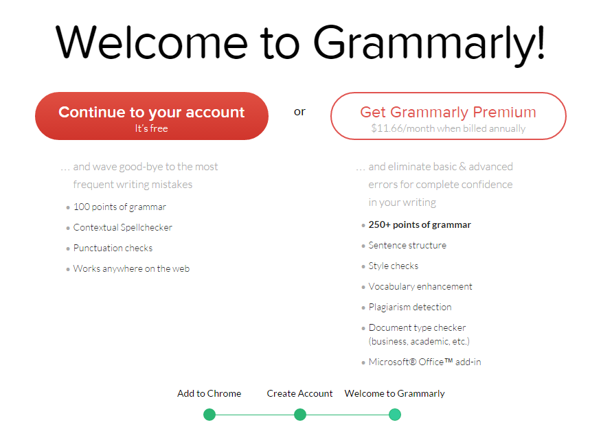
Signing-up is simple enough,
Create an account

Adding it to chrome is easiest


Adding to chrome

The Test Results

Codemakit itself tried its hand on the perfection seeking online gizmo. So we uploaded a previous article from codemakit on "The dangers of Fair Use Copyright Policy". It is a common policy at codemakit that each and every article published on the website, goes through a series of checks to keep the quality of writing consistent with the highest standards possible. As a result, the text of each article is subjected to

1. The normal spell and grammatical check at Microsoft word,
2. Additional Checks at blogger platform
3. Proofreading of the complete document to ensure removal of contextual or logical errors that may have crept up.

The same article was abridged to remove unnecessary fringes and uploaded to Grammarly (After signing up at a fairly simple form).

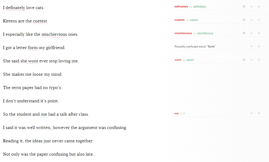
Yes Errors were minimal, but they were still present. It came out as a surprise that Grammarly could point out 5 errors in the text uploaded even after it was subjected to such rigorous checks.

The codemakit creative commons test

The errors were
2 Insertion of commas
1 Replacement of the word ‘of’ instead of ‘in’
2 Insertion of hyphens

Other Reviews

In the recent times, Grammarly has been under fire from various websites because of its non performance in pointing out errors in some easy statements (The economist was one of them). Grammarist.com conducted a test of its own for determining Grammarly's efficiency in pointing out errors in statements. 14 incorrect statements were typed in the Grammarly interface. Grammarly could find 4 errors but was unable to find anything wrong with the other 10. Since some time has passed since grammarist's test was conducted, Codemakit now repeated the same test with the same 14 sentences to check for updates in the engine. We found that now Grammarly could find 6 errors as opposed to the previous 4.

Other Reviews


Final Verdict

The perfection loving Grammarly isn't perfect, but just as a human, it is improving with time. Though imperfect, it is still better than the spell check tool at Microsoft word. I would definitely recommend its use to students and businessmen alike.

Update

After writing the article, I was sending a mail to some bloke and grammarly came in swooping like an eagle, pointing out two mistakes at my mail's disclaimer.
Oh this reminds me, I have to edit the disclaimer.

Update from codemakit mail disclaimer

Related Reading,

A previous post on organization of articles will help shed some light on the workings of codemakit aside from simple grammar check.

If you found the example text interesting, you'll be pleased to note that, we have another one like it, i.e. a case study on the dangers of fair use copyright policy.

This was on,
MohitChar Grammarly, A Review

Jan 26, 2015

Solutions to Copyright Problems in Interviews

Solutions to Copyright Problems in InterviewsWhen an interview is conducted for the purpose of publishing, who owns the copyright? Is it the interviewee who responds to questions or the interviewer who shoots the questions?

Codemakit has conducted a fair share of interviews with prominent web personalities in its term. With the pressure to create new and original articles, on often wonders, if an article is created with the cooperation of two individuals, who claims the ownership?

Let us take an example of an email interview. The interviewer or the person who asks the question has as much right over the content as the interviewee who answers the question.

Prevailing Theory

Now let us take a moment to digest. In an article or a video, what readers look after is not the questions of the interviewer, but the answers of the interviewee. So the copyright could be attributed to the interviewee. However since the interview is of no consequence if it is not published through a media, the interviewer too can claim copyright for the same.

One theory often prevails that if the interviewer publishes the interview at a location, he/she is called the de facto copyright holder. However as is mentioned in the "Rights of Writers" article, which is not the case always.

If a preset agreement between the interviewer and the interviewee is not present, some courts can look at it in a different light. It can be seen as if the interviewee had agreed implicitly to the copyright.

The matter of copyright often creeps up when the interviewee does not want the interview to be used in one way or another. For example, if you interview a person who does not want a specific part of interview to be broadcasted. When you publish it, you are liable to attract problems on the basis of copyright violation.

Best Practice

So what is the best practice? It is highly advised to get the interviewee to agree to transfer copyright to you before conducting the interview. If it is an email interview, ask the interviewee to accede to an agreement. If it is a videotaped interview, get them to agree on the tape that the copyright of the following interview will be held by the publisher itself. However, if the interviewee wants to say something 'of the records', ensure that you honor the request.

If you’re not much of a control freak, you can get the interviewee to agree to a creative commons type license to the work created (Though you’ll have to first check which creative commons license would suit the work better).

Examples

The following is a sample document asking interviewees to accede to the agreement before getting interviewed. Click here to get the sample copyright document for Email Interview and Click here to get the sample copyright document for Video Interview.

Related Reading

Check out the awesome article on the dangers of trading an article for a service.

You can read about fair use copyright policy and its problems while you’re reading about copyrights.

This gave you, 
Solutions to Copyright Problems in Interviews MohitChar

Jan 12, 2015

Best Practices for Website Fonts

Best Practices for Website Fonts Front
Arial, Verdana, Georgia, Helvetica; which font is the best for websites? Which font sizes will guarantee that your website will prevail? Which font color is the best? We'll be trying to answer this question in a series of articles.

The articles shall try to answer each of the above questions as lucidly as possible. As a part of research, I came across the following interesting articles. A SixRevisions Article on user experience (Did I mention, The founder of sixrevisions gave an interview to codemakit.com, Read the interview with Jacob Gube!), the dude in that article did a split test on which font types and size would be the most effective in conversion. His results included that among 10px, 14px, 18px and 21px, users connected most with 14px fonts.

One of the best places to get a customized answer for your question is Google forum. There I asked the following question, "Which font leads to maximum User Interaction?", there I found some of the most ingenuous methodologies and concepts that many wouldn't even dream of. The solutions are incorporated into the articles.

However, every one of them stopped at one single point, as if everyone finally concludes with, ".. Any font of any size would do great, provided you choose them in accordance with your website type and content."

Though I agree font type and size must change with the type of website, (i.e. a funny comic blog can be embellished with comic sans or an official looking website to be adorned with Georgia/Arial etc), but still which font would do great for News website or a blog? There are plethoras of official looking fonts which give the feeling of authenticity to the text. But which one strikes a chord with the user? Hence this research.

Study methodology

The Study methodology is simple enough, you visit several popular websites based on either alexa rank or Pagerank or a 'list of' and check out three font parameters from the text. The parameters are Font Type (Which Font family it belongs to), Font Size (In Pixels) and Font Color (Hex Colors. Then the data is divided into 4 categories i.e. Blogs, News based Websites, Academic Journal Based Websites and Information Based websites.


Type

Website

Font Type

Font Size
Font Color (RGB)
Red Green Blue
blog 1stwebdesigner Helvetica 14 34 34 34
blog Treehugger.com Arial 11.5 0 0 0
blog Mashable.com Helvetica 11.5 85 85 85
blog Crooksandliars.com Arial 10 34 34 34
blog copyblogger.com Helvetica 13.5 51 51 51
blog thefword.org.uk Trebuchet MS 13 102 102 102
Information Wikipedia.org Arial 12.5 37 37 37
Information support.google.com Helvetica 11.5 68 68 68
Information Encyclopedia Britanica Arial 10 68 68 68
Journal Psycology today Arial 12.5 0 0 0
Journal Scientific America Geogia 14 0 0 0
Journal MIT Technology Review Helvetica 10.5 0 0 0
Journal ASCE Arial 8.5 88 89 91
News The Economist Arial 13.5 74 74 74
News NyTimes Geogia 14 51 51 51
News Forbes Geogia 16 0 0 0
News Wired Geogia 11.5 51 51 51
News The Hindu Geogia 11 59 58 57
News Reuters Geogia 11.5 0 0 0
News AlJazeera Arial 12.5 0 0 0
News Fox News Helvetica 12.5 34 34 34
News CNN Arial 10 0 0 0
News Wall Street Journal Arial 10 51 51 51

Here is a pdf codemakit document of some of the samples collected for the study.

The study is based on the assumption that, since the websites are one of the best in their field, the font parameters would also be the top as per industry standards. Though there are a few studies in which font size or color should you use? There is a general dearth of a good quality study that would lead by example instead of just pointing out the facts.

In Conclusion,

Finally, I would like to point out the following conclusions based on previous studies by codemakit.
Based on codemakit's study, "Which Font Size is the Best?", I would highly recommend a 14 px size for better readability and ease.

Based on codemakit's study, "Which Font Type is the Best?", I would advice for a Georgia for Blogs and Arial for News Journal based Websites. Also never use your custom font or a handwritten font in the body content part of your blog, use it in titles and stuff. This would ensure best fit.

Based on codemakit's study, "Which Font Color is the Best?", I would say, #222222 for Blogs and #333333 for any other website. If you find the hexadecimal values upsetting, you can visit the article for a better feel of the color.

This showed you,
Best Practices for Website Fonts MohitChar

Sep 14, 2014

Which Font Size is the Best?

How do you know if your font size is readable enough?

What font can be called too large and how many pixels are too small? 

Learn what font sizes are used by award winning websites. Also find out how people improve readability and retention of their text by modifying the font size.


Blogs

If yours is a personal or a professional blog, written by on or many authors about one particular subject and the views are of the author only, then it’s a blog.

The size of font used by the sample of bloggers considered in the research was perfectly conclusive. After the study, It was like a known fact, that a 14px font. More than 40 percent of bloggers thought 14Px is the magical number one should size their text on. 

Another interesting fact which popped out of this graph is that more than 80 percent of bloggers thought, font size must be greater than 12px. This might be attributed to the major aim of filling more space with lesser text. 

Another reason could be that people respond positively towards things they can understand (Remember the face your teacher or boss makes when you rant on something you’re not clear on). A larger font would surely help in that.

News based websites

If you are not into information or Ideas, and just want to talk about current affairs (i.e.) what is happening currently in the world, country or your locality, you my friend, have a news website.

News websites too showed similar trend i.e. about half news websites had a font of 14 pixels and more than 70% websites thought any size more than 12 pixels is good enough for text to look readable. Least preferred font size was anything more than 16 pixels (You’ve got to stop somewhere).


Academic Journal Websites

If you do not blog or write about facts and events, but like to experiment and jot your results down for others to see, then your website is an academic journal. Examples include anything from journals to private research diary.

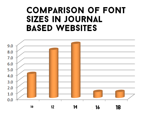
Journal websites were by far the most unpredictable as far as the study goes. Their values were erratic and difficult to extrapolate. Font size for most journals based websites never exceeded 14 pixels. 
About 92 percent of journal based websites had a font size less than (or equal) 14 pixels, as opposed to a paltry 60 percent in blogs. Just 8 percent journal websites had a font size of more than 14 pixels. Surprisingly the higher font size was mostly found in medical journals.


Information based websites

And if you are none of the above, you're involved in an information based website.

Information based websites followed the trend of journals, 80% of information based websites thought it would be better if they kept their font size less than (or equal) to 14 pixels. Just 20 percent thought of exceeding the 14px mark.

Findings Explained

Some notes on Font sizes

Now there is a reason why everybody is so gung-ho on keeping their fonts near 14 pixels. Though Bonn, from smashing magazine contests that 16px isn't too bad, but let’s face it, it is a magazine. 

Ergonomics

You should not keep your font less than 12px. The reason being, your websites are to be accessed on desktops too, lesser font sizes would put strain on the users eyes.

According to smashing magazine, most people sitting comfortably are about 20 inches (about half a meter) from their computer screen.

Why Font Sizes matter

People can argue saying, Font size doesn’t matter, on can obviously zoom and change the size.
Of course users can zoom their screen by holding control key and scrolling upwards, but most people do not know the feature (not all are computer geniuses like you)

Conclusions

So all-in-all, here are the conclusions,

  1. If you're a blog, best font size you could use is 14px to 16px. In a blog if you don't write much and expect people to get your meaning in few lines 16px might just be fine.
  2. If you are into news 14px is the best you can do. A larger font size might mean you do not have enough to show and anything smaller would hamper the reading. 
  3. If yours is a research journal (Which is mine too partially), it is better to follow the trend and have the font size in the range of 12px and 13px. I guess the concept of “using large fonts if you do not have anything" hasn’t really caught on in the minds of people wearing lab coats. 
  4. If you plan on starting an information based website, i.e. a dictionary website, or a private encyclopedia, your best bet would range in 13px or 14px.
  5. If you still haven't decided on which category your website falls in, close your eyes and keep 14 as the font size. 


Further reading,

You could have a look at W3C's advice on font sizes too
Stackexchange on User experience too hosts a series of interesting conversations between knowledgeable participants on the optimal font size

More in font research Series

Find out Which Font Color is the best? - Did you know font colors can alter moods? Learn how professional award winning websites change text colors to ensure maximum user interaction and understanding.

Find out Which Font Type is the best? - Which font type is most favored by readers? Which font would keep them hooked to your website?

Find out Which Font Size is the best? - How do you know if your font size is readable enough? What font can be called too large and how many pixels are too small? 


This answered your question,

Aug 25, 2014

Which Font Color is the best?

Which Font Color is the best front
Did you know font colors can alter moods? Learn how professional award winning websites change text colors to ensure maximum user interaction and understanding.

I recently read an article 'Evoke Emotion through typography' where the author talked about connecting emotionally with people with the help of fonts.

The author stresses on the need of creating a relationship with the visitors on the website, a concept loosely labeled as 'emotional design', which isn't that illogical. Emotions help in decision making, increases motivation, affects memories and much more.

So here's an analysis on different colors (or different shades of grey) that award winning websites use for exceptional user experience. However, before going any further, you must first determine which category your website falls in.

The Study

For better understanding of the readers, the color  variations used by different websites have been clubbed into 7 parts  i.e. #000000, #111111, #222222, #333333, #444444, #555555, #666666 which can be assumed to contain  the color black as percentage 100.0, 93.3, 86.7, 80.0, 73.3, 66.7, 60.0 respectively as shown in the following table.


% of Black Red Green Blue Hex Code
100 % Black 0 0 0 #000000
93.3 % Black 16 16 16 #111111
86.7 % Black 34 34 34 #222222
80 % Black 51 51 51 #333333
73.3% Black 68 68 68 #444444
66.7% Black 85 85 85 #555555
60% Black 102 102 102 #666666


Font Colors for Bloggers

If you have a personal or a professional blog, written by one or many authors about some particular subject and the views are of the author only, then its blog.

The color variations used by bloggers varied a lot, however majority of them about 75% never crossed the 73.3% black mark (Or 75 % websites had fonts darker than #444444 hex).

If you're a blogger I would suggest #222222 or #333333 as your best bet.

color strip for blogFont Colors for Bloggers Donut Chart

Font Colors for News based Websites

If you are not into information or Ideas, and just want to talk about current affairs (i.e.) what is happening currently in the world, country or your locality, you have a news based website in your hands.

News websites on the other hand were fairly obvious; half of them used the color #333333 (Which contains 80% of Black and 20% white).

So If you run a news based website close your eyes and use #333333.

color strip for newsFont Colors for News based Websites Donut Chart


Font Colors for Journal based Websites

If you dig research with charts and tables, then your website is an academic journal.  Examples for such might include anything ranging from journals from academic institutions to private research diary.

Journal websites showed a different trend, in those websites there were two classes. One had the darkest possible color #000000 (i.e. 100% black), which were 44% of the websites.

The second class believed in a lighter approach which used #333333 (i.e. 80% of black and 20% of white), which were 30 % of the websites in the sample.

For research minded Journals, You have an option between #000000 and #333333.

color strip for journalFont Colors for Journal based Websites Donut Chart


Font Color for Information based Websites

And if you're not interested in events or ideas or your opinion, but just want to create a ready reference for others which would help them find factual information, you're involved in an information based website. E.g. Websites like Wikipedia, dictionary.com or thesaurus etc.

Information based websites too had nothing concrete to show, there was no definite trend visible in information based websites.

In short you can use anything.

color strip for informationFont Color for Information based Websites Donut Chart

Conclusion

News based websites can use #333333 as their font color. Academic Journals have a choice between #000000 and #333333. However for Bloggers and news based websites, instead of using any color combination, I would like to attract your attention to the following paragraph.

According to the research conducted on 'The Impact of Web Page Text-Background Color Combinations on Readability, Retention, Aesthetics, and Behavioral Intention', the author contests that color combinations with a higher contrast will ensure higher readability and retention than the ones with lower contrast. According to them, the priority of the color combinations looks like this,


Rank Background color Text Color Example
1 White Black Example
2 Dark Blue Light Blue Example
3 Cyan Black Example

If you're not sure, which category your website falls in, close your eyes and use #000000 or 100% black as your default font color with a white background.


Website Category Font Color
Blog Based Websites #222222 or #333333
News Based Websites #333333
Journal Based Websites #000000 or
#333333
Information Based Websites #000000

Related reading,


More in font research Series

Find out Which Font Color is the best? - Did you know font colors can alter moods? Learn how professional award winning websites change text colors to ensure maximum user interaction and understanding.

Find out Which Font Type is the best? - Which font type is most favored by readers? Which font would keep them hooked to your website?

Find out Which Font Size is the best? - How do you know if your font size is readable enough? What font can be called too large and how many pixels are too small? 


This research was about,
Which Font Color is the best MohitChar

Jun 30, 2014

Optimum Number of Images for a Webpage

Optimum Number of Images for a Webpage
Text has been the pioneer in information dissemination. But the ball has now left the court. In the digital age of high speed broadband internet, Text based websites are soooo 1980s.

A post from yola.com depicted clearly, the need to strike a balance between visual and text content on a website.

It is said that your readers often create impressions about your website in just 50 milliseconds, so do you think huge chunk of text is going to help the reader to form a really nice opinion about your website, instead a nice image would attract attention and if the reader likes it, he/she would move further. 

This technique is risky, because if the reader does not like the image, you'll receive a "hmmf" and the reader will move along.  As is evident, until now, the article is actually in confirmation to a few concepts of Website/ SEO Psychology.

However, It has a much higher probability of luring the readers into reading/ using your website than a chunk of smart looking text.

Ask Yourself What did you see first


But you know, anything in excess is never good. So how do you know, if you've over-rainbowed your website. How do you know when your website stops being an informative/productive/inspiring website and starts becoming an abomination made by an overweight pixie puking colorful paste?

Too many Images? BLUNDER!

In simple words, Adding too many images for a webpage (not a website) can cause some serious repercussions,
  1. Image will load glacially slow (That means so slow, that you’ll grow a beard). Your page speed will suffer and so will you.
  2. If you do not use a free resource like blogger, you’ll need to host the images somewhere, hosting needs space for storage and that would require money which will be taken from your pocket.
  3. Also too many images sometime puts off the readers. They get the impression that you did not have enough content and so you’re compensating by adding lots and lots of images.

Too less Images? BLOOPER!

But if you have too less images, it can cause some serious damage too.

  1. Less images would bore your visitors, If numerous images would have you growing flowing beard then after 5 minutes of lengthy article without images, you will have a bored skeleton sitting in front of a computer.
  2. Lesser images without significant breaks lead to people skipping some juicy parts of your article.


Images on Website Type?

Just like your Bounce rate depends of the type of website you have, similarly in the case of images, it all depends on the type of work you do. If you're a photographer or a design enthusiast, your website will have to show in the same manner. If you're a brooding extra mindful persona, you'll automatically use”no nonsense full of text” methodology. The eye tracking study of web readers by nngroup claim that users will read more text on newspaper websites than they do at any websites.

Psychologically, this is because they actually visit the newspaper websites to gain information, to know about things and also because many people sitting at offices are not able to visit many websites and hence resort to the ones that are not blocked by their IT dept./Government (Digress..) The same analogy can be seen in links too. People often say, the higher the number of links you have better is your page, but it’s not true every time.

The Results

My philosophy is to micromanage and document. At codemakit I tend to delve deep and after research I put forward values and processed data. For Example, The Ideal blog posting schedule for a week  or The one about what page rank should you have to reach top 500 of all websites, So here I have attempted to micromanage and tell how many images are optimum for a webpage (for different types of webpages).

Mind you, the table is created after hours of grueling research, using two different methods for the analysis and comparing. The study revolved around the top 500 websites of the world by Alexa as per 11th June 2014. Several websites were selected. Ones in language other than English were rooted out. Ones that need authentication (like Facebook, Reddit etc.) before letting the visitors enter were removed. Ones with objectionable content were not considered.


Finally the values are arrived by using weighted average method. The complete Study on "The Optimum Number of Images for a Website Type" is available now in pdf.


Type Images
Forum Type Websites 7
Photosharing Websites 10
Brand Specific Websites 10
Banking Websites 12
Shopping Websites 35
Product review Websites 56
Group Blogs 83
Newspaper Group Websites 130
Entertainment Websites 145

So what is bad? Bad is when you mix things up. When a simple blogger uses so many images that the page uses an hour to load on the reader's computer. When loaded the page greets the user now sitting with a face full of white beard. If you’re so hell bent on using images for every little piece of text you have, use it in awesome ebook covers and magazines. But remember “The moment you overdo anything, you're in trouble.”

Note,

Google webmaster guidelines clearly state, you should not embed important text in images, use alt text for images, also the image must be conducive to the text you've published (You do not see an image of a puppy in this webpage, because it is out of context)

But nowhere has anything been mentioned about the optimum number of images a webpage might have (Not even the hyped “How search Works” by Google. So, I posted a question at Google’s Webmaster Forum in search of professional opinion. You can see the topic here, But There was no response from that side. Maybe my question was convoluted. :-(

This was about,
Optimum Number of Images for a Webpage MohitChar

Jun 16, 2014

7 Best Free Image Websites without Watermarks and More

7 Best Free Websites without Watermarks
How often have you felt the need of a really nice image for your blog but all you can find are stock images charging you 1.29$ or 3.99$ for a single image. You try and optimize images you already have and you put on a long face cursing the website for the outrageous prices and move on?

But you know, high resolution photographs and images are often a major requirement for a better web design, this has been said even by design experts like, Jacob Gube and Steven Snell

Codemakit presents to you the best of the best image websites hosting free images for your benefit, Images that do not have a grotesque watermark at the center, Images that do not need any attribution (some that allow you to use for commercial purposes too) and definitely no websites that charge you outrageous amounts for seemingly stupid images. These need no attribution (some might), are absolutely free and you are free to meddle with them (almost).

Codemakit has always tried to bring you a comparison of the best. Never has it presented its own opinions on its readers. Take the examples of the Top 8 form creation websites or A comparison of Free storage for your website or even the recent Best Office websites of 2014. When you see the top competitors (each offering a different approach) you connect with them and finally bookmark them.

Stock Free Images

Stock Free images by far contain one of the most vibrant collections of stock free images (Ahem). The images are free to download, displaying image size, and dimensions along with sharing options.

Stock Free Images

Free Images

Free images, A UK based website, too has a really nice collection of images from around the world. My advice to them is to start working on the SEO side of their website. Otherwise everything else is nice, mate!

Free Images

UnProfound

Unprofound was started by Jim in 2001. Though his website has been attracting a lot of attention lately because of the sheer number and quality of images it hosts. But he still needs to work on his website.

UnProfound

Foter

Foter is by far the best website in terms of website design, and functionality. The landing page does not boast of overly beautiful images and sunset beach photos, but just a search bar where you need to type in your query and the engine would comply.

Foter

Morgue

Morgue file, though a small website with a little collection to offer is still workable as the pictures are of high quality and often meet the standards set by the webmasters. (p.s. It is the best website for photography students)

Morgue

Public Domain Archive

Public domain archive is an altogether different website. A professionally designed website filled with a really beautiful High resolution images. Codemakit tried contacting Matt the founder of this project for an interview but couldn't get through. I guess I would have to post a public invitation (So Matt if you're reading this, you are invited for an interview with codemakit)

Public Domain Archive

As is the custom, codemakit provides a complete comparison of all websites that have been studied in terms of functionality, web design and above all, content. Though the websites have been ranked, the readers not familiar with codemakit website rating (CWR) system can have a look at the rating document of Website Ratings.


Rank Name Download
Available
Creative
Commons
Free Codemakit
Index
1
Public Domain Archive
Yes
Yes
Yes
A2
2
Pixel Perfect Digital
NA
NA
NA
NA
3
Stock Free Images
Yes
NA
Yes
A3
4
Foter
Yes
Yes
Yes
B1
5
Free Images
Yes
NA
Yes
B2
6
Morguefile
Yes
Yes
Yes
B2
7
UnProfound
Yes
NA
Yes
C1

Update

Pixels

The website, Pixels provides photos licenced under Creative Commons Zero Licence. This means, you are free to download and use the images as you please. They have a huge collection of photos available in different sizes.


Large Photos

The website and its photos are mainly focused on commercial usage. But, don't fret yet, they're completely free to use. You can choose whether or not to attribute to the photos. However, as the name Large Photos suggests, the size of the photos can be pretty large.

Related reading,


This was about,

Jun 2, 2014

Simple Way to Convert excel tables to HTML

Simple Way to Convert excel tables to HTML
Many webmasters and bloggers not hailing from a web design back ground often feel the need to convert an excel file into html. But they want to achieve this feat without the unnecessary coding, hit-and-trials or head banging. 

One must admit, A method of converting an excel worksheet into its html counterpart is difficult. Owing to lack of options webmasters often resort to taking screenshot of the tables and inserting it as an image in the blog. Arguably, this is a great method to insert tables into a webpage, but it does not perform the job. The following are reasons why inserting table as an image is wrong.

  1. It does not look good
  2. Your readers cannot click
  3. They cannot copy the text (for which, even codemakit method cannot help)
  4. The image might perform weird in a mobile device
  5. The text and the table prepared by you so meticulously will not be read by search engines
  6. It shows lack of finesse in the blog


* You cannot just copy and paste the table text as alt txt in images, because large text in Alt-Text defies Blogger Policies.

So, looks like you're going to need HTML table. Now that I've established your need for HTML tables I shall present a solution.

First, open the table containing the spreadsheet. Save it as a .csv file.

Excel to HTML Sample


Excel to HTML Sample


* A .csv file is a comma separated values file, here the values are separated by commas, which makes it easier for online web applications to convert.

Excel to HTML Sample


Next, go to http://www.tablesgenerator.com/html_tables

Excel to HTML Table Generator


Click on file - Upload .csv File and Upload.

Excel to HTML Table Generator


Now you'll be presented with a raw version of your html table. You can make modifications, change font type, size, justification, color, cell color etc.

Excel to HTML Table Generator


Every update will be reflected at the newly created html-CSS file at the bottom of the page.

This was,
Simple Way to Convert excel tables to HTML Mohitchar