

What font can be called too large and how many pixels are too small?
Learn what font sizes are used by award winning websites. Also find out how people improve readability and retention of their text by modifying the font size.
Blogs
If yours is a personal or a professional blog, written by on or many authors about one particular subject and the views are of the author only, then it’s a blog.
The size of font used by the sample of bloggers considered in the research was perfectly conclusive. After the study, It was like a known fact, that a 14px font. More than 40 percent of bloggers thought 14Px is the magical number one should size their text on.
Another interesting fact which popped out of this graph is that more than 80 percent of bloggers thought, font size must be greater than 12px. This might be attributed to the major aim of filling more space with lesser text.
Another reason could be that people respond positively towards things they can understand (Remember the face your teacher or boss makes when you rant on something you’re not clear on). A larger font would surely help in that.

News based websites
If you are not into information or Ideas, and just want to talk about current affairs (i.e.) what is happening currently in the world, country or your locality, you my friend, have a news website.
News websites too showed similar trend i.e. about half news websites had a font of 14 pixels and more than 70% websites thought any size more than 12 pixels is good enough for text to look readable. Least preferred font size was anything more than 16 pixels (You’ve got to stop somewhere).

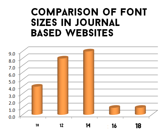
Academic Journal Websites
If you do not blog or write about facts and events, but like to experiment and jot your results down for others to see, then your website is an academic journal. Examples include anything from journals to private research diary.
Journal websites were by far the most unpredictable as far as the study goes. Their values were erratic and difficult to extrapolate. Font size for most journals based websites never exceeded 14 pixels.
About 92 percent of journal based websites had a font size less than (or equal) 14 pixels, as opposed to a paltry 60 percent in blogs. Just 8 percent journal websites had a font size of more than 14 pixels. Surprisingly the higher font size was mostly found in medical journals.
Information based websites
And if you are none of the above, you're involved in an information based website.
Information based websites followed the trend of journals, 80% of information based websites thought it would be better if they kept their font size less than (or equal) to 14 pixels. Just 20 percent thought of exceeding the 14px mark.

Findings Explained
Some notes on Font sizes
Now there is a reason why everybody is so gung-ho on keeping their fonts near 14 pixels. Though Bonn, from smashing magazine contests that 16px isn't too bad, but let’s face it, it is a magazine.
Ergonomics
You should not keep your font less than 12px. The reason being, your websites are to be accessed on desktops too, lesser font sizes would put strain on the users eyes.According to smashing magazine, most people sitting comfortably are about 20 inches (about half a meter) from their computer screen.
Why Font Sizes matter
People can argue saying, Font size doesn’t matter, on can obviously zoom and change the size.Of course users can zoom their screen by holding control key and scrolling upwards, but most people do not know the feature (not all are computer geniuses like you)
Conclusions
So all-in-all, here are the conclusions,- If you're a blog, best font size you could use is 14px to 16px. In a blog if you don't write much and expect people to get your meaning in few lines 16px might just be fine.
- If you are into news 14px is the best you can do. A larger font size might mean you do not have enough to show and anything smaller would hamper the reading.
- If yours is a research journal (Which is mine too partially), it is better to follow the trend and have the font size in the range of 12px and 13px. I guess the concept of “using large fonts if you do not have anything" hasn’t really caught on in the minds of people wearing lab coats.
- If you plan on starting an information based website, i.e. a dictionary website, or a private encyclopedia, your best bet would range in 13px or 14px.
- If you still haven't decided on which category your website falls in, close your eyes and keep 14 as the font size.
Further reading,
You could have a look at W3C's advice on font sizes tooStackexchange on User experience too hosts a series of interesting conversations between knowledgeable participants on the optimal font size
More in font research Series
Find out Which Font Color is the best? - Did you know font colors can alter moods? Learn how professional award winning websites change text colors to ensure maximum user interaction and understanding.
Find out Which Font Size is the best? - How do you know if your font size is readable enough? What font can be called too large and how many pixels are too small?
This answered your question,


.png)

.png)