Showing posts with label Online Tools. Show all posts

Feb 18, 2013

Best Free website Builders - Reviews Part II

Best Free website Builders - Reviews Part II Front

Which website builder is the best? Whats the best website builder for creating your first mobile e-commerce website? The answers are evident in the second article of free website builder series. The second portion of the free website builder series presents to you a review on Yola and Wix.com. Both equally good in their respective USPs. Let us find who will win in this legendary duel between the kings of website builders of the 21st century.

FInd who wins between webs.com and weebly.com at the first article of the series.

Yola

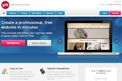
Just as the name suggests, yola reeks of African aura in its website as well as in the company. According to website tool tester, the only USP of yola is its powerful yet elegant customer support. The website provides support to its customers (free and paid both, something not all websites offer) through telephone.
Though yola has been notorious for its hefty fees for domains, websites and emails, but it compensates by providing outstanding services. Yola has partnered with Ecwid to provide users a hands on experience with an online store. The store however is not available to the freebies.

Yola


Pros
  1. Simple and easy builder
  2. Nice collection of help videos
  3. Moderate template variety
  4. Comparatively high numbers of language is supported by the site builder
  5. Moderate variety of widgets
  6. A very powerful online store
  7. Meta tags and description are customizable
  8. Can add HTML code


Cons
  1. Cannot handle complex templates or settings
  2. In-house Blog comments are handled only through disqus
  3. In-House Forums are handled only through Tal.ki


1.       The meta tags can be edited once throughout the website
2.       Blog hosted on an external website
3.       Erratic beahviour of the website builder sometimes

Codemakit’s Score – 6.6

Wix Editor

The corporate structure was created in 2006 by Avishai Abrahami, Nadav Abrahami and Giora Kaplan. With its headquarters in Tel Aviv it opened in beta mode after 2 years. Flash content on websites have always been viewed with contempt and confusion. Contempt because several services like apple do not support flash content, so the websites having flash content cannot be viewed correctly. Confusion  because there are no specific rules or information regarding the effect of flash on the website hosting it (usually search engines do not like it by SEOmoz and w3origin Blog). Wix’s USP is flash peppered with aesthetics and beauty. Unlike webs.com, the website builder is not clumsy and slow, it is powerful and fast.

Wix Editor


Pros

  1. Simple and easy builder
  2. Drag and Drop functionality
  3. Higher range of templates than its counterparts
  4. Can modify images on the go
  5. Mini pages on the same URL
  6. Highly suitable for mobile websites
  7. Added feature of designing and creating facebook pages, see how to do it
  8. Never seen before widgets
  9. 500 MB storage space

Cons

  1. Very long URL for a free website
  2. Complex process of page creation
  3. The meta tags can be edited once throughout the website
  4. Blog hosted on an external website
  5. Erratic behavior of the website builder sometimes

Codemakit’s Score 9.0

This was about,
Best Free website Builders - Reviews Part II MohitChar

Feb 12, 2013

Remove your blog in the new blogger


Remove your blog in the new blogger Front
The following article explains how and when a blog is removed.
A time comes in many a blogger’s life when he has been over ambitious, when he has taken more projects than necessary, started more blogs than he could have handled and tried writing more than his capacity. But, then one day it strikes him, it had been wrong all over. Then he tries to amends his mistakes by leaving the particular blog and diverting his attention towards the mainstream blog, but all in vain. He is still reminded about how ambitious the earlier project was and how popular was it going to be. Finally one day it falls on him, what if he could delete the blog? So then he moves on to delete it.

There are five reasons why blogs are deleted, yours must be among these:
  1. Blog is blacklisted
  2. Blogger not interested
  3. Blog unable to garner enough earnings
  4. Blog interfering with mainstream work of the blogger
  5. Blog user finding it difficult to understand the blogging process

So how do you delete your blogger blog?
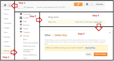
  • Step 1: Determine the blog you are going to remove
  • Step 2: Now go to Blogger dashboard, Click on the pull down menu and Go to Settings
  • Step 3: In the settings tab, Click on other
  • Step 4: On the top you will see a portion of the screen titled ‘blog tools’. It is here when you can import export or delete your blog.
  • Step 5: The new and improved blogger allows the user to download the entire blog, for future use. Also the new blogger will retain the particular blog in its database in case the user changes his mind for 90days. Also blogger allows its users to create another blog in the name of the particular blog i.e. the URL of the deleted blog will be available to others.

Here is a detailed walk-through chart to help you in the process.

walk-through chart


This was about,
Remove your blog in the new blogger MohitCHar

Jan 1, 2013

Analyse your competitors and internal links

Analyse your competitors and internal links Front
 A website is only popular as its incomming links or backlinks. So when you have quite many backlinks, rest assured your website or blog will be good. But how do find out the quality of your links.

The open site Explorer from SEOmoz is a good tool for it. SEOmoz aims at developing SEO software and provides API and hosts even.

It is based in Seatle as consultants but now creates softwares.

The site Explorer contains all the tools you might need to analyse your website and compare it with your competitors. There was a comparable website analysis tool which existed free a few years ago known as Webceo.

The software has a tool for finding the inbound links, Top pages, Linking Domains etc.
You will find your domain authority and SEOmoz ranks too. SEOmoz ranks are also important in estimating the pagerank of websites.

Site Explorer

This was all about,
Analyse your competitors and internal links MohitChar

Dec 27, 2012

When was my blog started?

When was my blog started Front
Its been a while, since you've started blogging, Now out of the blue you need to find out when did you start blogging. The need might arise out of any reason, might be because you needed to impress your friend, or you're filling an online form for your blog and you need to know the start date of your blog.

now there are three types of date, when you talk about date of blog.


1. The date of publication – The date when you published your page on your respective blogging platform.
2. The date of Discovery – The date when search engine bots find out your blog or its posts. Now this date changes from one search engine to another.
3. The date of Cache – This is the most recent date when your blog or blog post was crawled by a search engine bot.
Now, here are the methods.

Method 1:

Now, there are two ways by which you can find out the start date of your blog, One is the normal URL method, Here just find out the URL of the first post of your blog and you will find the date below the URL in green.
Method 1:

Method 2:

You can also, add the Google operator "inurl: " (use the operator without the quotes) before the URL of the post and you will find the oldest date possible, i.e. the date when a third party found your website.

Method 2:

This was all about,
When was my blog started MohitChar

Nov 29, 2012

How easy is my website's navigation?

How easy is my website's navigation? Front
You've created a splendid website, with huge bucket loads of features and function, but are all its functionalities accessible to your users. Are all your buttons working? Have you put alt.text in all your images? Are there problematic hyperlinks in your website that you're unaware of? 

Or for even smaller mistakes like Are there empty header tags in your HTML code? Such small mistakes must not be over looked, as they make you look good on the bot diary, which finally makes you look good on the books of giant search engines like Google or Bing. Correcting such small mistakes would also lead to an improvement in your page rank, Alexa Rank, ASR ranks etc. Long story short, It will give you higher Visitors and more money for monetized developers.

The following are the most common errors.


Website navigation sample

WebAIM Started in 1999 is a non-profit organization within the Center for Persons with Disabilities at Utah State University. The people there have come up with an excellent Idea of pointing out a website's Mistakes, Though the feat might not look much, but it is a golden oppotunity for web Developers who have not got enough time to check their code, regularly for mishaps,

WAVE 4.0 Development Team consists of Aaron Andersen, Jared Smith, Diogenes Hernandez as the project heads.


WAVE offers four types of reports:

  1. Errors, Features, and Alerts
  2. Structure/Order View
  3. Text-only View
  4. Outline View
The WAVE online tool, helps analyse the website on the basis of small mistakes in coding and accessibility, The tool Displays your website in their own window and mark the areas found to be faulty.

website's navigation

On preliminary Examination, I found out that my blog has huge number of accessibility problems, But It is natural for such big a site and necessary corrections would be done in the near future.

website's navigation Screenshot

After analysing your website, If you need to looks upon the Legend to find out what do the errors mean,

This was all about,

Nov 13, 2012

How many visitors can my site handle?

How many visitors can my site handle Front
How many visitors can your website/blog handle without being impractically slow? What is the maximum visitor load capacity?
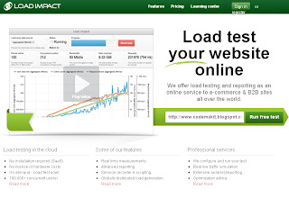
Load Impact is an online visitor load testing service which tests your website’s performance when it is subjected to increased visitor loads. The website is exceedingly simple and the report is extremely informational. The about page claims of over 40,000 load tests until now.
Few years ago, a fast website was a luxury, but now it has become a necessity. You may ask, since when? Since 2010 when Google introduced the concept of page load time in its algorithm. Users when entering a slow website would think twice before clicking on any link.
This applies to all your own potential links the user might visit and potential advertisement links which might bring you revenue. So, in  a nutshell, a slow website leads to cautious visitor and a cautious visitor leads to decreased online surfing on your website, finally leading to lower revenues.
Load test your website online
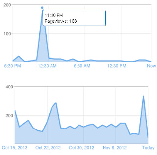
From another perspective, after teh load testing has been done, you would find a spike in your visitor readings in your blog or website, but don't be too happy, as they are all inorganic visitors.
Load time analysis spike

Reading and understanding the Site report.

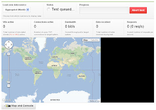
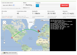
At the top of the page, you will find your URL being displayed. You will also see another public address (that is where your report has been generated). Now you may share the public link with your friends and colleagues. There will be a status bar, giving you the progress of the test being performed. At the top left you would find “Load Zone Data source” which will allow you to select the location of source of the load being generated on your website. 

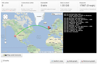
The information is very well depicted in the form of a geographical map (Google Maps). In the maps, the arrow spot tells you the location of target of the loading and the bulb like option shows the location of the source of the load. Now the thicker the line joining the points, higher is the traffic density or the loading.

traffic density or the loading.

traffic density Screenshot

traffic density Screenshot

Now comes the charts, on the y-axis we have the number of visitor loading applied and the time duration of the response of the website and the x-axis gives the duration of website. if you see it carefully in the following screenshot of a chart, you will observe that, as the number of visitors are increased on the website, the time taken by the website to respond too increases. 

Now the visitor load is applied gradually, so comes the inclined line.  Now you may click on the button above the chart to change the metrics, and see the results in a different light altogether. Using the information, your Search Engine Optimization techniques can be tuned to perfection.

How many visitors can my site handle Graph

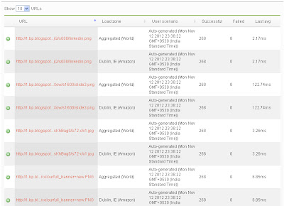
The lower table gives a list of resources and URLs accessed from your site, How many requests were made and the how many number of URLs gave negative response. Also the table will show how many resources (like scripts and images) on your website loaded within the stipulated time frame in which your website was tested.

How many visitors can my site handle List

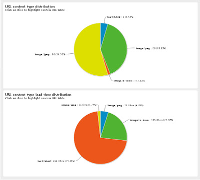
Finally the pie chart will show, through percentage distribution, the time required for different resources to be loaded.

percentage distribution


This would answer your question,
How many visitors can my site handle MohitChar

Nov 11, 2012

Merge Several URLs into one

Merge Several URLs into one Front
Imagine a situation when you're sitting next to a computer, you want to share a number of websites to your friends, so you've got two ways, either collect the URLs and paste them at a single place, however, the method would pose problems when you try to squeeze them together in a tiny 140 character limit for twitter. Now use of URL shorteners (like bitly.com) is also possible but with limitations.


Other method is when you share the URL individually on your microblogging site. But even you know, that its tedious and time consuming. Now that leaves you open to hear out the solution given bellow.

The website, BridgeURL combines the different URLs given by the user and displays them at a single webpage, with a url given to you at Bridge URL.

The website is simple as it is and highly functional. You job is to collect the URLs you need to share and paste them in the space provided, give a name to your list and just click create link.

Bridge URL
You'll recieve a message that your bridge has been created and you'll be presented with two different working URLs.

If you need to find out how you new URL looks like, then copy and visit it.
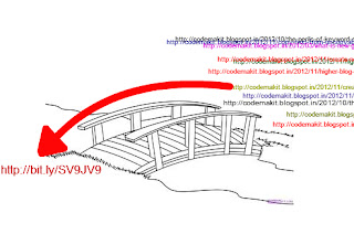
You'll be presented with a list of your links all at one page.

Bridge URL

The website metaphorically creates a bridge between your selected links and its created one.

Bridge URL

Here is a Video depicting its usage


That was all about,
Merge Several URLs into one MohitChar

Nov 7, 2012

Make your own website Logo easily

Make your own website Logo easily Front
When you're in need for a free image, with least licence restrictions, you try for a website which is the easiest to operate, the search is never ending. Until, you stumble upon a website like LogoTypeMaker.

When you have many articles to write and you need something to freshen up the articles, You would try and find out services, that would help you in the process. The image would also look good independently on your website or blog.

So how do you make a good logo for your website, that speaks out about your website in a single jpeg. Here is a 3 step process.


The website is professionally prepared, sprinkled with quality CSS and XHTML, with clear and concise well defined functions and buttons. Go to Label Type Maker,

Name your creationSTEP 1 : Name your creation


First step is to input a text for the logo, you're preparing. The text will be shown with the logo in the subsequent steps.


STEP 2 : Choose your Logo

STEP 2 : Choose your Logo

Now, you have to choose the logo, you want to work with. But free lancers, please keep in mind, choose a free logo, to avoid coming back again from the later stages.


STEP 3 : Personalize and Symbolize 

STEP 3 : Personalize and Symbolize
Once you've selected a logo, you'll be presented with choices, to change background color, text size, text shape, etc.

Now its on you, to make it as personalized and unique as you can.


Now, click on the "Download this Logo" button, which will take you to the size selection option.

Here is a YouTube Video Depicting its use.


Like Every design website, There are licence requirements, Which you will admit is nothing to hold.
The following are the licence requirements
  1. The licence type is a site type
  2. Also by downloading any of the Logos you would have to agree to hold the website harmless for any damage that may occur when you use it.
  3. Also, all the logos created through the website are a property of the website itself
This was all about,
Make your own website Logo easily MohitChar

Oct 20, 2012

Copy and paste characters, that are not in your computer

Copy and paste characters, that are not in your computer Front
Many people, sometimes encounter problems when typing and do not find a character for their writings,

This is especially the case with mathematicians and erudite scholars during research.

Though there are alternatives, like adobe fonts and so forth, but you cannot expect yourselves to be blessed with such software on every machine you sit on, So you'll need something more mobile, something that you can rely on.

Here's your solution, The website copypaste Characters is one of the most useful solution to such problems.

It is basically an internet application for copying and pasting characters that does not comes with the computer’s typefaces, to be pasted into emails, tweets, text documents, forums etc.

Copy and paste characters


The website also allows you to create your own set of characters, Though you will have to sign-up with the website which is not a herculean task altogether.

Copy and paste characters


According to the about page of the website, Copy Paste Character was developed in Stockholm, Sweden, by Konst; Teknik; Martin.

Here is a simple Flowchart about, how to operate the website.

Copy and paste characters 5 Steps

Here is a video depicting the website,


This was all about
Copy and paste characters, that are not in your computer MohitChar

Sep 30, 2012

Check your Website for Mobile Compatibility Part 1


Ever wanted to test your website for mobile applications? Ever wanted your own opinion to know about, how your website looks on a mobile device ? GoMo is one of the best services available to you if your want to determine the mobile compatibility of your website in just a few seconds. According to the site about 75% of customers prefer a mobile-friendly site. 

You would surely not want to trampled upon by other web developers to stamp on you and progress further, just because you don't have a mobile compatible website.


The developers at the website have developed a tool known as GoMometer, which performs the function of analyzing. During the analysis, you will also find small snippets of information about mobile websites and their optimization.

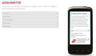
Gomometer screenshot

The website shows you, your own website on a preview and asks you about the experience.

Gomometer screenshot 2

Finally, you are presented with the site results both in html and pdf format.

Gomometer screenshot for site results

According to Google, 66% of users find mobile sites through search engines, but if they don not like their experience, 79% will go back to search and look elsewhere. About 81% of users prefer mobile sites to apps for researching prices, 79% prefer mobile sites for product reviews and 63% prefer them for purchasing.

So now you have enough reasons to getup and do some thing about your video.

Here is a video depicting the website and how to find mobile web compatibility of your website.
As expected the website is of top notch quality and highly informative.


 This was all about,
Gomometer screenshot for site results mohitchar